

Originally published: 17/09/2021 08:24
Publication number: ELQ-25752-1
View all versions & Certificate
Publication number: ELQ-25752-1
View all versions & Certificate

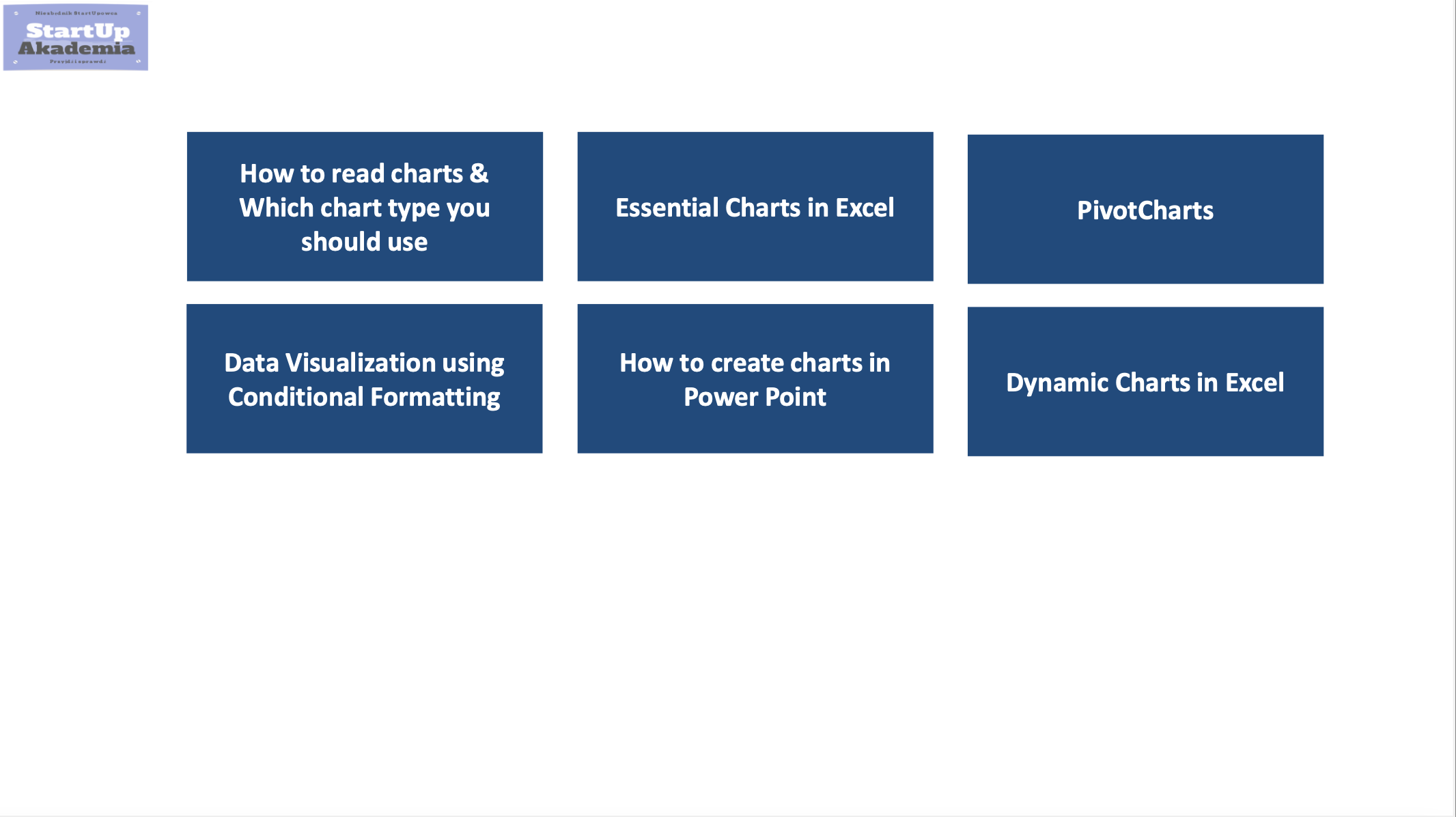
Data Visualization for Management Consultants & Business Analysts
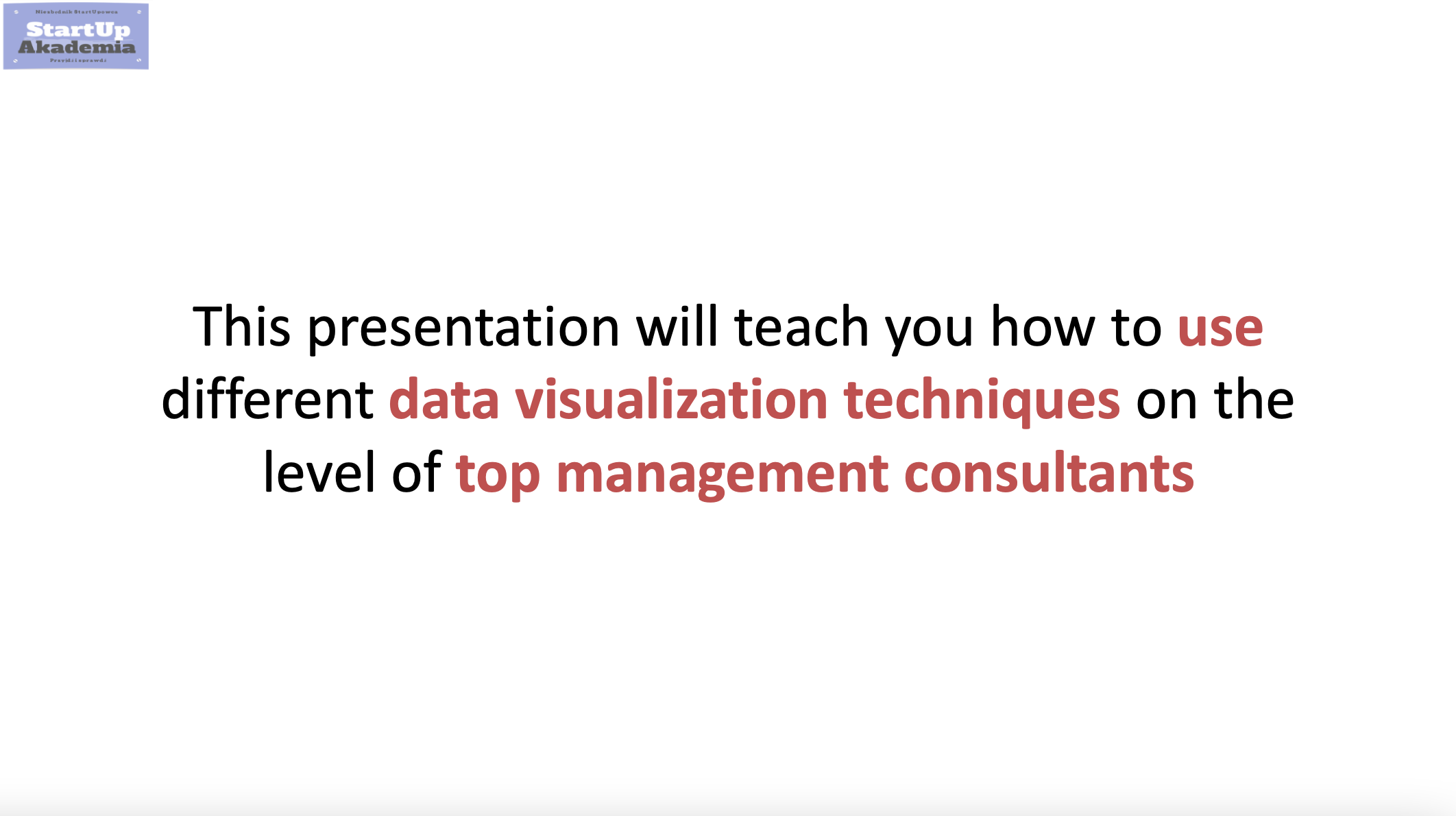
Data Visualization for Management Consultants & Business Analysts A practical guide on how to show results during consulting projects
Expert in performance improvement and restructuring with significant experienceFollow 427