Originally published: 02/03/2021 08:29
Last version published: 07/04/2021 09:50
Publication number: ELQ-38780-4
View all versions & Certificate
Last version published: 07/04/2021 09:50
Publication number: ELQ-38780-4
View all versions & Certificate

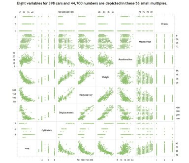
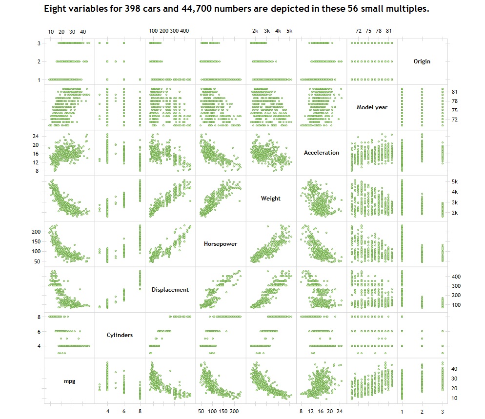
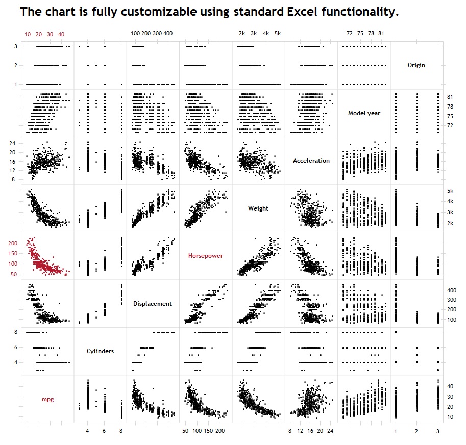
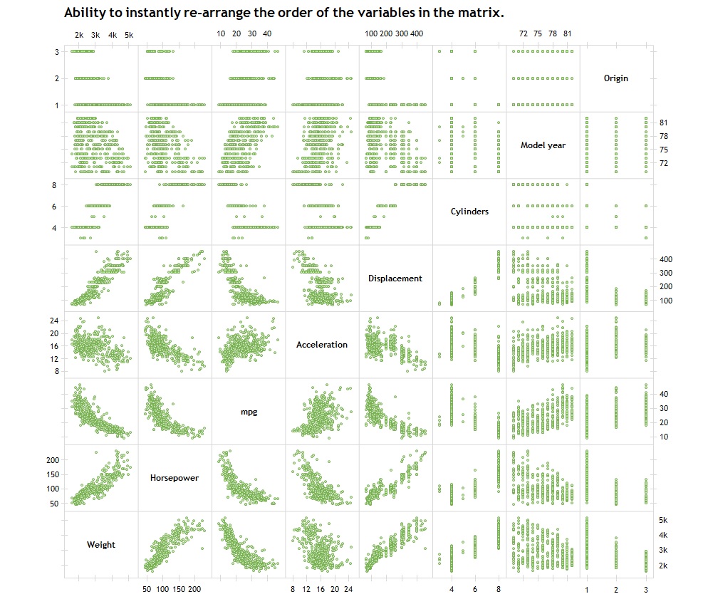
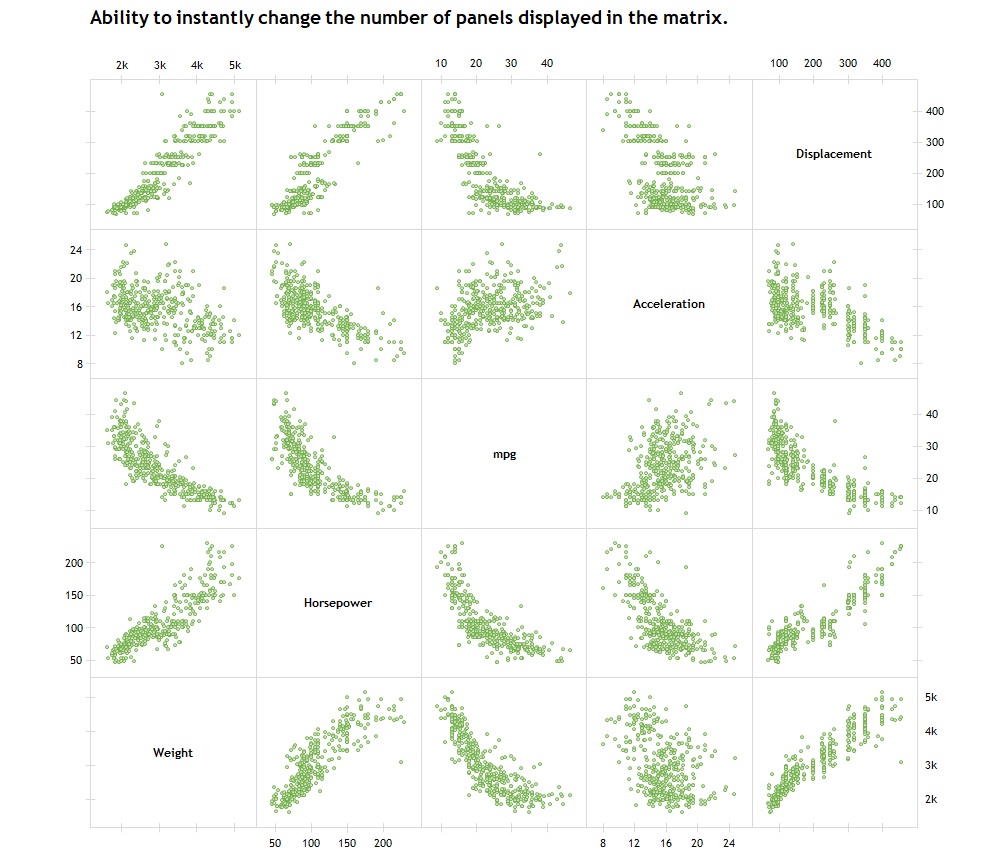
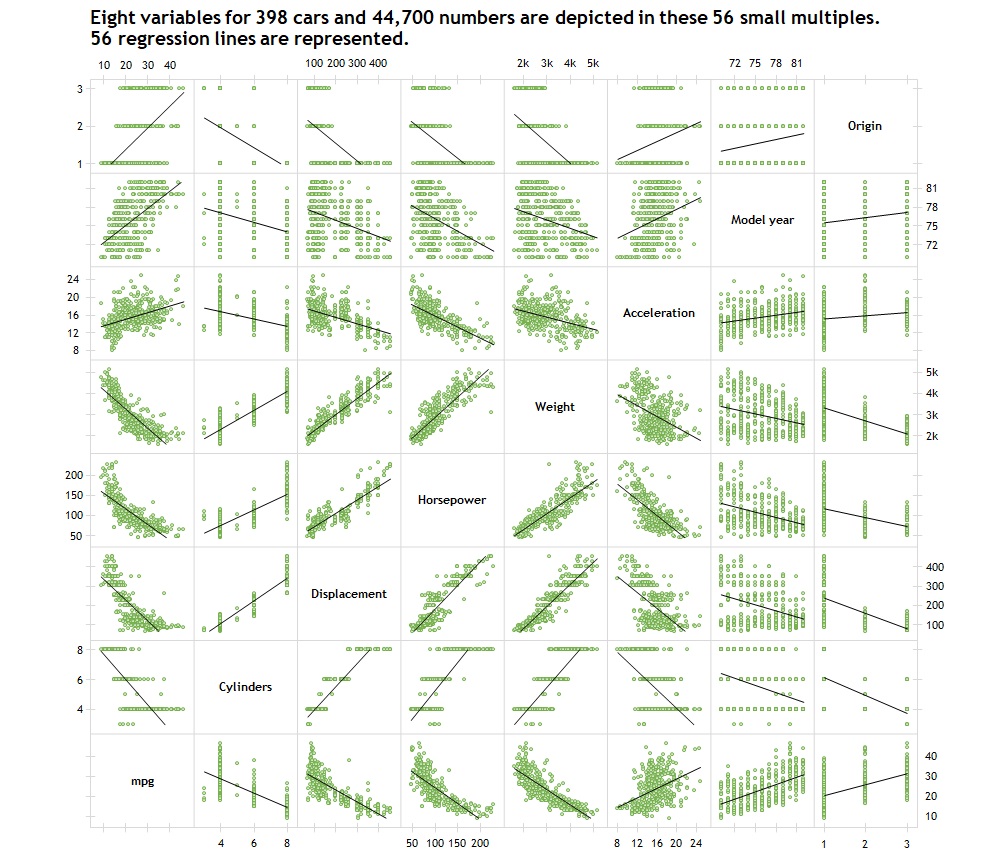
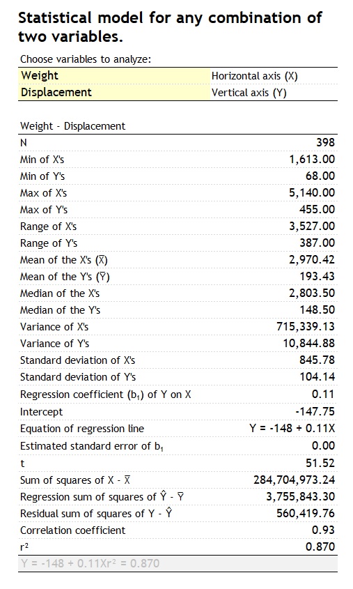
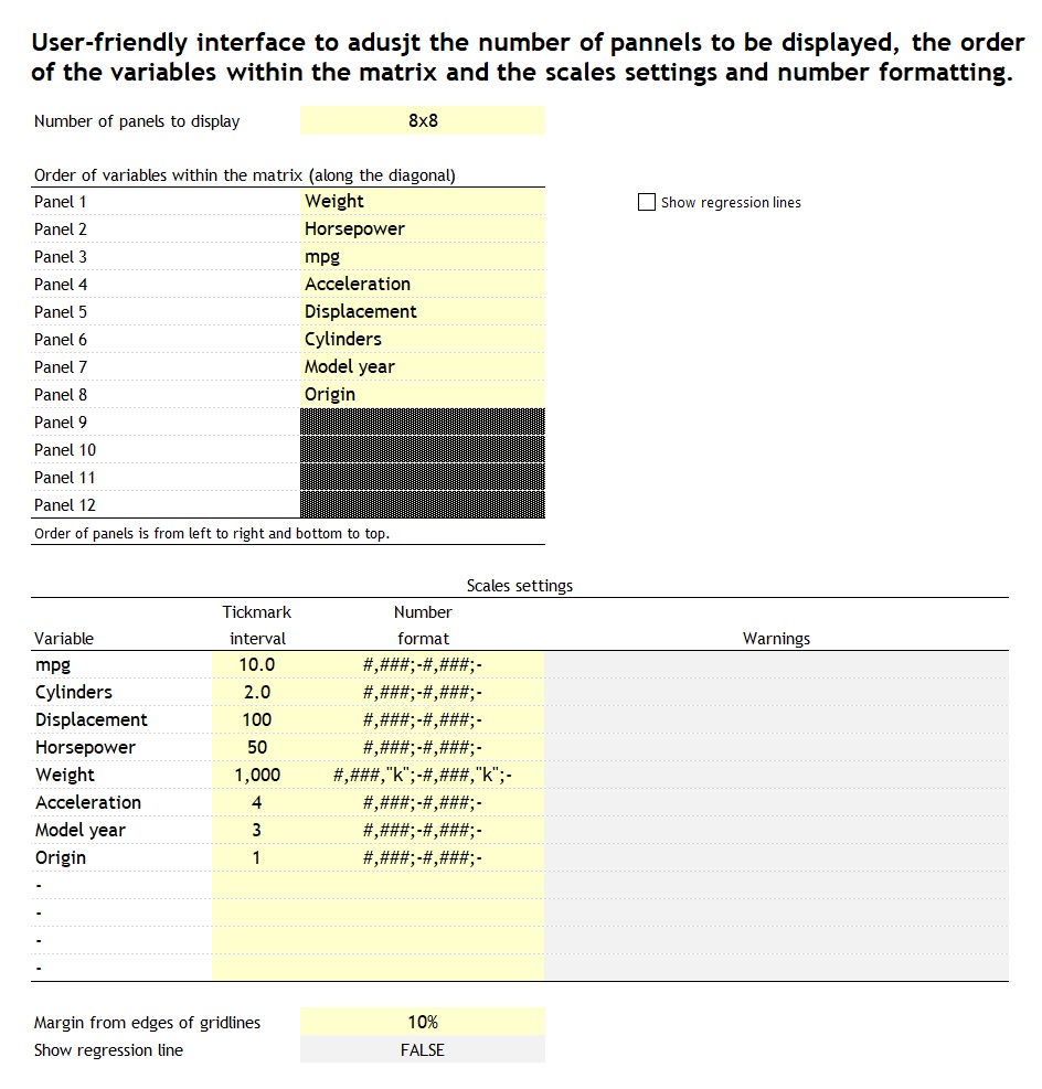
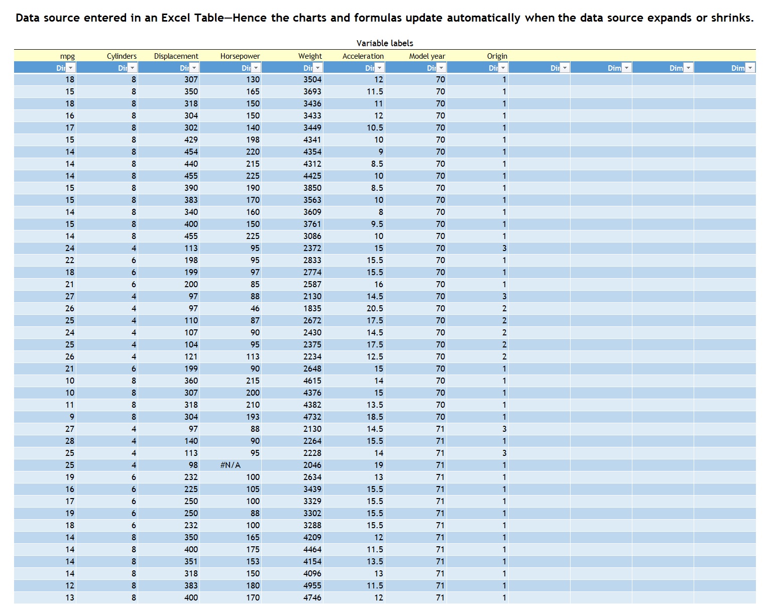
Scatter Plot Matrix in Excel (12x12 panels) with Correlation Matrix
Excel template to build a Scatterplot Matrix—with up to 12 variables—in one chart for ease of analysis and formatting.
I build tools that make data analysis, data visualization and real estate investment analysis easier, faster and more fun.Follow
Further information
To enable business analysts, scientists, statisticians, data visualizers and journalists to produce scatterplot matrices in Excel along with the correlation matrix in graphic form.
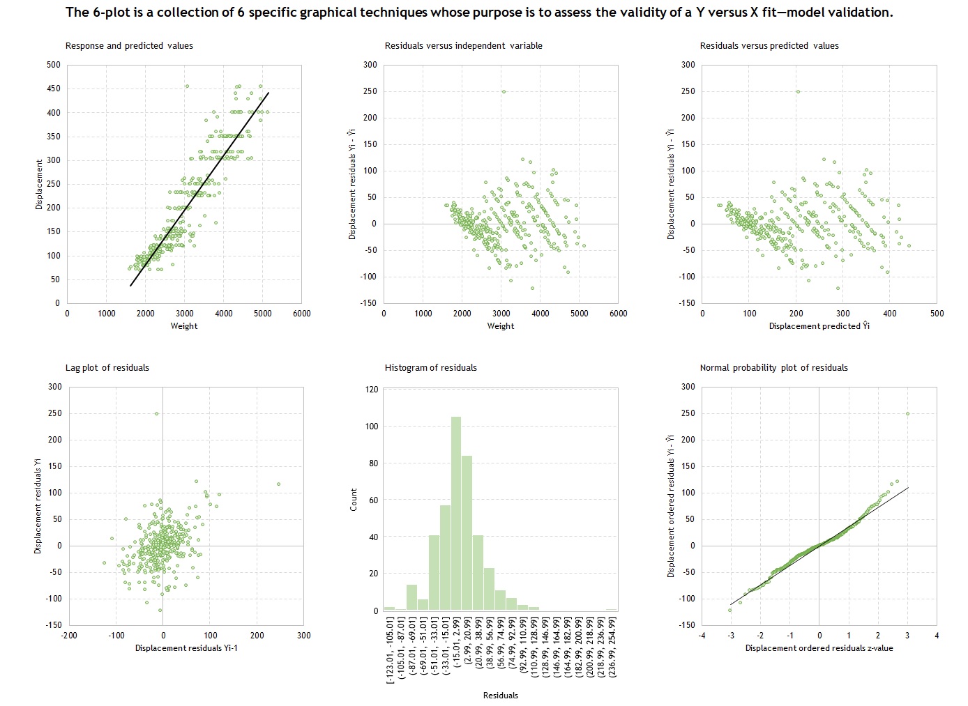
Moreover, the Excel template generates the statistical model along with the 6-Plot—a collection of 6 specific graphical techniques whose purpose is to assess the validity of a Y versus X fit.
Business, science, statistics, data visualization, data journalism
Template relies heavily on Excel's Dynamic Arrays capabilities, only available to Office 365 subscribers.