


Originally published: 27/07/2018 09:26
Last version published: 06/03/2020 08:39
Publication number: ELQ-18068-12
View all versions & Certificate
Last version published: 06/03/2020 08:39
Publication number: ELQ-18068-12
View all versions & Certificate

Dashboard Design in Excel - The Complete Course
The complete, comprehensive course for dashboard design in Excel.
dashboardvideo courseexcel skillsexcel trainingexcel dashboardtraining coursedashboard courseexcel course
Description
Lean how to Create Mind Blowing Excel Dashboards from Scratch.
Generate stunning dashboards and reports that will turn heads in your organisation. Learn how to aggregate and transform large volumes of data into succinct visual content. Leverage Excel functionality to build sophisticated, interactive tables and charts to improve the quality of your reporting. Learn the theory behind dashboard design so you can produce the same high quality output time after time.
This Dashboard Course will teach you everything from the design of your calculations to the layout of an effective Dashboard report. Follow these simple rules every time and your spreadsheets will have structure and the production of easy to update Excel dashboards will be knowledge you possess.
Creating an Excel Dashboard is mostly about structure. The report has to be laid in just the right way to be able to generate the look and feel you require. The course will cover these elements.
The final report should be simple and the information should simply fall into the dashboard in a very easy to follow way. Creating highly flexible calculations is the key.
On completion of this course, you will be able to create your own Excel dashboards which have a stunning look and feel and are the talk of your office. Invest in yourself and your skillset will flourish along with your ability to generate stunning Excel dashboard reports.
This is a self-paced dashboard course where you will build a number of excel dashboards form the calculations to the charts to the layout. The more you practice my technique the more adept you will become at creating dashboards that have an exceptional look and feel. The course contains self-paced video content where you get access to all the lessons and download files upon registration. The lessons are packed with all I have learned about the structure and layout of a spreadsheet to create highly interactive beautiful dashboards.
The course is 8 modules that will cover all Excel dashboard methodology and help you create fully functional dashboards from scratch.
Video 1: Excel Dashboard Essentials
In this video, I will take you through the theory behind creating excel dashboards from structure and layout to design tips which will help readers absorb the information quickly.
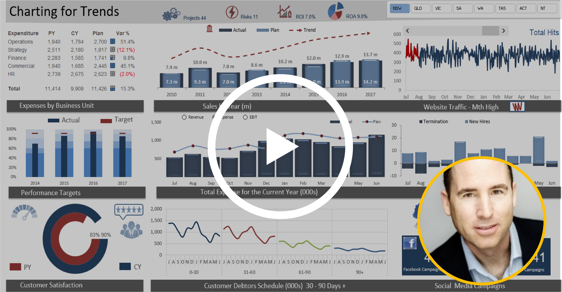
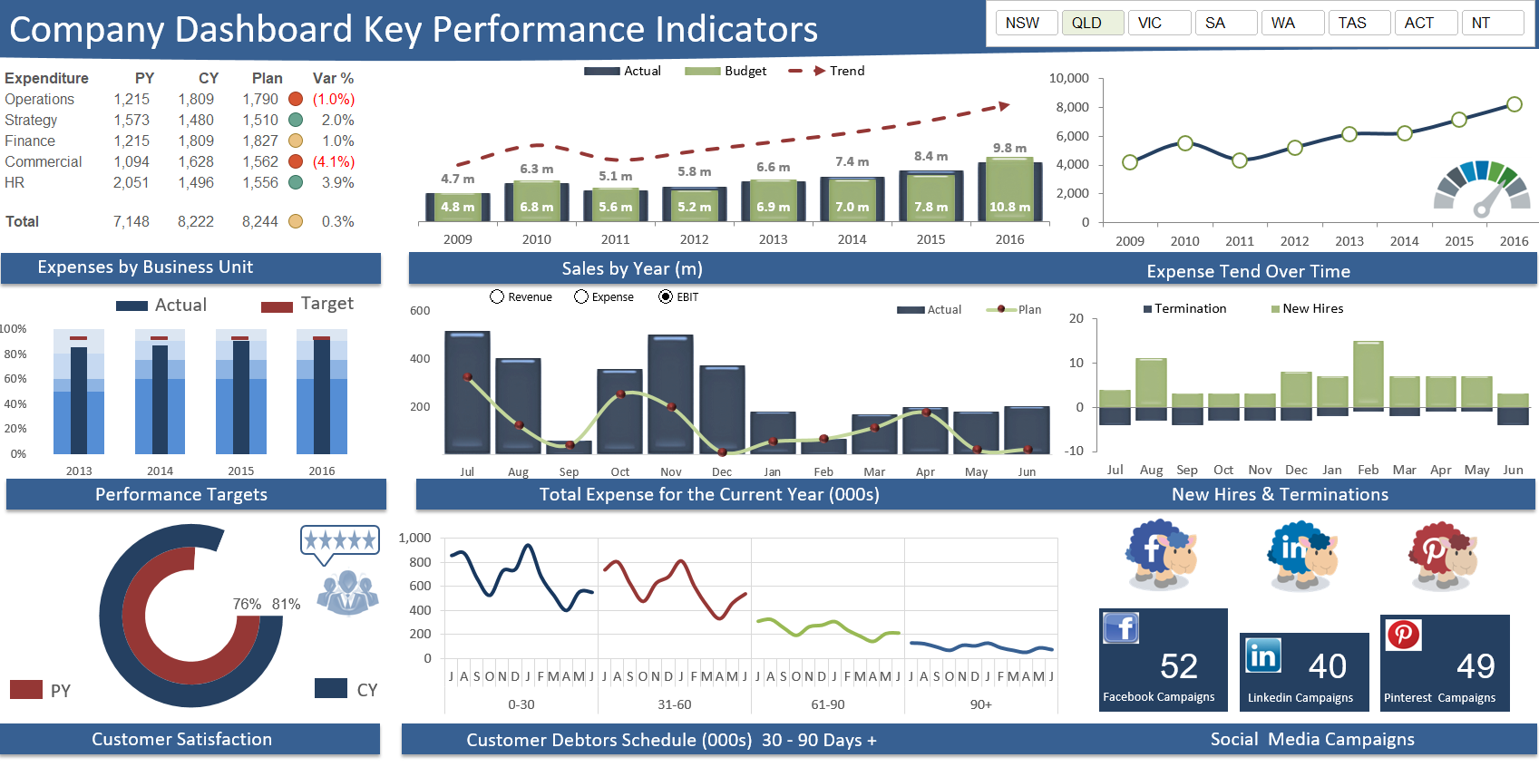
Video 2: Charting for Trends
Generate some fun and innovative combination charts in all in this highly interactive dashboard. The charts are an innovative line chart which compares debtor days, a new take on Actual v budget with a column and line chart, how to quickly and easily set up a bullet chart and create some option buttons which allows the central chart spin on revenue, expense or EBIT.
Video 3: Dashboarding with Pivot Tables
Build a highly interactive report through the generation of multiple linked pivot tables. The report will seamlessly consolidate without the need for complex formulation. Generate all of the pivot tables and the charts, excel tables and learn to use conditional formatting to create bar charts.
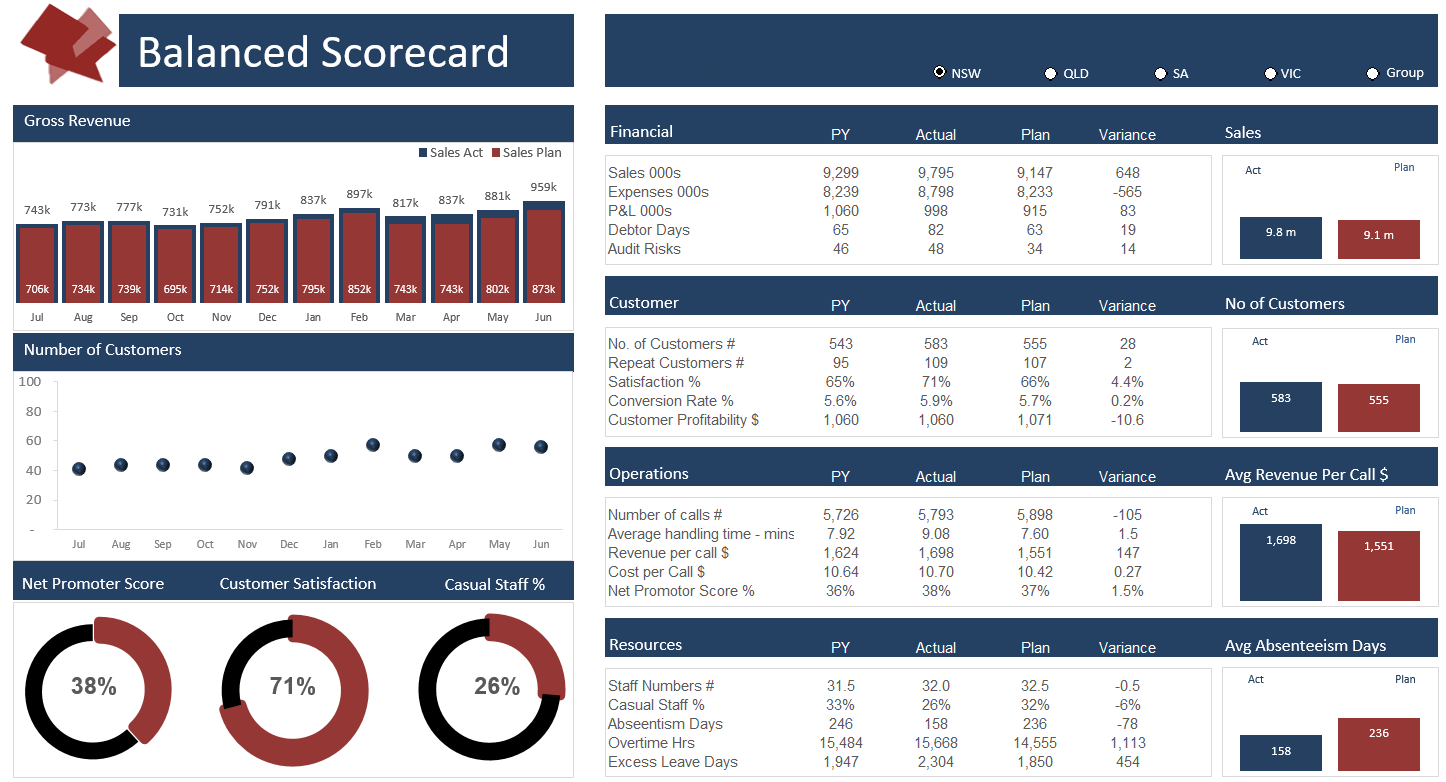
Video 4 : Creating a Balanced Scorecard Report
Generate a balance scorecard report which has the capacity to spin on region with the use of option buttons. Generate the calculations and tables and charts to produce an interactive dashboard that tells a compelling story.
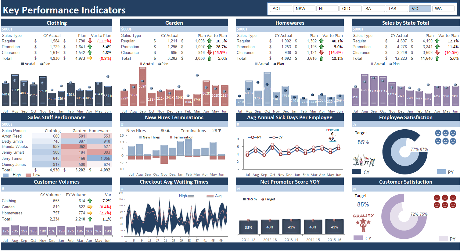
Video 5: KPI Report
Create a highly interactive KPI Dashboard report from scratch in this highly interactive tutorial. The course focuses on the correct layout of the calculations page so this beautiful interactive work can make you shine.
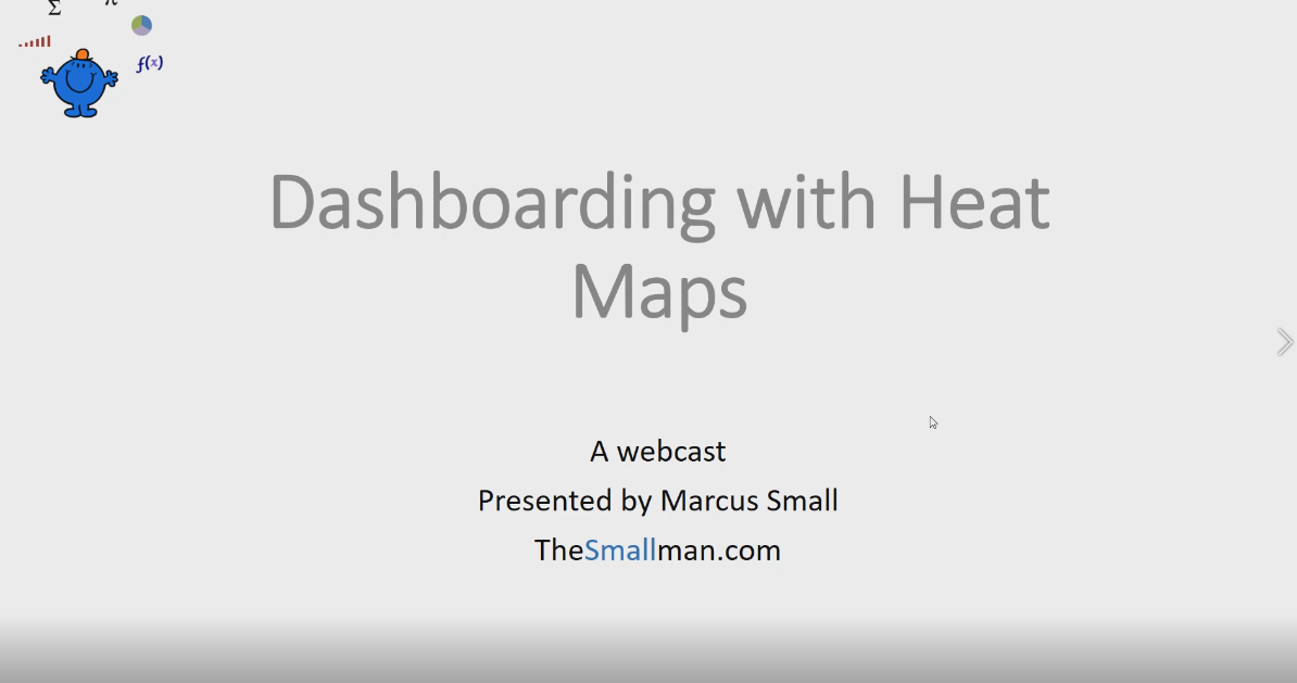
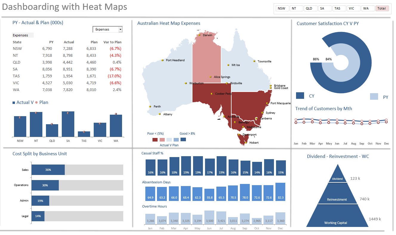
Video 6 Dashboarding with Heat Maps
The concept of heat mapping is introduced in this dashboard where the centre piece is a map of Australia which changes colour based on selection. This type of geo thermal technology is at your finger tips in this chart. A combo box is created to spin the report and a slicer to change the region. Some of the key calculations and all of the charts are built from scratch.
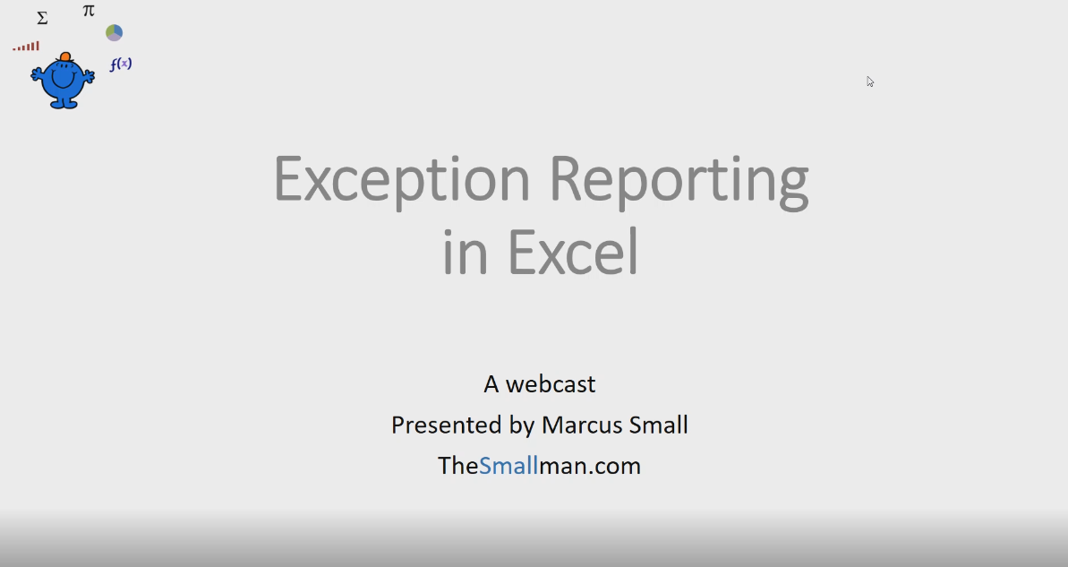
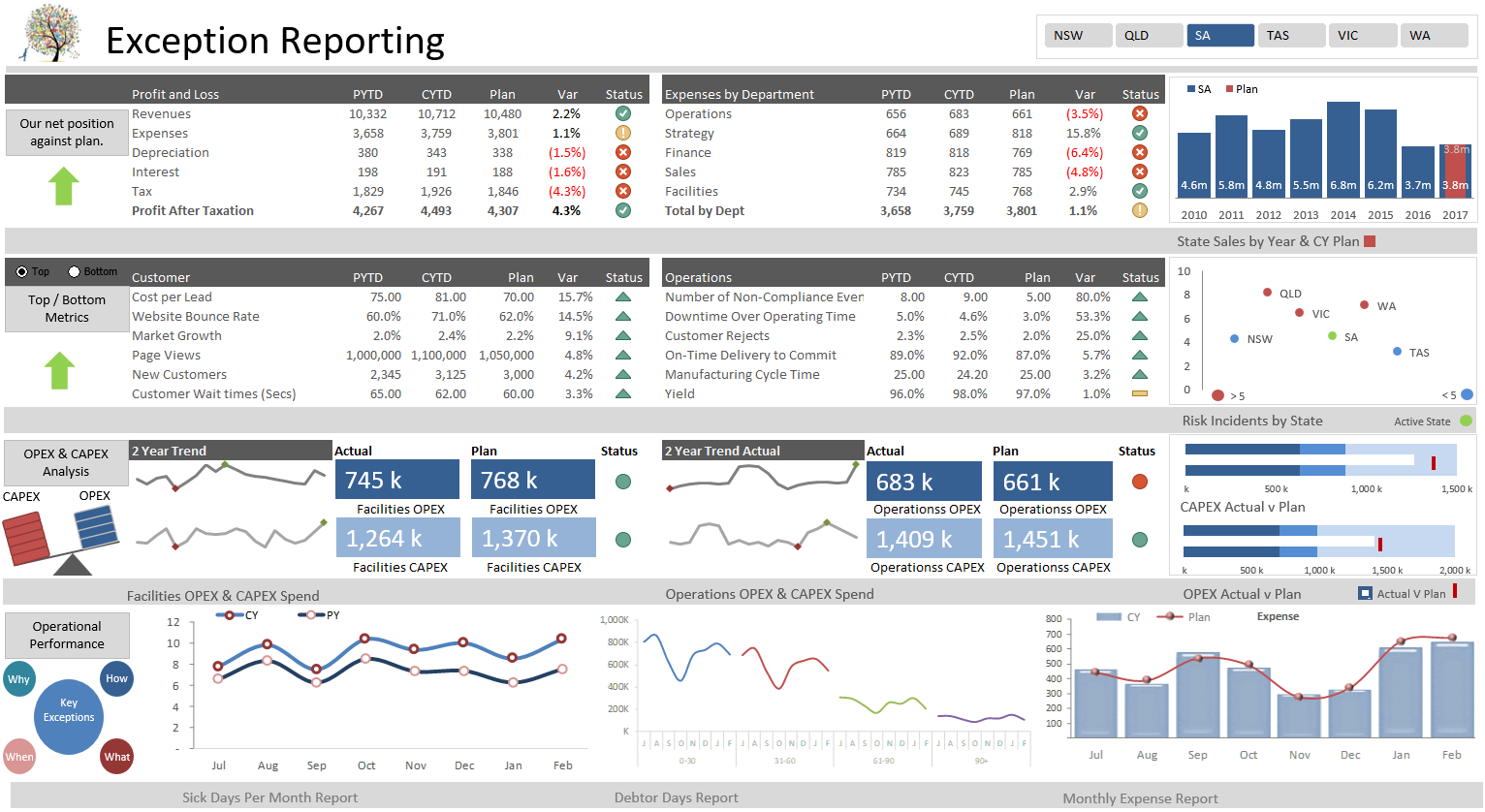
Video 7: Exception Reporting
The productions of this report brings in some of the heat mapping technology and introduces a fun technique where you can display different charts based on a set of criteria. The bottom 3 charts are a group of 5 charts and only the worst 3 performing charts for each region are displayed. The 5 charts are very different in nature. The report is interactive and very easy on the eye with a clean clear layout for the user.
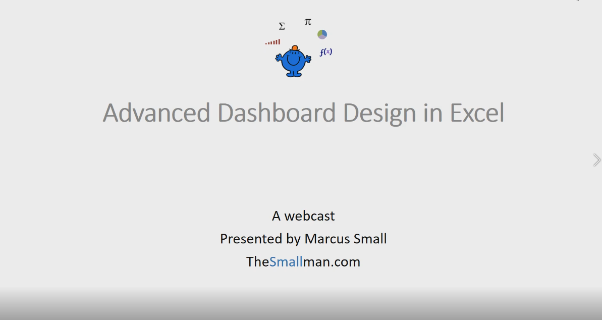
Video 8: Advanced Dashboard design
this dashboard brings together a lot of the functions we have learned into a stunning highly functional visual. The course acts as a capstone unit where once you can create a dashboard of this calibre you can create anything.
Lean how to Create Mind Blowing Excel Dashboards from Scratch.
Generate stunning dashboards and reports that will turn heads in your organisation. Learn how to aggregate and transform large volumes of data into succinct visual content. Leverage Excel functionality to build sophisticated, interactive tables and charts to improve the quality of your reporting. Learn the theory behind dashboard design so you can produce the same high quality output time after time.
This Dashboard Course will teach you everything from the design of your calculations to the layout of an effective Dashboard report. Follow these simple rules every time and your spreadsheets will have structure and the production of easy to update Excel dashboards will be knowledge you possess.
Creating an Excel Dashboard is mostly about structure. The report has to be laid in just the right way to be able to generate the look and feel you require. The course will cover these elements.
The final report should be simple and the information should simply fall into the dashboard in a very easy to follow way. Creating highly flexible calculations is the key.
On completion of this course, you will be able to create your own Excel dashboards which have a stunning look and feel and are the talk of your office. Invest in yourself and your skillset will flourish along with your ability to generate stunning Excel dashboard reports.
This is a self-paced dashboard course where you will build a number of excel dashboards form the calculations to the charts to the layout. The more you practice my technique the more adept you will become at creating dashboards that have an exceptional look and feel. The course contains self-paced video content where you get access to all the lessons and download files upon registration. The lessons are packed with all I have learned about the structure and layout of a spreadsheet to create highly interactive beautiful dashboards.
The course is 8 modules that will cover all Excel dashboard methodology and help you create fully functional dashboards from scratch.
Video 1: Excel Dashboard Essentials
In this video, I will take you through the theory behind creating excel dashboards from structure and layout to design tips which will help readers absorb the information quickly.
Video 2: Charting for Trends
Generate some fun and innovative combination charts in all in this highly interactive dashboard. The charts are an innovative line chart which compares debtor days, a new take on Actual v budget with a column and line chart, how to quickly and easily set up a bullet chart and create some option buttons which allows the central chart spin on revenue, expense or EBIT.
Video 3: Dashboarding with Pivot Tables
Build a highly interactive report through the generation of multiple linked pivot tables. The report will seamlessly consolidate without the need for complex formulation. Generate all of the pivot tables and the charts, excel tables and learn to use conditional formatting to create bar charts.
Video 4 : Creating a Balanced Scorecard Report
Generate a balance scorecard report which has the capacity to spin on region with the use of option buttons. Generate the calculations and tables and charts to produce an interactive dashboard that tells a compelling story.
Video 5: KPI Report
Create a highly interactive KPI Dashboard report from scratch in this highly interactive tutorial. The course focuses on the correct layout of the calculations page so this beautiful interactive work can make you shine.
Video 6 Dashboarding with Heat Maps
The concept of heat mapping is introduced in this dashboard where the centre piece is a map of Australia which changes colour based on selection. This type of geo thermal technology is at your finger tips in this chart. A combo box is created to spin the report and a slicer to change the region. Some of the key calculations and all of the charts are built from scratch.
Video 7: Exception Reporting
The productions of this report brings in some of the heat mapping technology and introduces a fun technique where you can display different charts based on a set of criteria. The bottom 3 charts are a group of 5 charts and only the worst 3 performing charts for each region are displayed. The 5 charts are very different in nature. The report is interactive and very easy on the eye with a clean clear layout for the user.
Video 8: Advanced Dashboard design
this dashboard brings together a lot of the functions we have learned into a stunning highly functional visual. The course acts as a capstone unit where once you can create a dashboard of this calibre you can create anything.
This Best Practice includes
12 Video Files, 7 Excel Files and 1 Word File
