
Originally published: 03/06/2020 19:38
Publication number: ELQ-29894-1
View all versions & Certificate
Publication number: ELQ-29894-1
View all versions & Certificate

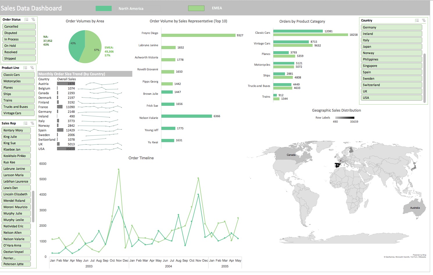
Sales Data Excel Dashboard
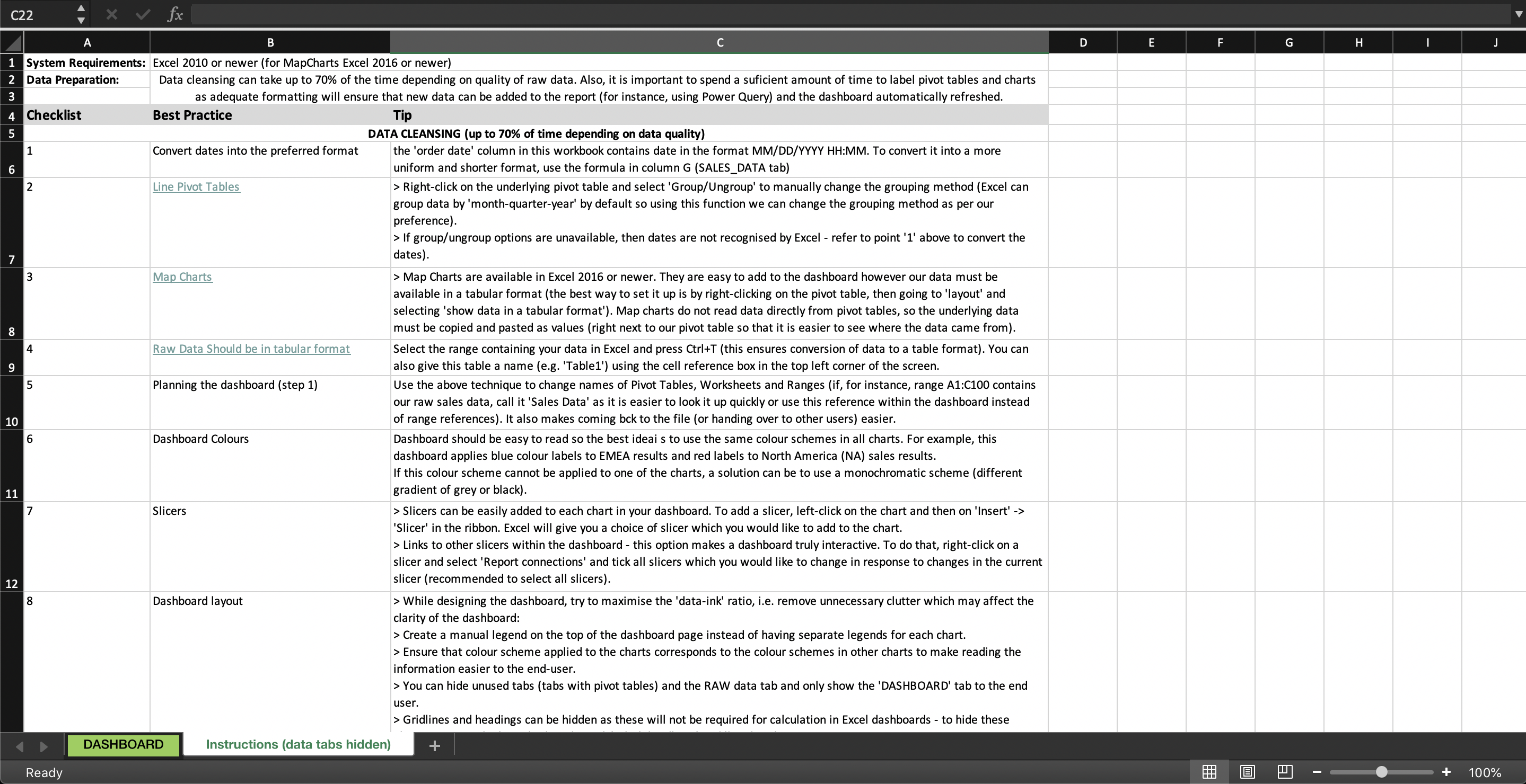
Excel Dashboards are versatile and easy to prepare. You do not necessarily have to invest in BI tools to visualise data.
Further information
To help users create visualisations with the most versatile analytical tool (Excel)
Sales data, team data, any data set manageable in Excel
