
Publication number: ELQ-64596-1
View all versions & Certificate

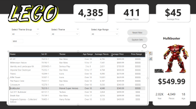
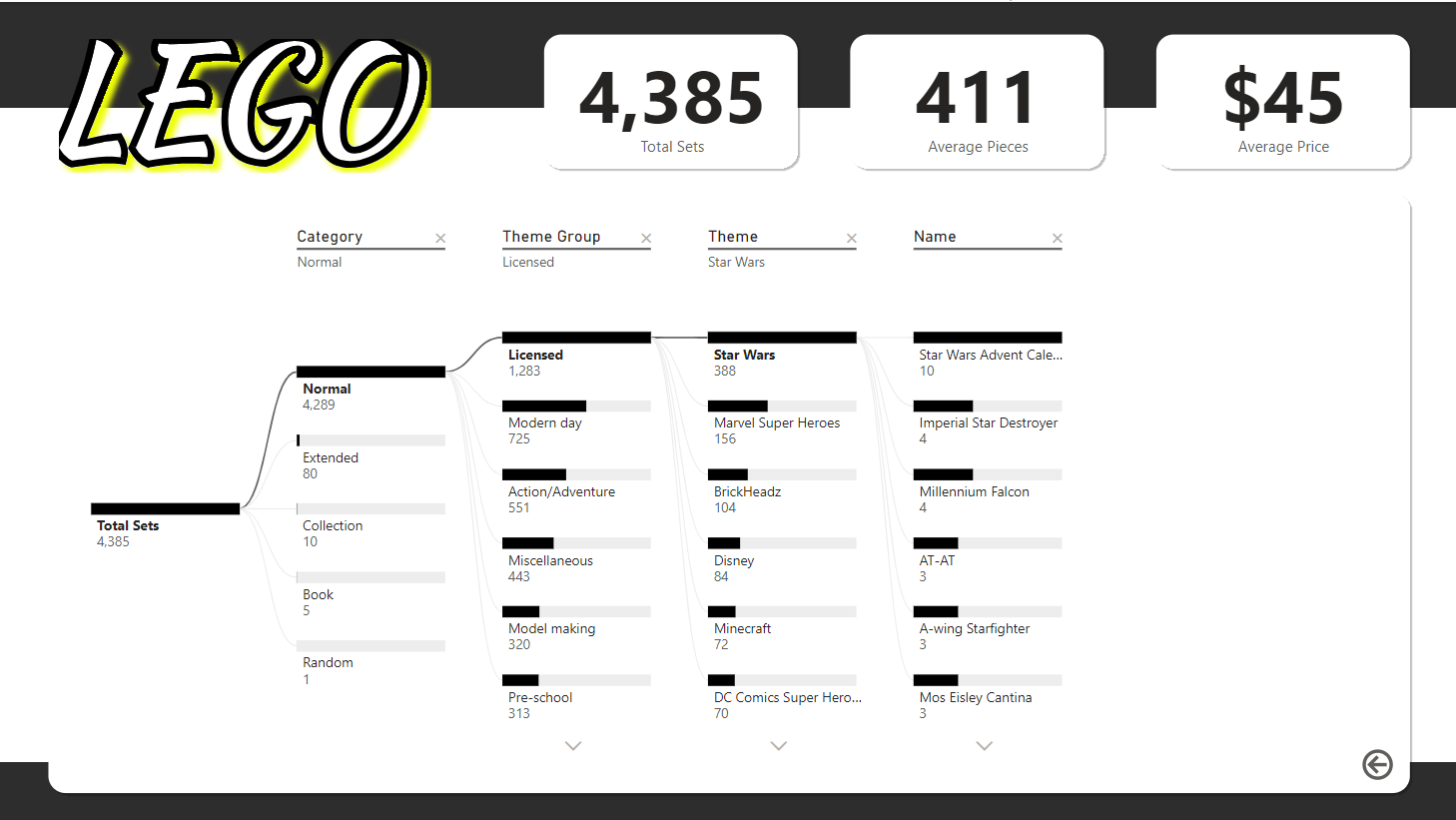
Exploring LEGO with Power BI: Insights, Metrics, and Dynamic Filters
Learn how to create a dynamic Power BI dashboard using LEGO data to explore themes, prices, and age ranges.
Further information
1.Guide Users in Creating a Dynamic Dashboard
Teach users how to design a visually compelling and interactive Power BI dashboard, focusing on best practices for layout and functionality.
2. Enhance Data Analysis Skills
Provide hands-on experience in leveraging Power BI tools, filters, and KPIs to gain actionable insights from a dataset.
3. Showcase Advanced Visualization Techniques
Demonstrate how to use visuals like tree maps, cards, and custom images to make data more engaging and intuitive.
4. Enable Better Decision-Making
Help users build dashboards that empower data-driven decisions by uncovering patterns and trends within the LEGO dataset.
5. Provide Inspiration for Other Projects
Inspire users to adapt the techniques learned to their own datasets, fostering creativity in data visualization and storytelling.
Analyzing Large or Diverse Datasets, Building Engaging Dashboards for Stakeholders, Educational or Training Purposes, Market Analysis and Trend Visualization
,
Extremely Minimal or Static Datasets, Non-Tabular Data Formats, Non-Interactive Use Cases
