Originally published: 09/03/2023 08:56
Last version published: 10/05/2024 13:14
Publication number: ELQ-10648-4
View all versions & Certificate
Last version published: 10/05/2024 13:14
Publication number: ELQ-10648-4
View all versions & Certificate

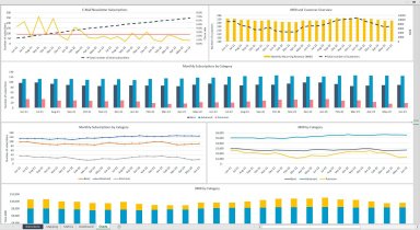
SaaS Business Tracking Template
SaaS Metrics & Dashboard Excel Template is designed to facilitate the monitoring of critical data points for a Software as a Service.
Our online platform provides a wide range of engaging and useful templates that cater to various needs.Follow 85
