Call Center Descriptive Analytical Dashboard in Microsoft Excel 365
Originally published: 07/08/2026 12:56
Last version published: 07/08/2026 13:07
Publication number: ELQ-92754-2
View all versions & Certificate
certified

Call Center Descriptive Analytical Dashboard in Microsoft Excel 365

Call Center Descriptive Analytical Dashboard (Dynamic) in Microsoft Excel 365 with Dynamic Array Fromulas

Description
Call Center Descriptive Analytics Dashboard using Dynamic Array Formulas (Excel 365)

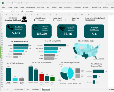
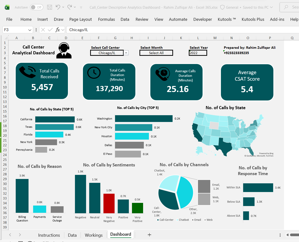
This Call Center Descriptive Analytics Dashboard is a modern Microsoft Excel 365 reporting solution built entirely with Dynamic Array Functions, eliminating the need for complex VBA programming or repetitive manual reporting. The dashboard provides an interactive view of call center performance through automated KPIs, charts, maps, and slicer-like dropdown selections for Call Center, Month, and Year. By leveraging powerful Excel functions such as FILTER, SORT, SORTBY, UNIQUE, GROUPBY, PIVOTBY, TAKE, DROP, CHOOSECOLS, HSTACK, VSTACK, XLOOKUP, LET, SEQUENCE, and TEXT, the dashboard updates instantly whenever a user changes the selected filters. It presents essential business metrics including Total Calls Received, Total Call Duration, Average Call Duration, CSAT Score, Top Performing States and Cities, Customer Sentiment Analysis, Call Reasons, Communication Channels, Response Time Performance, and an interactive geographic map. The dashboard is designed with a clean, executive-friendly layout that transforms raw operational data into meaningful business insights, enabling managers to monitor trends, identify service gaps, and make faster data-driven decisions. Since all calculations are dynamic, new records can be added to the source data with minimal maintenance while the reports automatically refresh.


Advantages of Using This Dashboard Template

  • Built entirely with modern Excel 365 Dynamic Array Functions—no VBA required.
  • Fully interactive with dropdown-based filtering for instant analysis.
  • Automatic report updates when source data changes.
  • Scalable design suitable for thousands of records.
  • Professional dashboard layout ideal for business presentations.
  • Reduces manual reporting time and improves reporting accuracy.
  • Easy to customize for different industries and business scenarios.
  • Demonstrates best practices in modern Excel dashboard development.


Learning Benefits

After completing this project, learners will be able to:

  • Build professional interactive dashboards in Microsoft Excel 365.
  • Master advanced Dynamic Array Functions for real-world reporting.
  • Create automated KPI cards and interactive visualizations.
  • Develop Top-N analysis using GROUPBY and SORTBY functions.
  • Combine multiple Dynamic Array Functions using LET for cleaner and faster formulas.
  • Design executive-level dashboards without PivotTables or VBA.
  • Improve dashboard performance using spill ranges and structured references.
  • Gain practical experience that can be applied to business analytics, finance, sales, customer service, and management reporting projects.

This Best Practice includes
2 Excel Files

Rahim Zulfiqar Ali offers you this Best Practice for free!

download for free

Add to bookmarks

Discuss


0.0 / 5 (0 votes)

please wait...