Visualize Financial Statement with Dynamic Charts
Originally published: 17/02/2020 16:19
Publication number: ELQ-82542-1
View all versions & Certificate
certified

Visualize Financial Statement with Dynamic Charts

This spreadsheet and manual demonstrate how to include dynamic charts for the visualizations of the financial statements

Description
One of the pillars of standards financial modelling is user friendliness. Neglecting usability or user friendliness in a financial model is a costly mistake. A financial model should be easy to read and manipulate for users.

You need to include tools which enable easy understanding of the model results. Therefore it is recommended to include a summary tab when you are designing your spreadsheet. The summary tab should contain the summary of the most important highlights of the model.

One of the important outputs of a financial model is a projected financial statement. Namely Cash flow statement, Profit and loss statement and balance sheet. So it’s useful to include the key lines of these 3 statements somewhere in your summary tab under “Summary Financial statements”. To even make it visual, you can easily integrate a dynamic chart and with a drop-down list, then you can simply switch between different items of the 3 statements.

The Excel template contains an example of a flexible and dynamic chart for the visualization of the financial statements.

In the manual the steps on how to make a flexible chart using drop-down list and index function is explained. The methodology is explained in an easy, step-by-step approach so that anyone can follow and duplicate the work in their own spreadsheet.

This Best Practice includes
1 Excel, 1 PDF

FinExMod offers you this Best Practice for free!

download for free

Add to bookmarks

Discuss

Further information

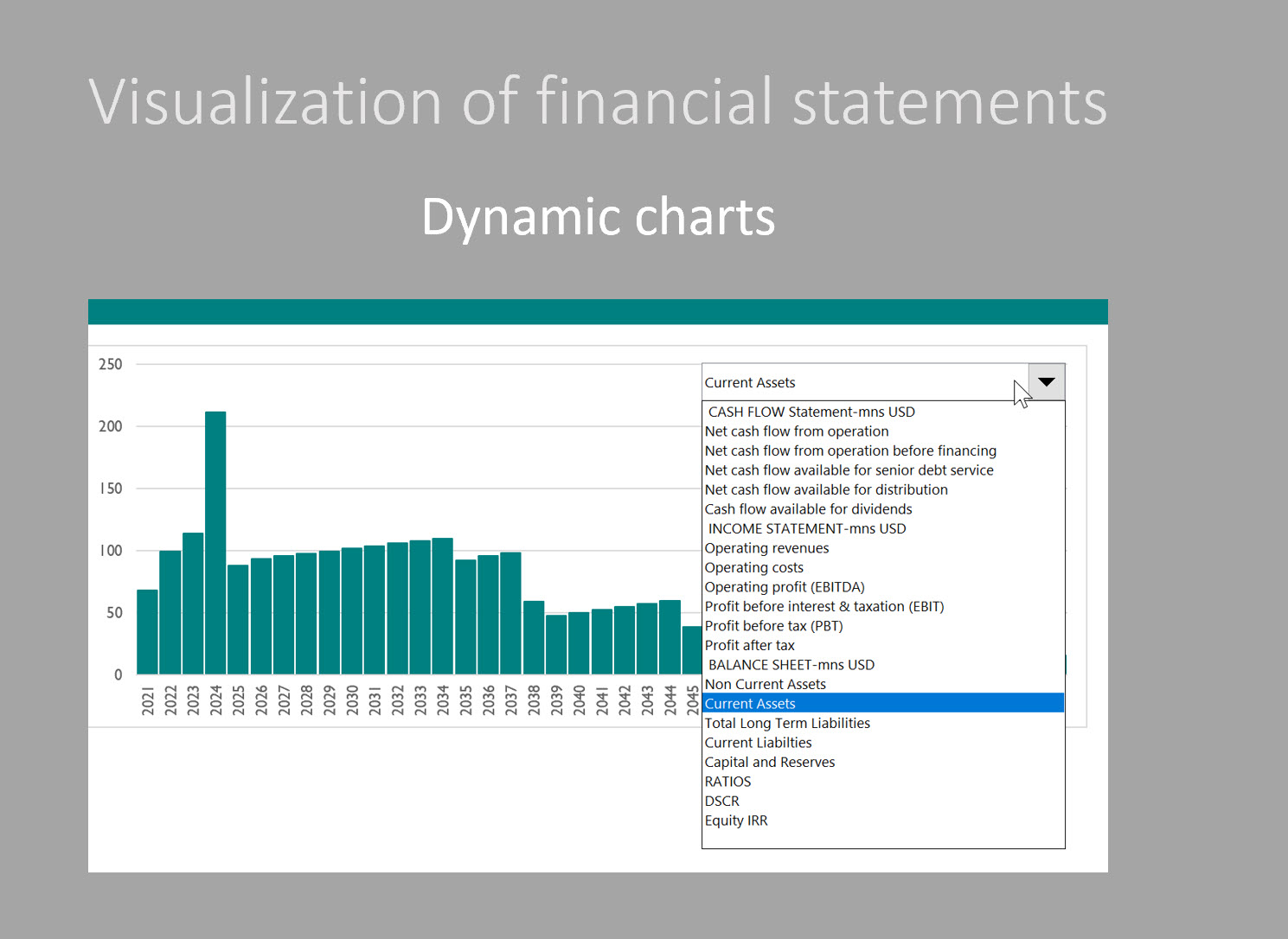
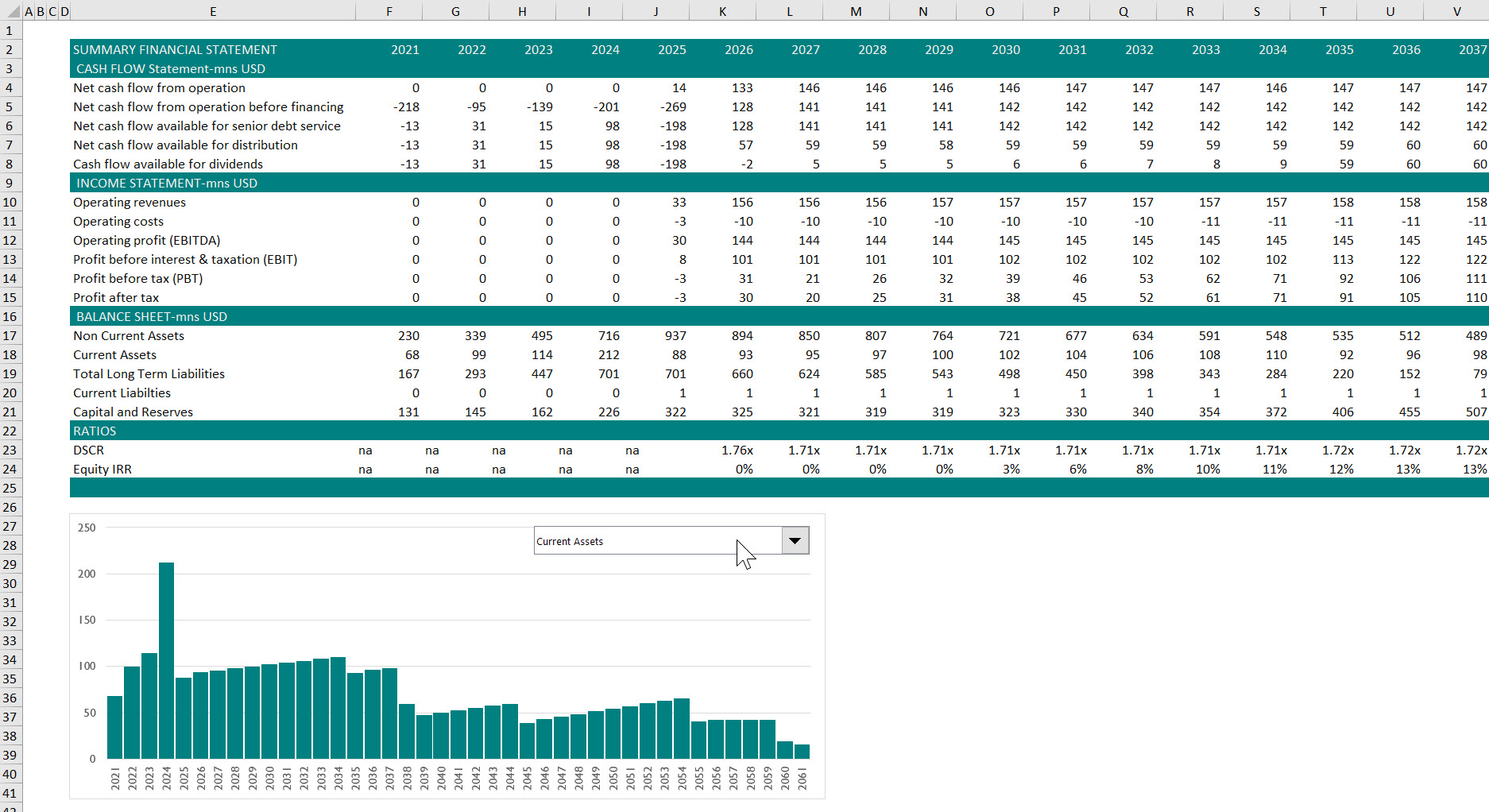
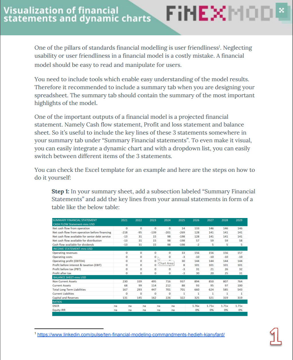
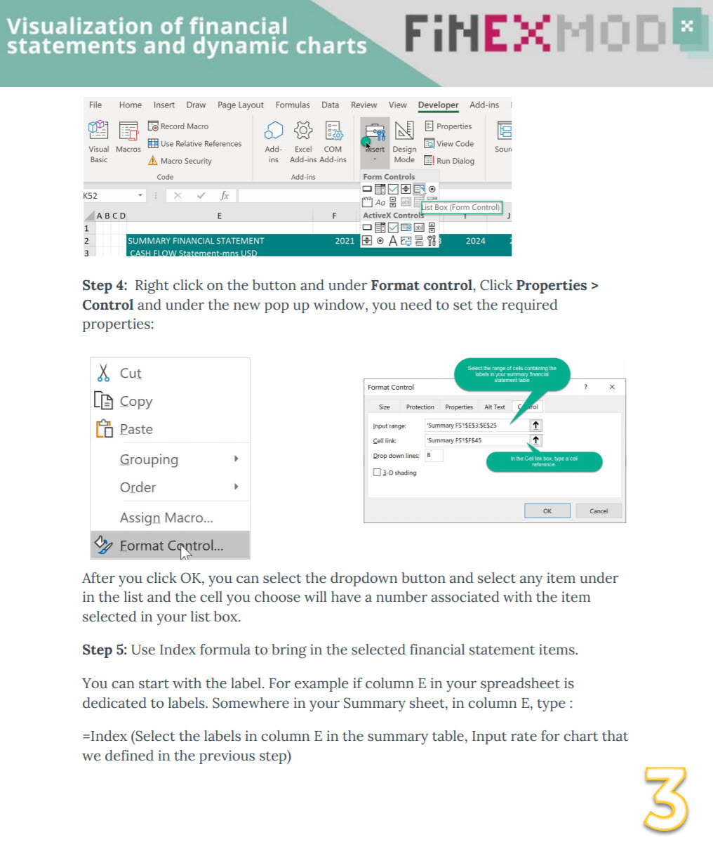
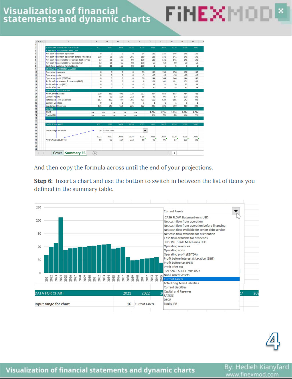
To demonstrate how to include dynamic charts for the visualizations of the financial statements or any time series data.


4.7 / 5 (19 votes)

please wait...