
Originally published: 30/03/2023 07:50
Publication number: ELQ-97168-1
View all versions & Certificate
Publication number: ELQ-97168-1
View all versions & Certificate

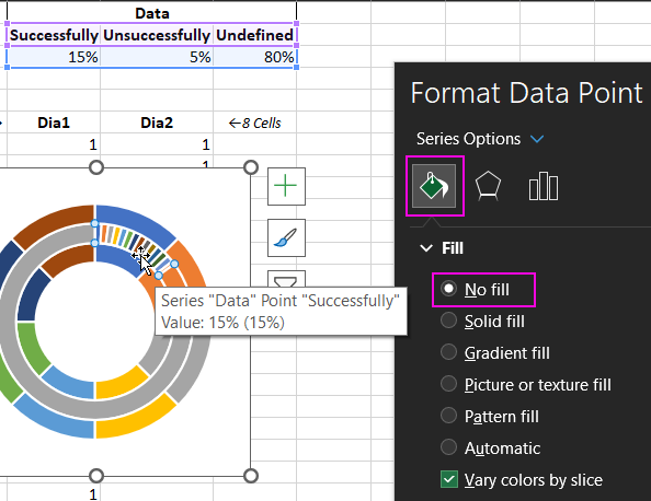
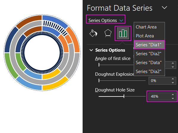
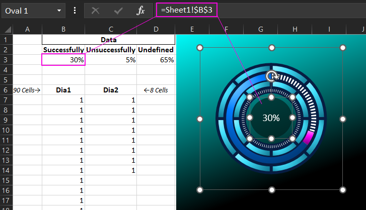
Colorful Pie Charts in Excel
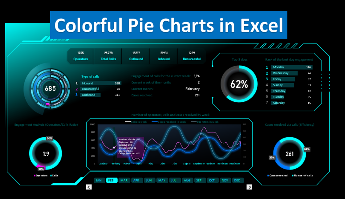
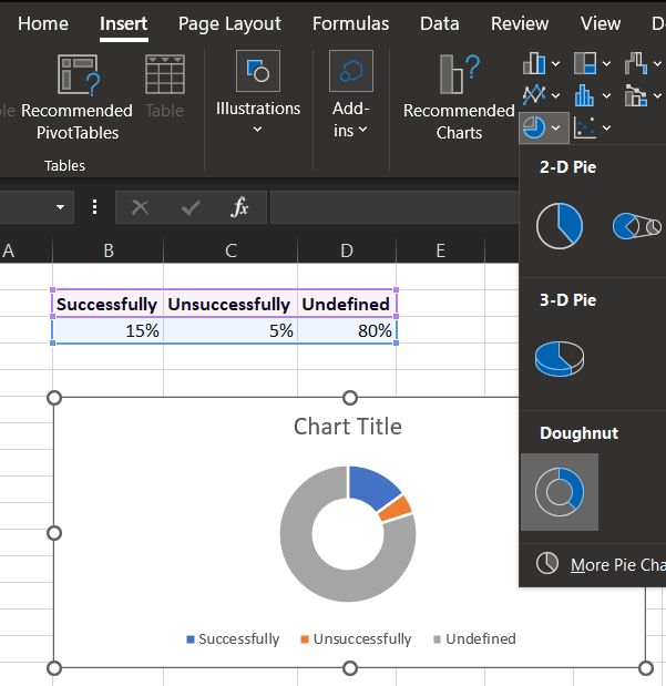
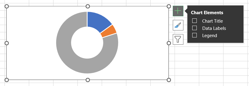
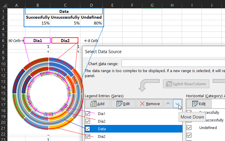
Colorful pie chart for dashboards in Excel
I work as finance professional in a Spanish subsidiary of a global multinational company in the IT sector since more than twenty years.Follow
Further information
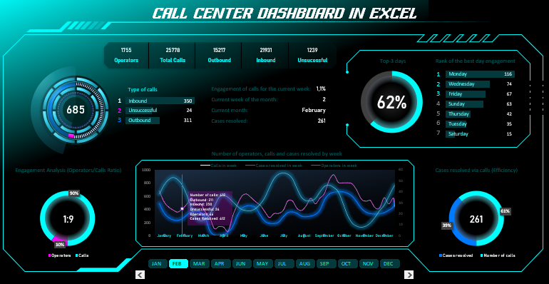
Enable users to prepare and customize beautiful and compelling dashboards fully interactive
Create beautiful and compelling dashboards for your presentations
