Originally published: 02/01/2019 14:03
Publication number: ELQ-72980-1
View all versions & Certificate
certified

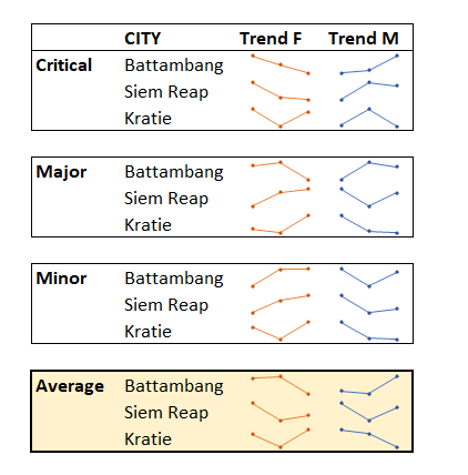
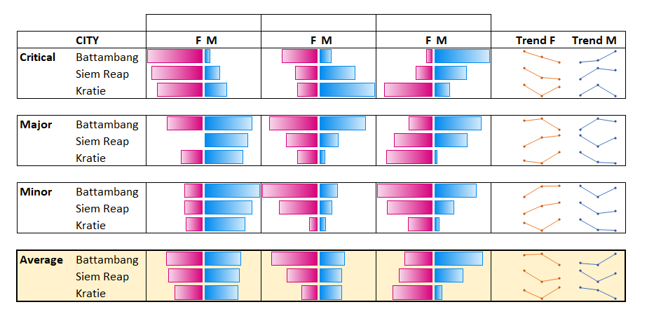
Excel In cell charts & heat maps

Who needs large floating chart objects - get the visuals inside the cells them-cell-ves

Description
Even number lovers have brains process information faster when it’s visual. Excel’s classic charts are heavy floating objects disconnected from the data. Excel has for some time now had the ability to hold charts in cells, but only the few know that these features exist.

Colour scales: A user should never take more than 3 seconds to assess which numbers are the highest, that's where conditional formatting's colour scales/heat maps comes in.

In Excel you can also have bar charts that respond dynamically to the data inside the cells, this is another kind of conditional formatting that has bar charts in the cell, you will even learn some advanced tricks to make it more elegant.

Sparklines are in cell line charts that allows to measure one trend per row. Select the cell where you want the sparkline to appear, then go to Insert tab> Line (in the Sparklines section, not the line chart section), then finally choose the data range. The best part though is as they’re in cell items you can drag them down, just like a formula!

Having more than just numbers/formats in cells is the future of Excel. Just released forfor Office 365 PC customers “Geography” and “Stocks”, you can have a cell with just a country name containing information about its population, flag, capital city etc. and a similar capability for sticks too.

This Best Practice includes
Walk through demo on Excel

Add to bookmarks

Did David Benaim's Best Practice help you? You can make a small financial contribution to support the author.

helpSupport


0.0 / 5 (0 votes)

please wait...