
Originally published: 30/01/2025 11:22
Publication number: ELQ-45004-1
View all versions & Certificate
Publication number: ELQ-45004-1
View all versions & Certificate

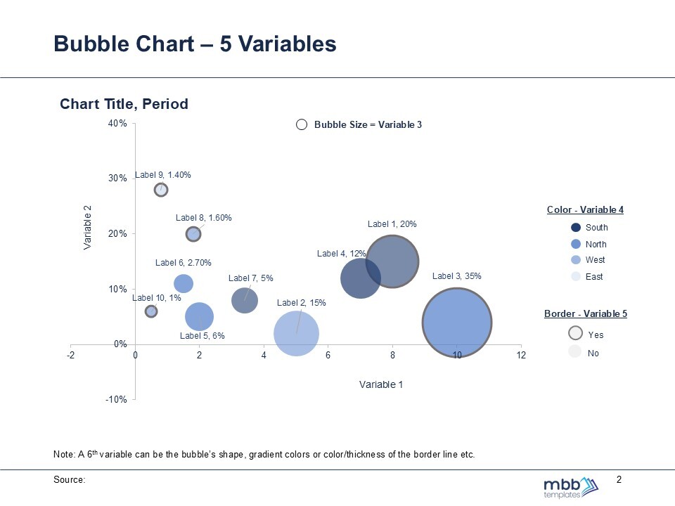
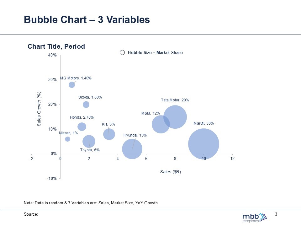
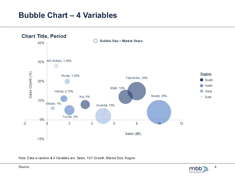
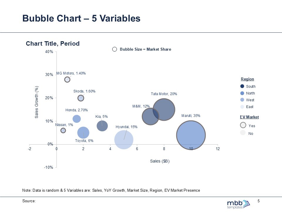
Bubble Charts Advanced
A bubble chart displays data points using circles, representing three to five variables through position and size for visual analysis.
