Originally published: 24/04/2019 13:48
Publication number: ELQ-64923-1
View all versions & Certificate
Publication number: ELQ-64923-1
View all versions & Certificate

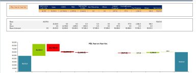
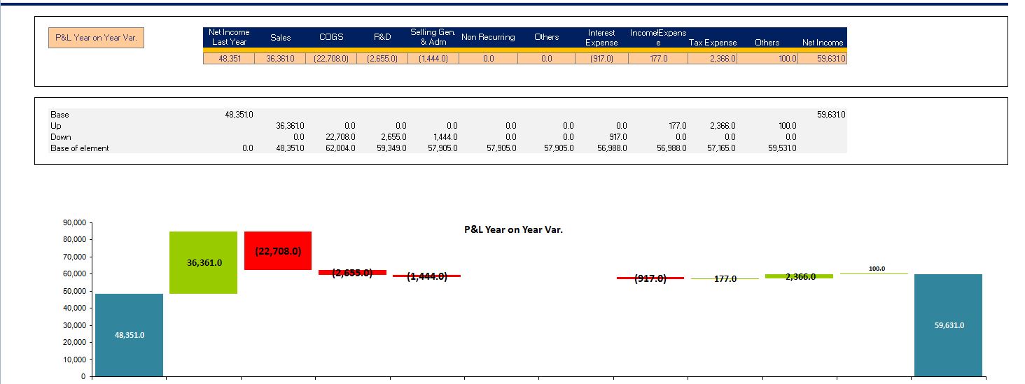
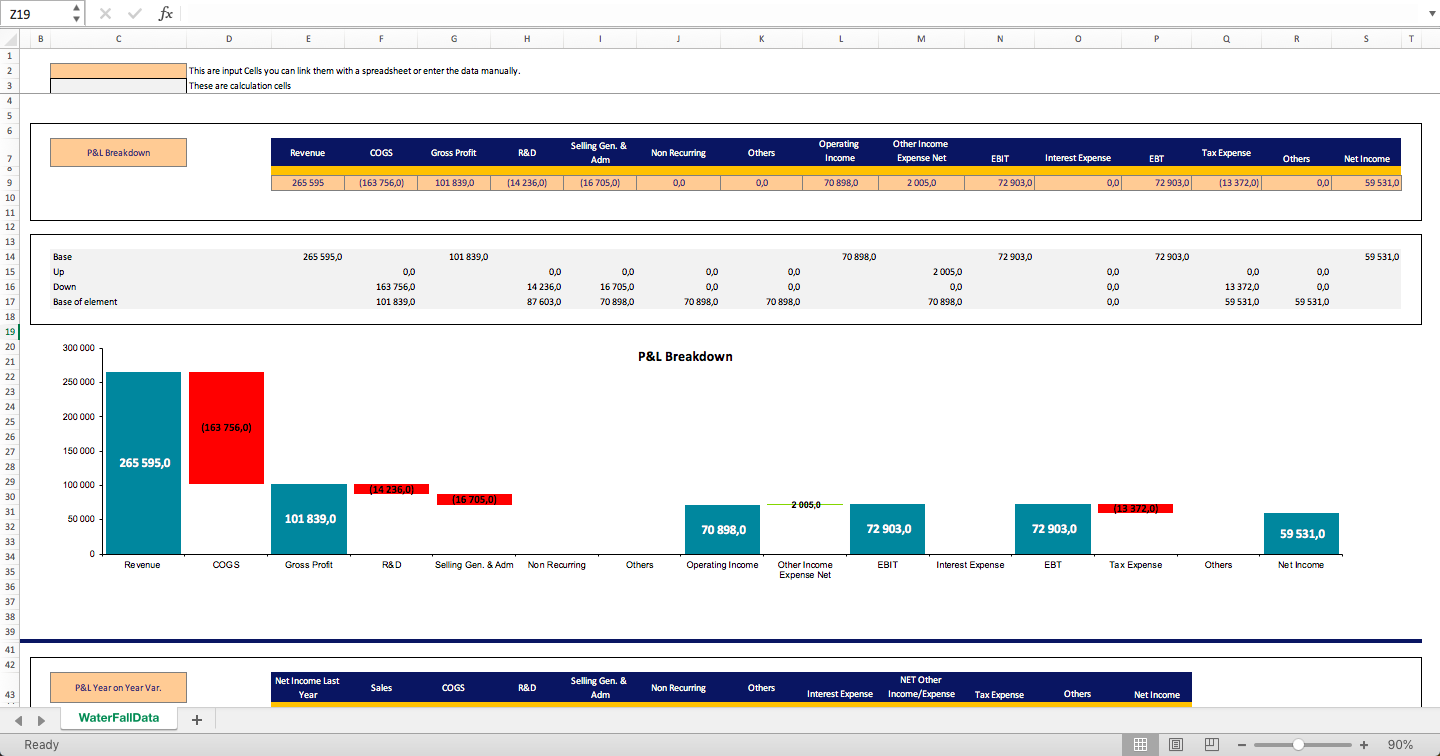
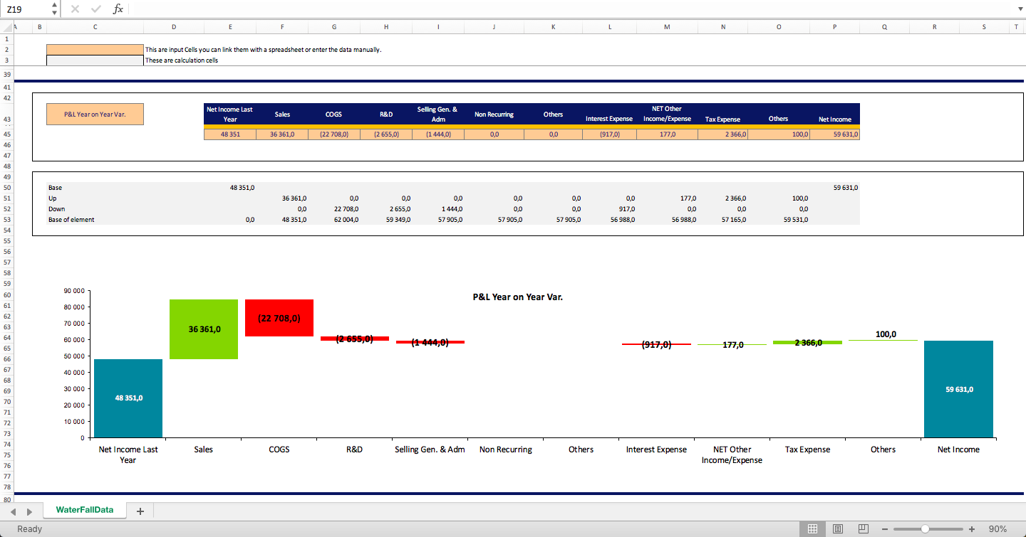
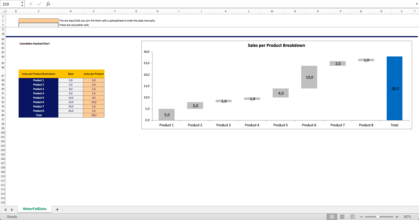
Waterfall Chart Excel Model
A real life example of a waterfall chart cascade in Microsoft Excel.
