
Originally published: 05/11/2020 20:40
Publication number: ELQ-81153-1
View all versions & Certificate
Publication number: ELQ-81153-1
View all versions & Certificate

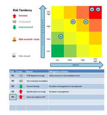
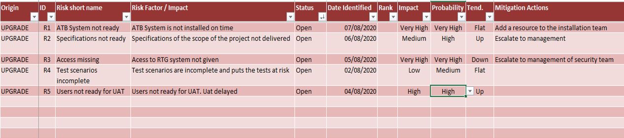
Risk Tower
Risk Tower is a risk register Excel Sheet with a bubble graph
I help people use IT to optimize their productivity | Excel Wizard | Time management Expert ⌚Follow
