
Originally published: 12/10/2020 13:02
Publication number: ELQ-18552-1
View all versions & Certificate
Publication number: ELQ-18552-1
View all versions & Certificate

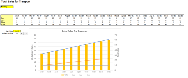
Dynamic Chart - For Monthly, Quarterly & Annual Views. Number of periods shown can be changed instantly.
A Dynamic chart that can be used for monthly, quarterly or annual analysis. Number of periods shown can also be changed.
Further information
Interactive dashboards, for those users who like to drill into the data.
