
Originally published: 19/10/2024 13:18
Publication number: ELQ-41042-1
View all versions & Certificate
Publication number: ELQ-41042-1
View all versions & Certificate

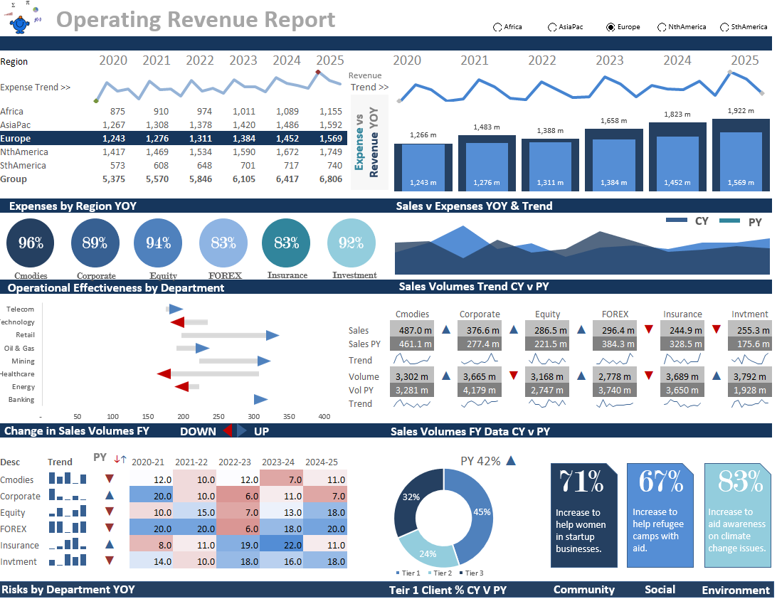
Regional Operations Report
Operations Dashboard Report
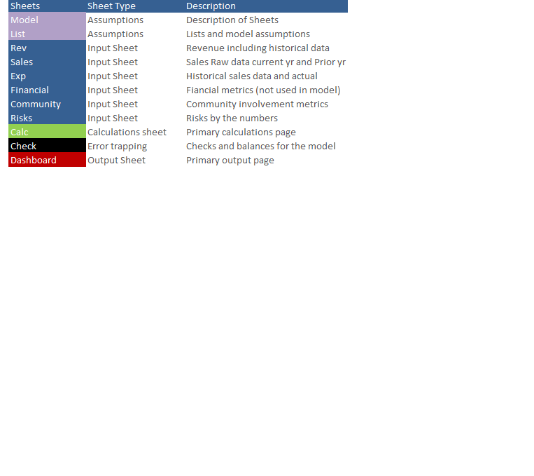
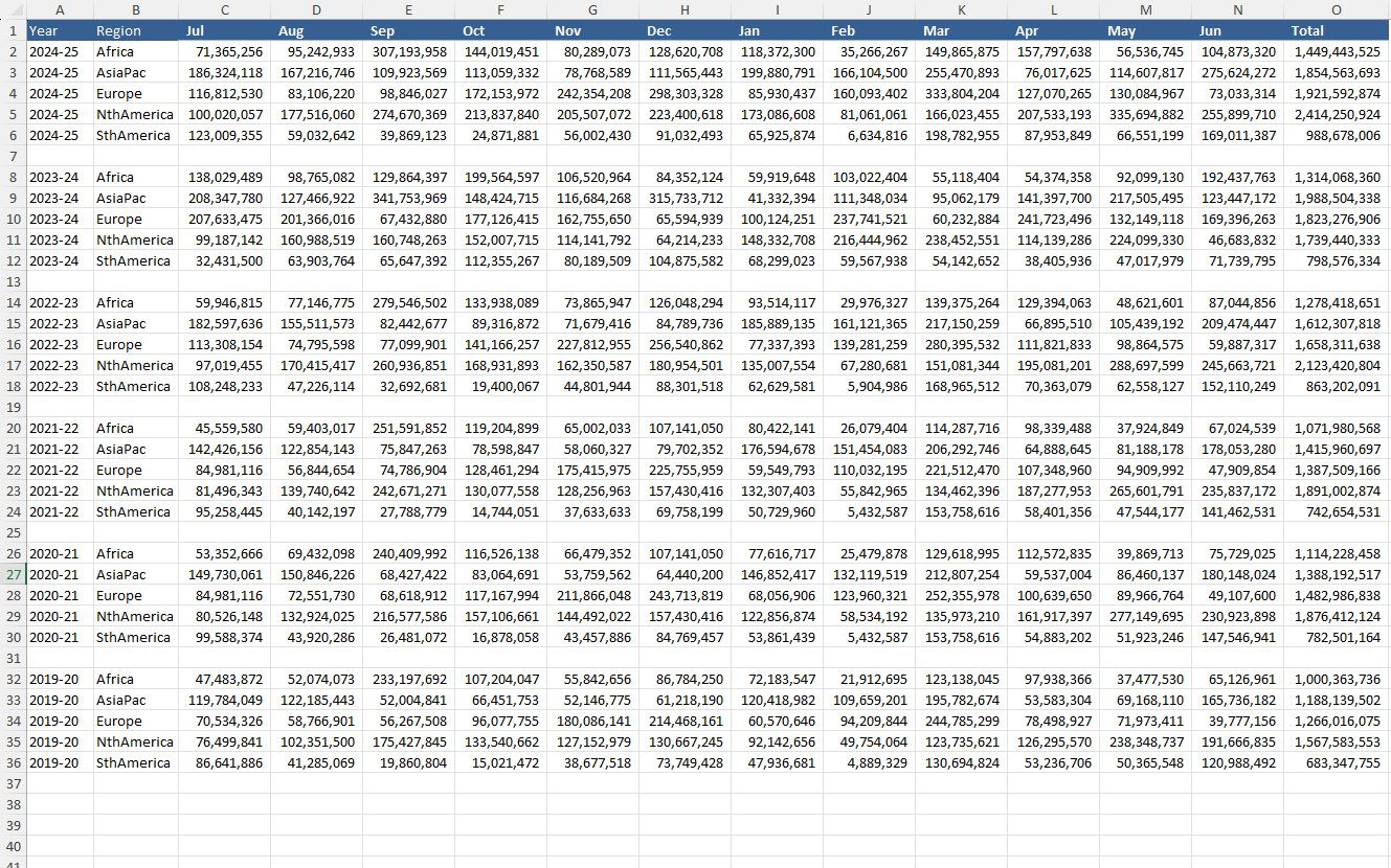
Further information
Share the simplicity of a well designed Excel Dashboard
Where operations metrics are needed to be displayed in a succinct summary.
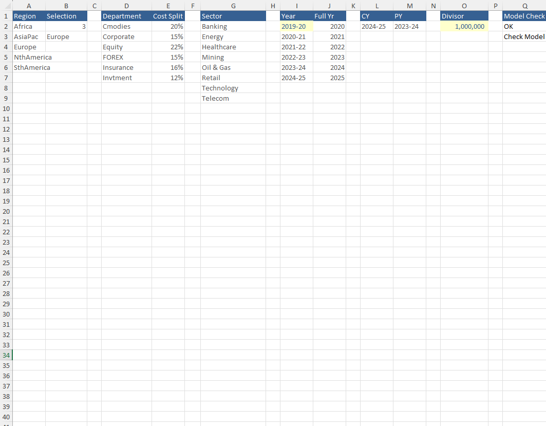
Where the user doesn't use Excel
