
Originally published: 30/01/2025 11:21
Publication number: ELQ-90798-1
View all versions & Certificate
Publication number: ELQ-90798-1
View all versions & Certificate

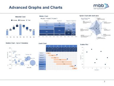
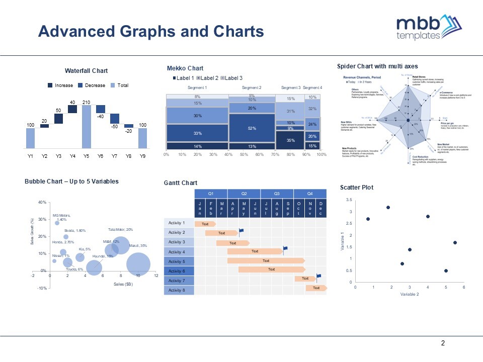
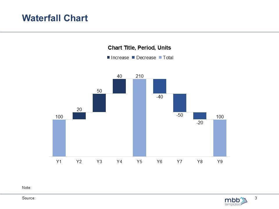
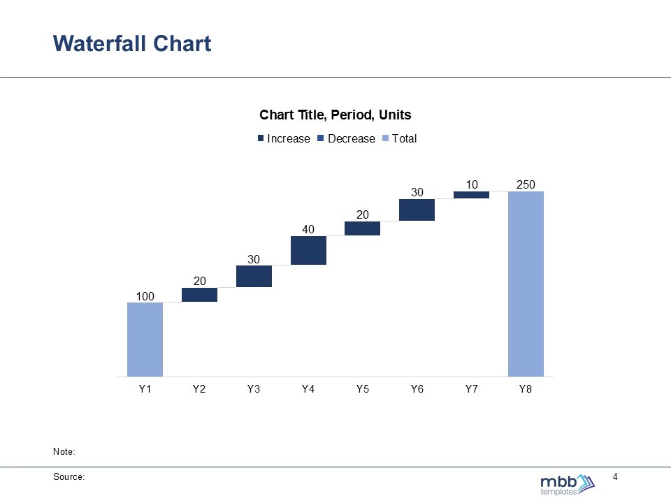
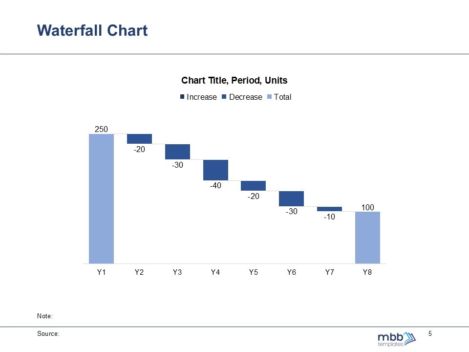
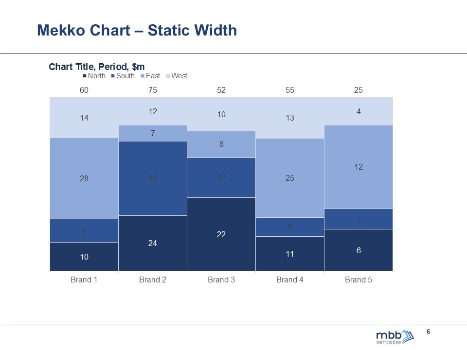
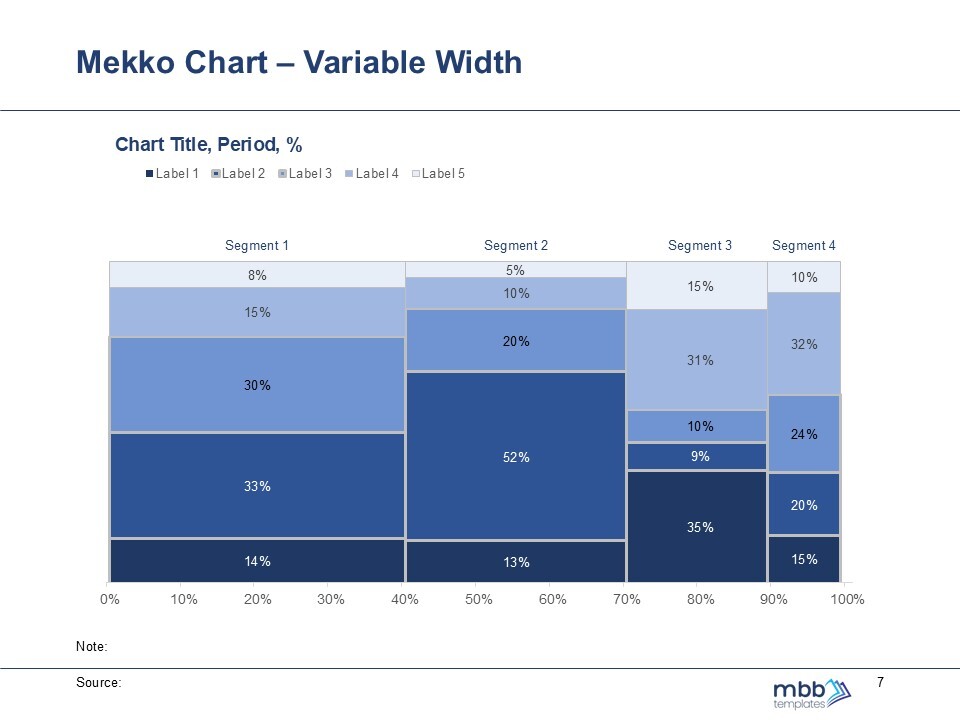
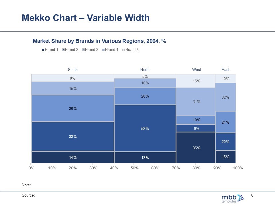
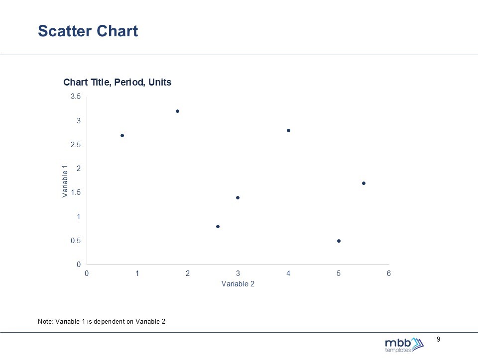
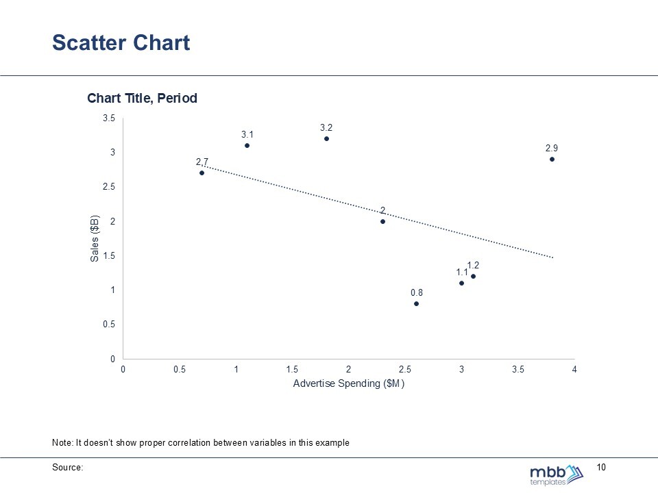
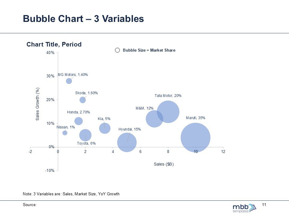
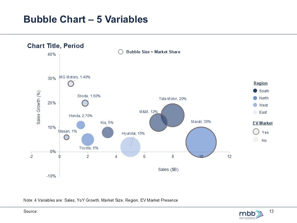
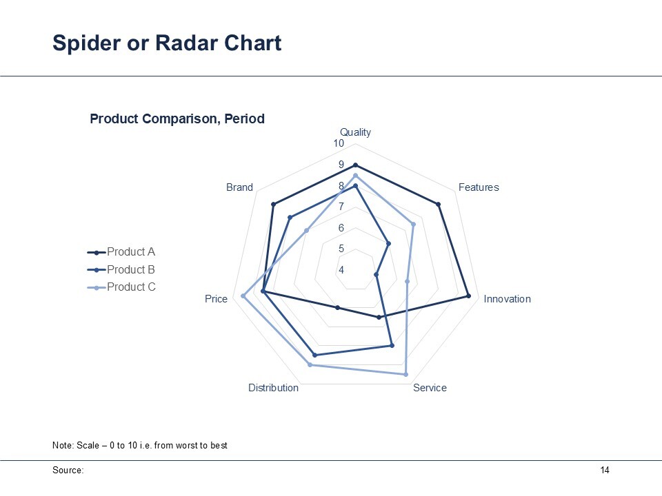
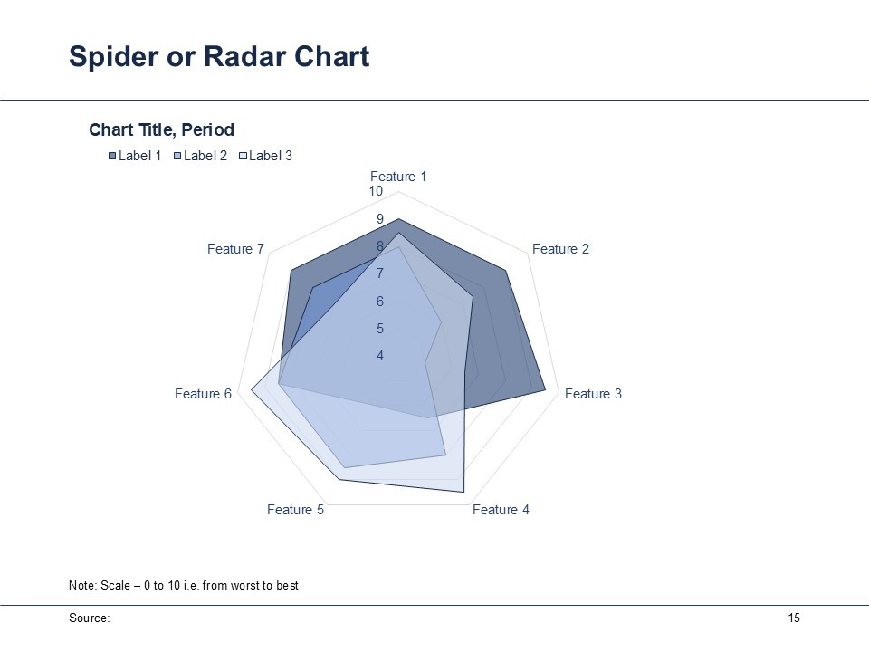
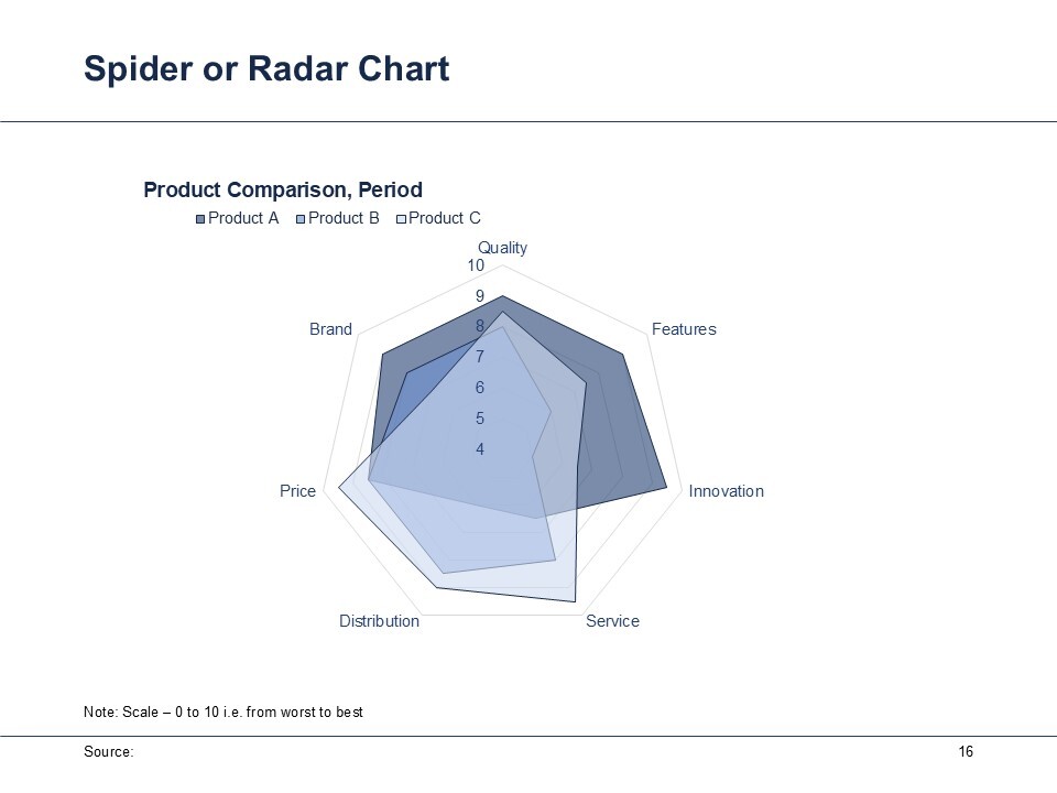
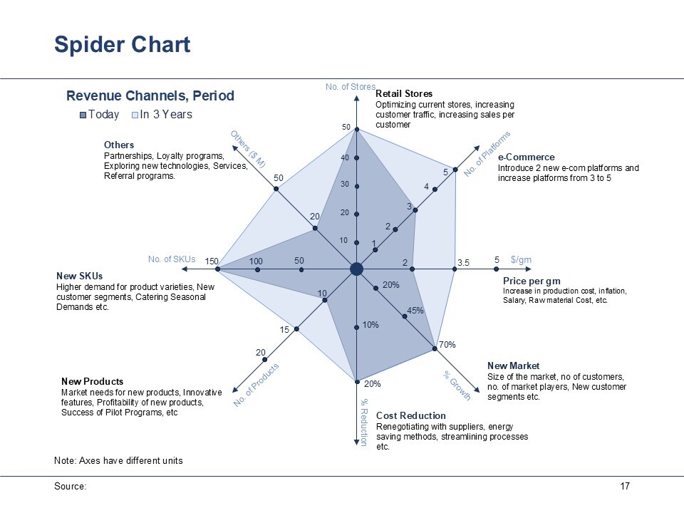
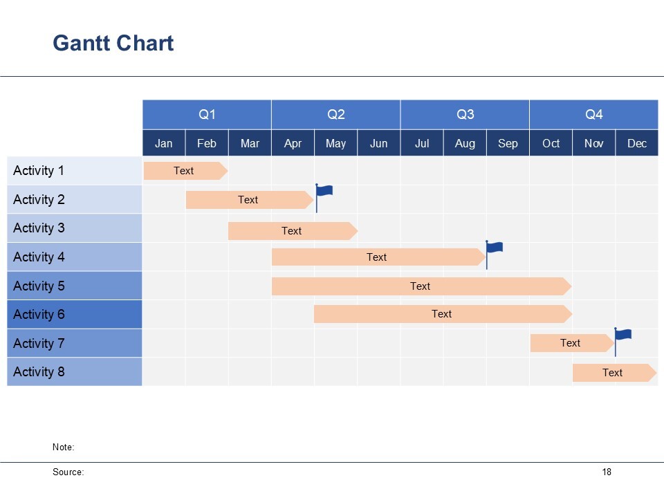
Advanced Graphs and Charts
This PowerPoint Presentation (PPT) Template contains Advanced Charts: Waterfall Charts, Mekko Charts, Bubble Charts, Spider Charts, Scatter Plots & Gantt Chart
mekkochartswaterfall chartsspider chartsbubble chartsscatter plotsgantt chartmarimekkochartsadvanced graphs and chartsgraphs and charts in ppt
Description
Advanced Charts and Graphs are powerful tools for presenting complex data clearly and effectively in business contexts.
1. Waterfall Charts: Waterfall charts visually represent the cumulative effect of sequentially introduced positive or negative values. They help illustrate how an initial value is affected by a series of intermediate values. These charts are useful for showing financial data, such as revenue changes due to various factors over time, or for tracking budget vs. actual spending.
2. Mekko Charts: Mekko charts (also known as Marimekko charts) combine bar and stacked column charts, representing two-dimensional data with different widths and heights. The areas show the value of two variables simultaneously. Ideal for market analysis, such as comparing market share across different segments and showcasing product performance across various dimensions (like pricing and volume).
3. Scatter Plots: Scatter plots display values for two variables for a set of data, allowing for the visualization of correlations and distributions. Each point represents an observation. Great for determining relationships between variables, such as analyzing customer satisfaction against sales figures or studying trends in performance metrics.
4. Bubble Charts: A variation of scatter plots, bubble charts add another dimension by using the size of the bubbles to represent a third variable. This enables the visualization of complex data sets. Useful for representing data such as market analysis where companies can be plotted based on sales, profit margin, and market size, making comparisons across multiple variables easier.
5. Spider Charts: Spider charts (or radar charts) display multivariate data in a two-dimensional graph with axes starting from the same point. They are used for comparing multiple items across various criteria. Effective for performance assessments, such as evaluating a product against competitors or assessing employee skills across different areas.
6. Gantt Chart: Gantt charts provide a visual timeline for the planning and scheduling of projects, showing task durations, overlaps, and dependencies. It is essential for project management presentations to display project schedules, track progress over time, and communicate timelines to stakeholders effectively.
Use this template and modify the data in the data sheet of the respective graph or chart as per user's requirements.
This Best Practice includes
1 PPT containing 18 slides, 6 types of Charts