

Last version published: 11/03/2021 15:30
Publication number: ELQ-89778-7
View all versions & Certificate

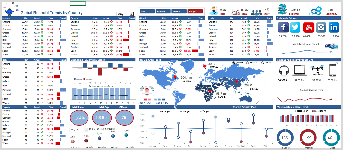
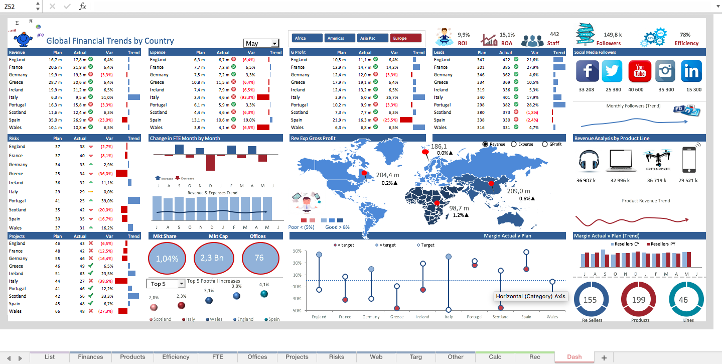
KPI Excel Dashboard Model
This financial KPI dashboard displays a range of organisational metrics (actual v plan) in a clear succinct summary.
Further information
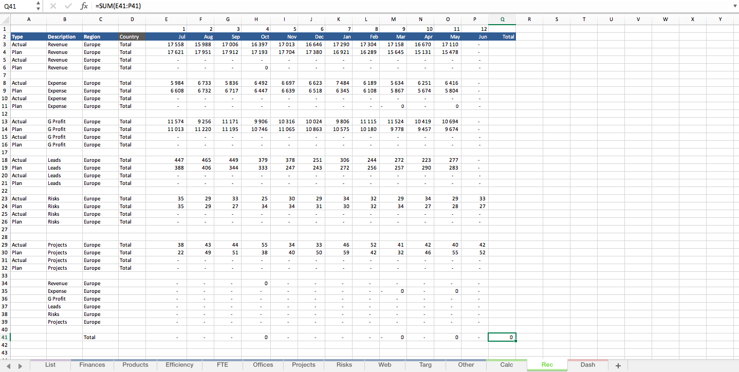
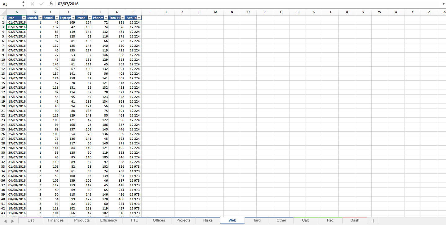
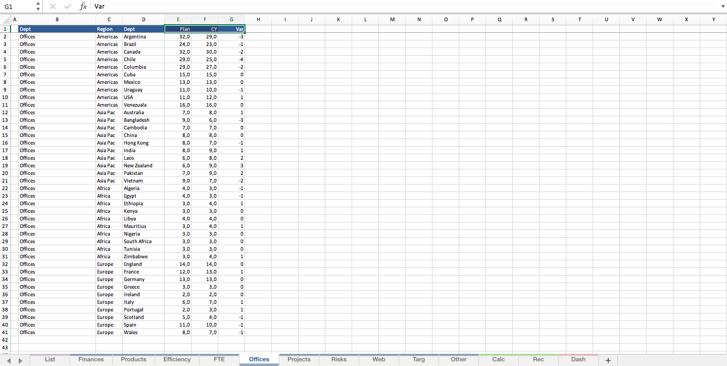
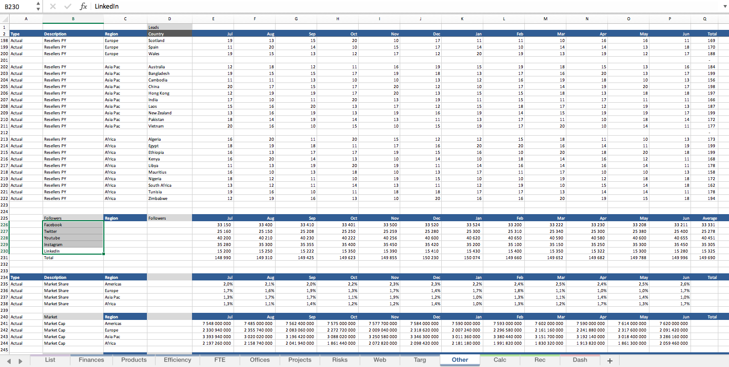
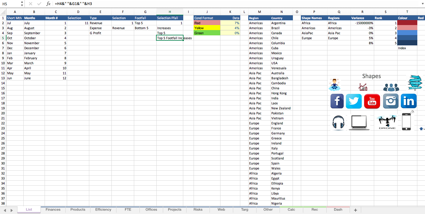
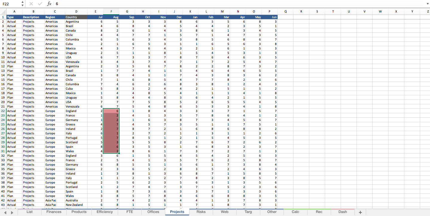
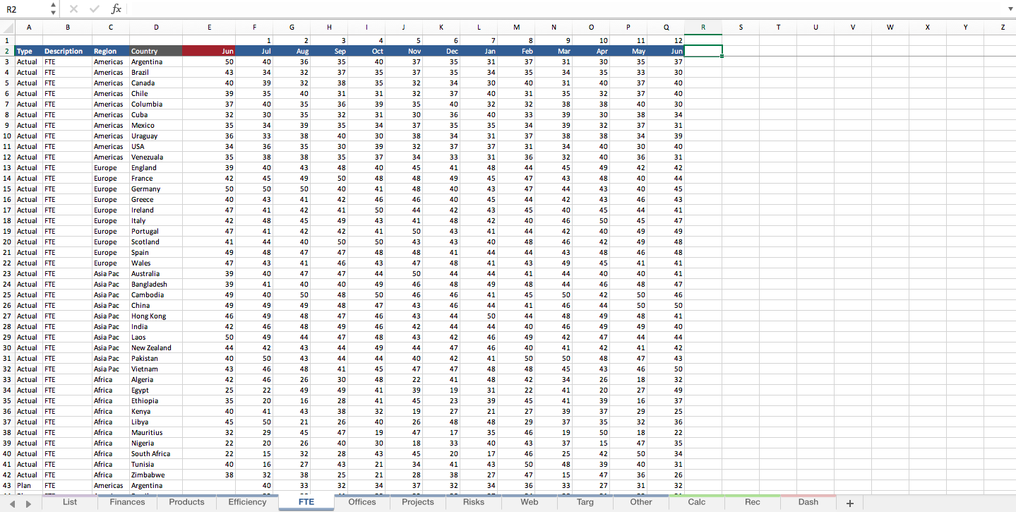
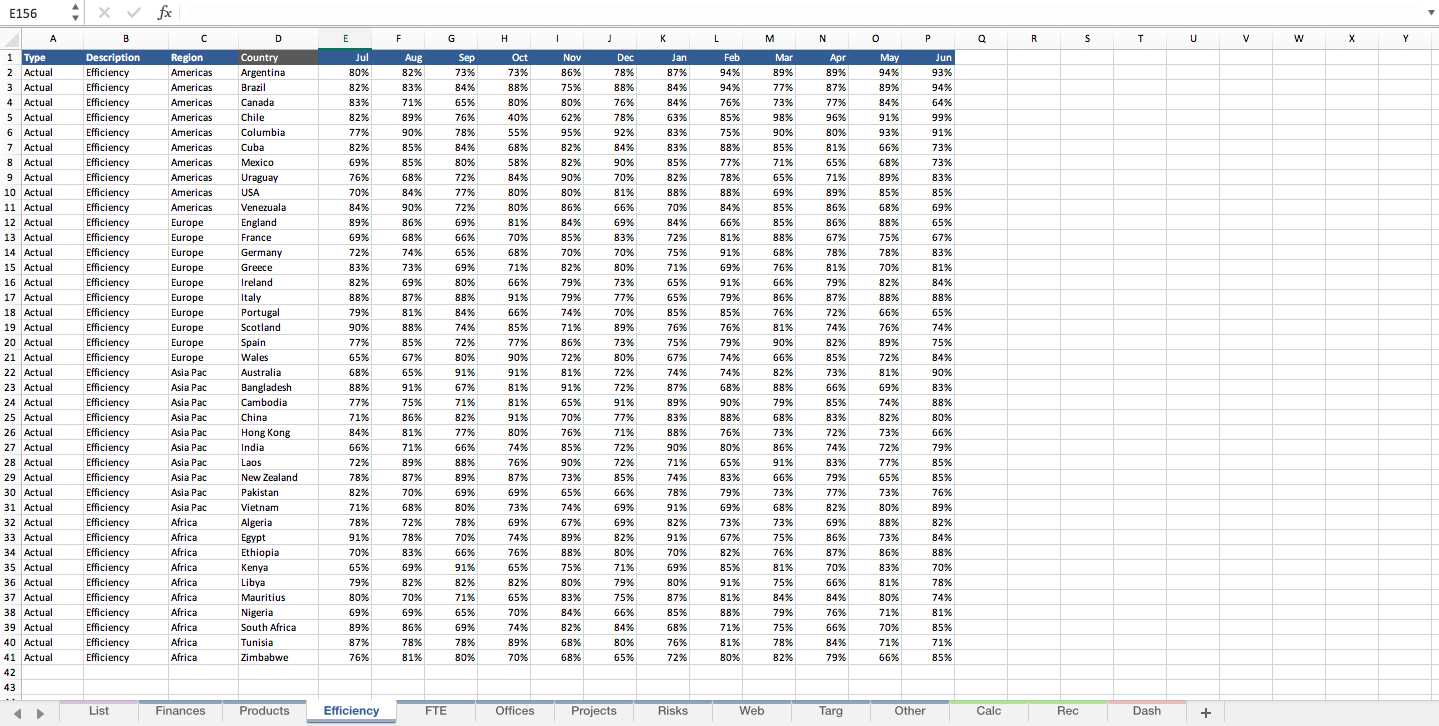
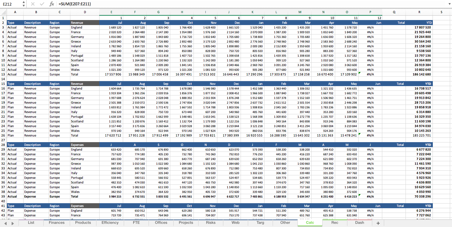
This Financial Model outputs a YTD P&L by region and a range of organisational metrics, FTE trends, projects actual v plan, revenue by product, social media metrics. It takes into account YTD and has the power to change automatically. The model has a robust heat map tool which displays colour based on performance against predetermined metrics. So changing the metrics changes the heat map accordingly. This is a weapons grade YTD financial KPI dashboard with some very nice infographics to compliment the dataset.
Where an organisation needs to report actual v budget on a range of key organisational metrics. This model can sub metrics in or out. Just change the criteria and keep the KPI dashboard format the same.
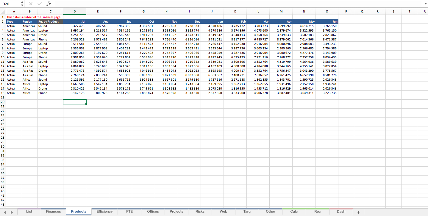
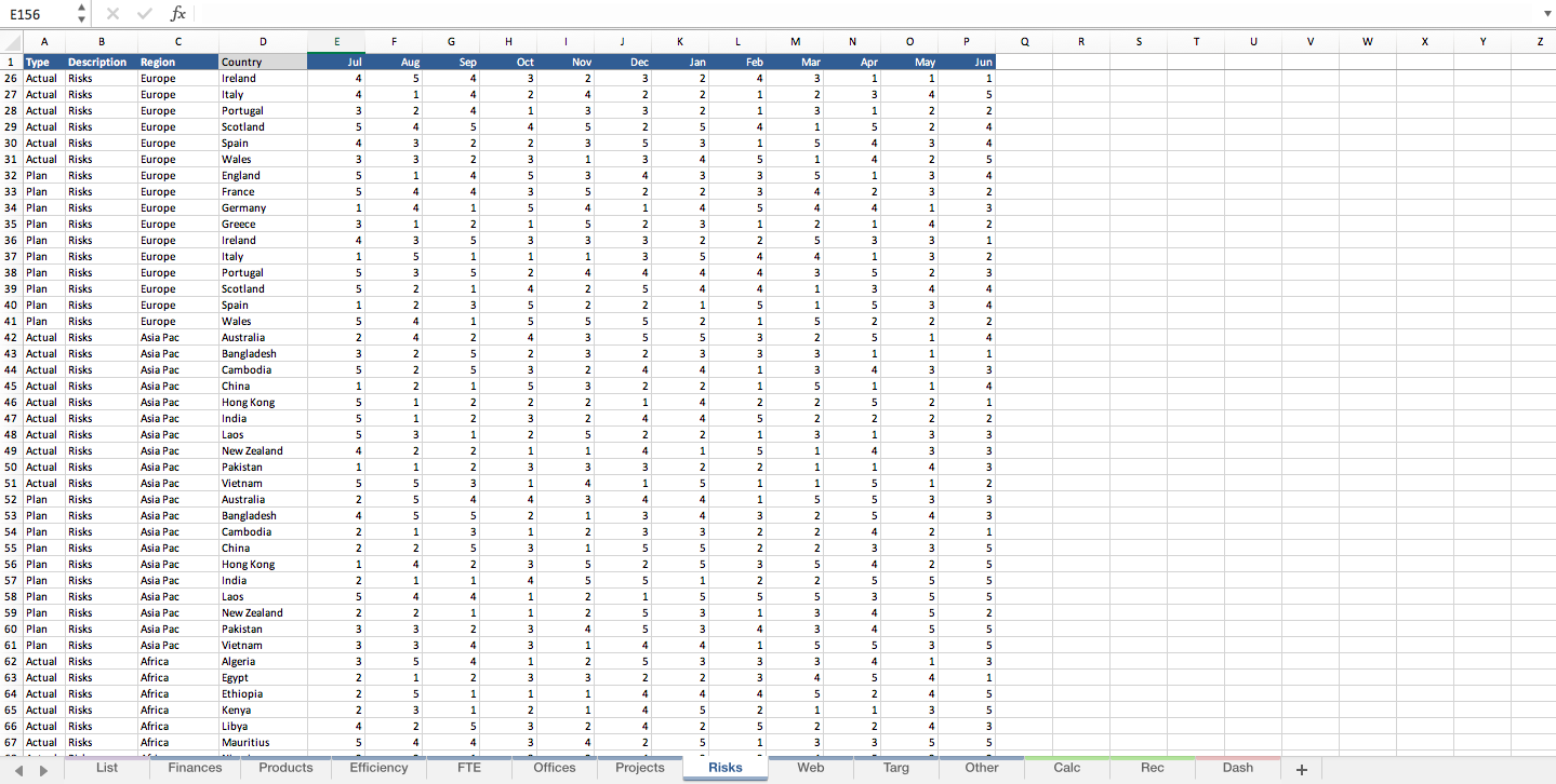
Professionally formatted to easily cut and paste key data into this workbook and have the data flow through to the calculations pages.
