Publication number: ELQ-81439-1
View all versions & Certificate

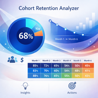
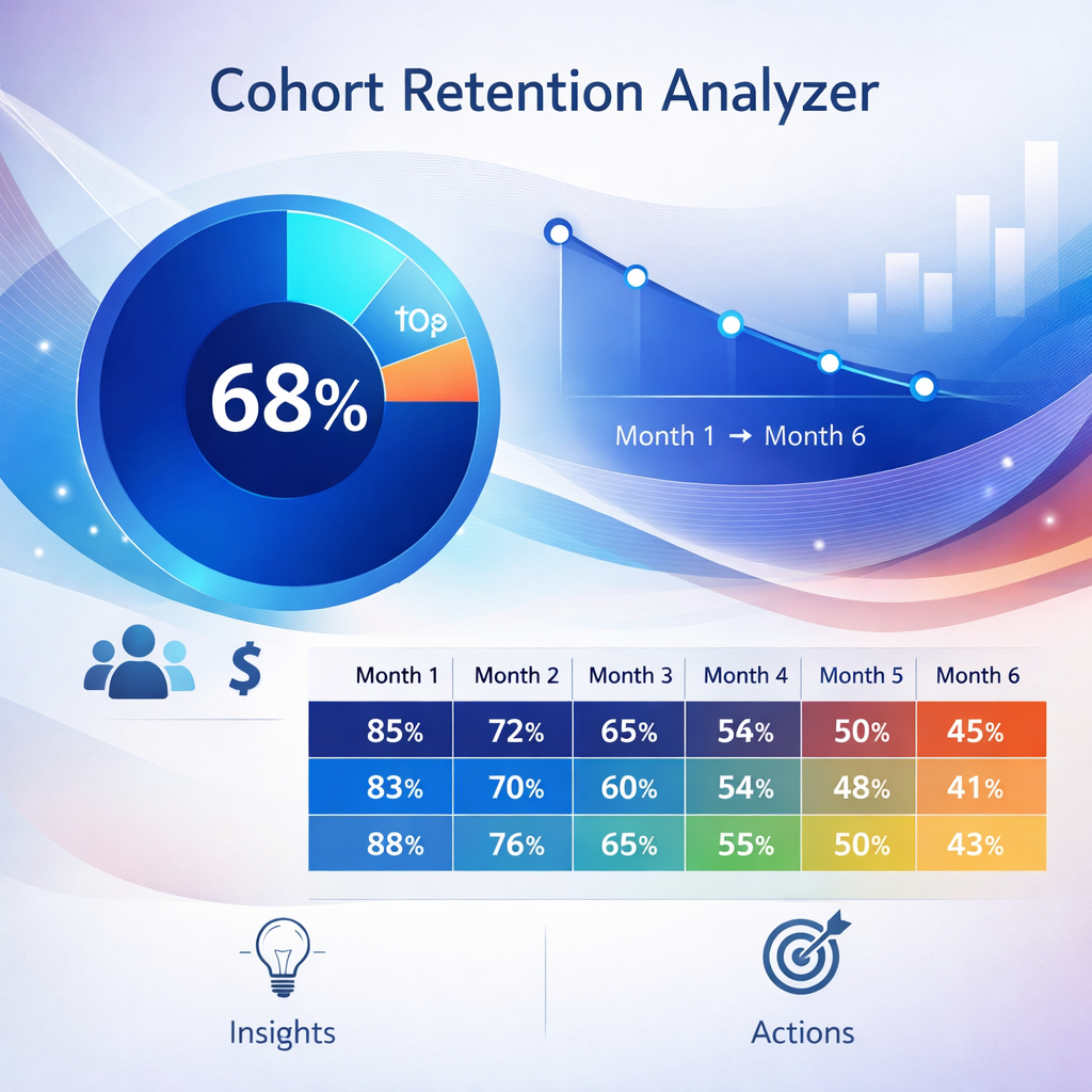
Customer Cohort & Retention Analyzer
This Excel tool builds the full cohort retention matrix, MRR by cohort, LTV:CAC analysis, and a 24-month LTV projection
📊 Customer Cohort & Retention Analyzer — Excel Template
By Data'sOk
━━━━━━━━━━━━━━━━━━━━━━━━
Do you know which month's customers are your best — and why?
Most subscription businesses track total churn and total MRR. What they miss is the pattern underneath: some cohorts retain far better than others, some months produce customers with 3× the lifetime value, and the reasons are almost always invisible until you look at the data the right way.
Cohort analysis is the standard method serious SaaS and subscription businesses use to answer these questions. Until now, doing it properly meant either building a complex model yourself or paying an analyst to do it. This template does it for you.
━━━━━━━━━━━━━━━━━━━━━━━━
WHAT YOU GET
8-tab Excel workbook, fully unlocked:
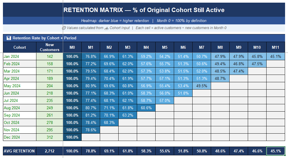
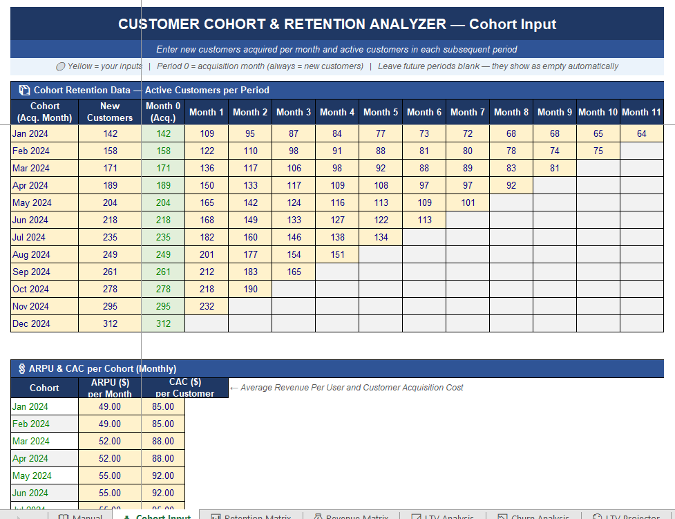
📥 Cohort Input — Enter new customers per month and active customers in each subsequent period. Enter ARPU and CAC per cohort. 12-month sample data included.
📊 Retention Matrix — The classic cohort heatmap: % of each cohort still active by month, colour-coded dark-to-light blue. Average retention row included. Instantly shows which cohorts decay fastest.
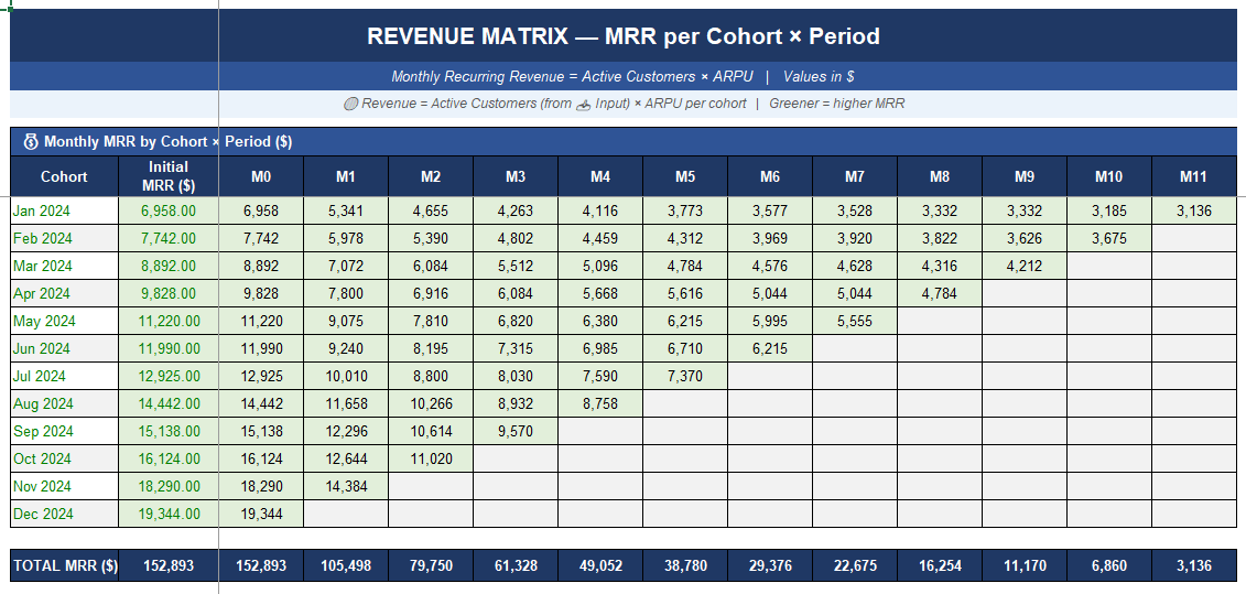
💰 Revenue Matrix — MRR per cohort × period (active customers × ARPU). See exactly how much revenue each acquisition month is still generating today.
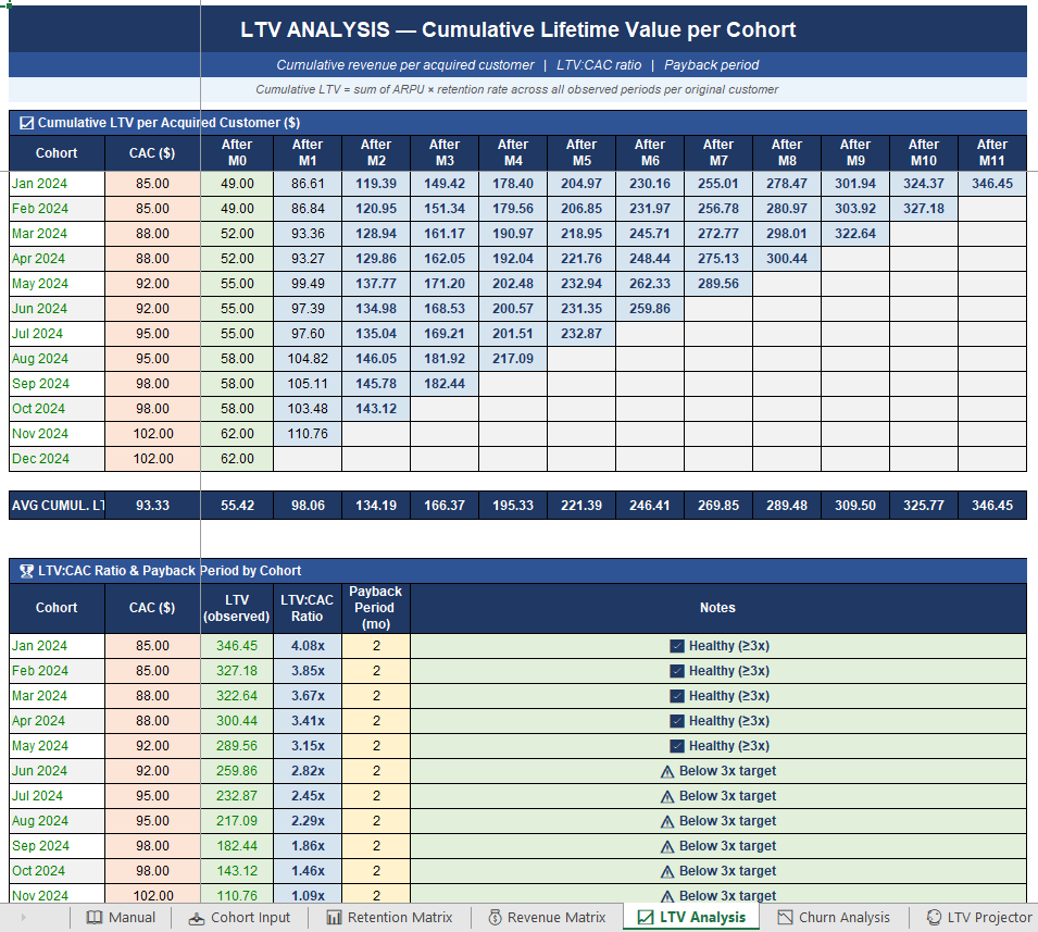
📈 LTV Analysis — Cumulative lifetime value per acquired customer, LTV:CAC ratio, and estimated payback period per cohort. Traffic-light signal: ✅ ≥3x / ⚠️ below target.
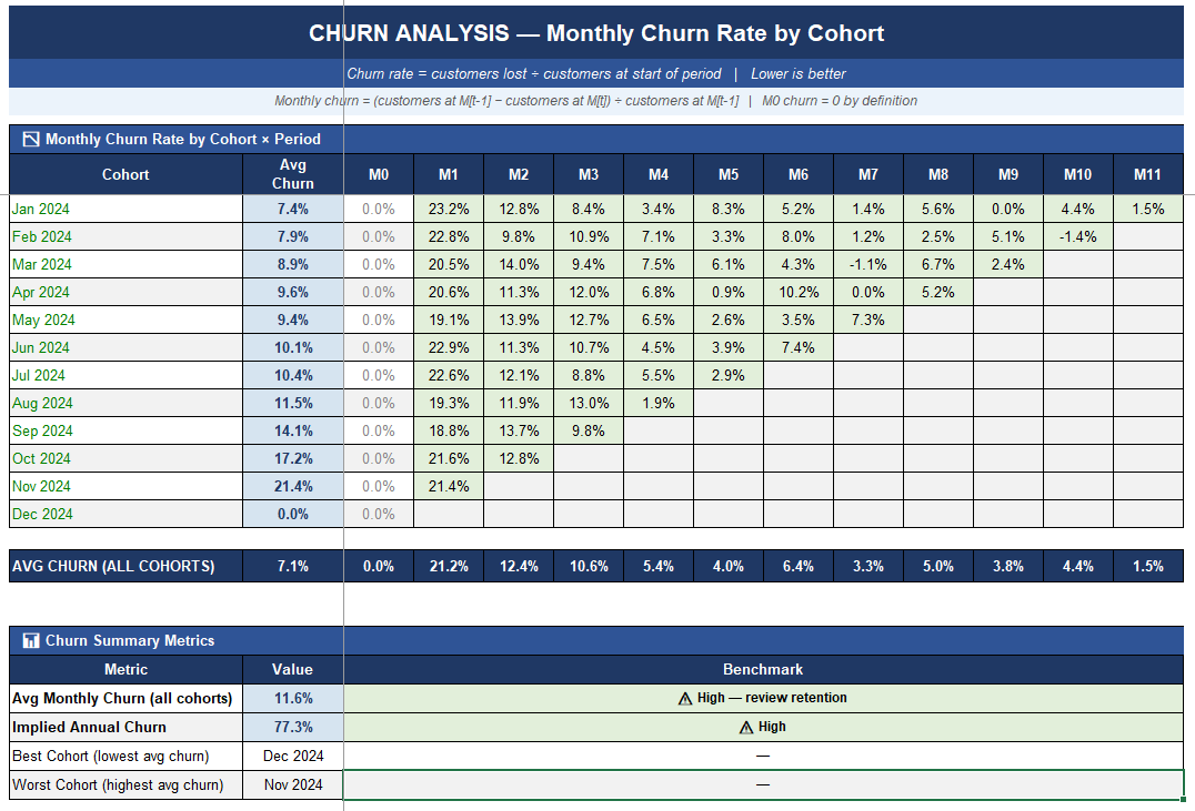
📉 Churn Analysis — Monthly churn rate by cohort × period. Average churn, implied annual churn, best and worst cohort. Benchmark signals included.
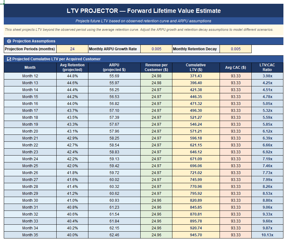
🔮 LTV Projector — Forward projection of LTV beyond the observed window. Adjustable assumptions: ARPU growth rate, retention decay, projection horizon up to 24 months.
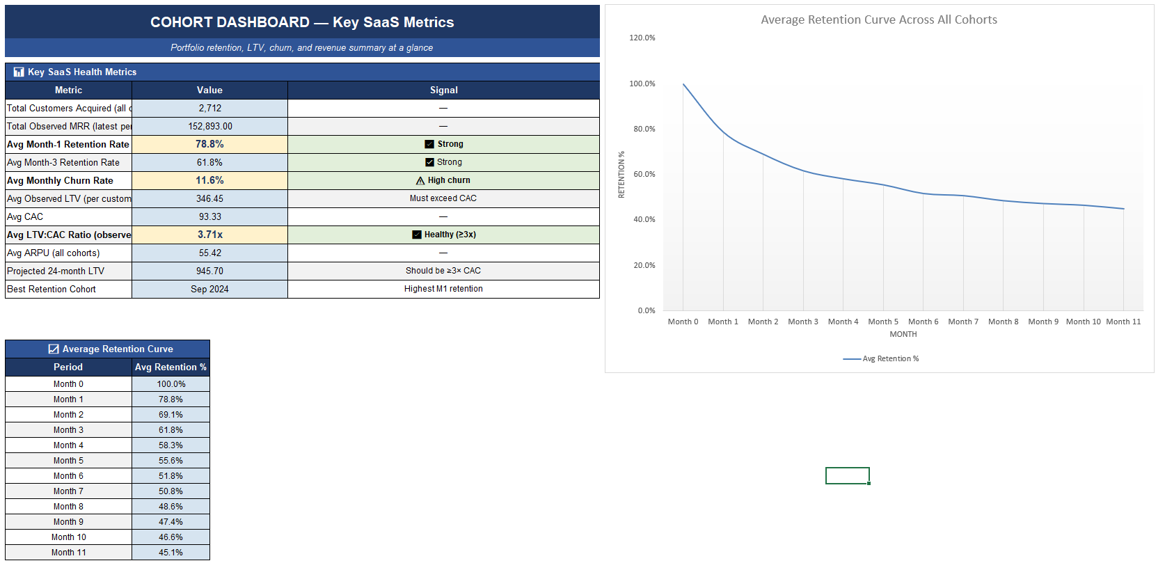
📋 Dashboard — 11 key SaaS metrics with benchmark targets and signals, plus an average retention curve chart.
📖 Manual — Plain-English guide to cohort data entry, all metrics explained, how to read the retention matrix, and LTV projector logic.
━━━━━━━━━━━━━━━━━━━━━━━━
WHO IT'S FOR
→ SaaS founders and product managers tracking retention and LTV trends
→ Subscription business owners who want to know if their LTV justifies their CAC
→ Analysts and consultants building a retention review for a client
→ Anyone who has ever wondered why total churn looks stable while revenue slowly declines
━━━━━━━━━━━━━━━━━━━━━━━━
WHY IT'S DIFFERENT
Most churn dashboards show you a single number. This tool shows you the full cohort picture — which months produced healthy customers, whether retention is improving or declining over time, and what your customers are actually worth over their lifetime relative to what you spent to acquire them.
No subscription. No software to install. No data uploaded anywhere. Just Excel.
━━━━━━━━━━━━━━━━━━━━━━━━
REQUIREMENTS
Microsoft Excel 2016 or later (Windows or Mac). Not tested in Google Sheets.
12 monthly cohorts × 12 periods supported out of the box.
This Best Practice includes
1 Excel file.
