
Originally published: 09/07/2020 08:16
Last version published: 26/11/2020 08:07
Publication number: ELQ-81185-3
View all versions & Certificate
Last version published: 26/11/2020 08:07
Publication number: ELQ-81185-3
View all versions & Certificate

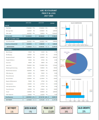
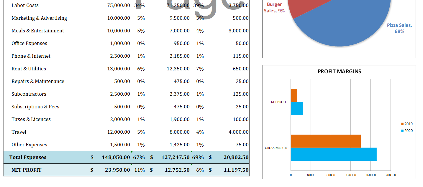
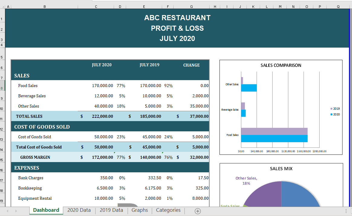
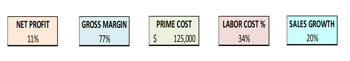
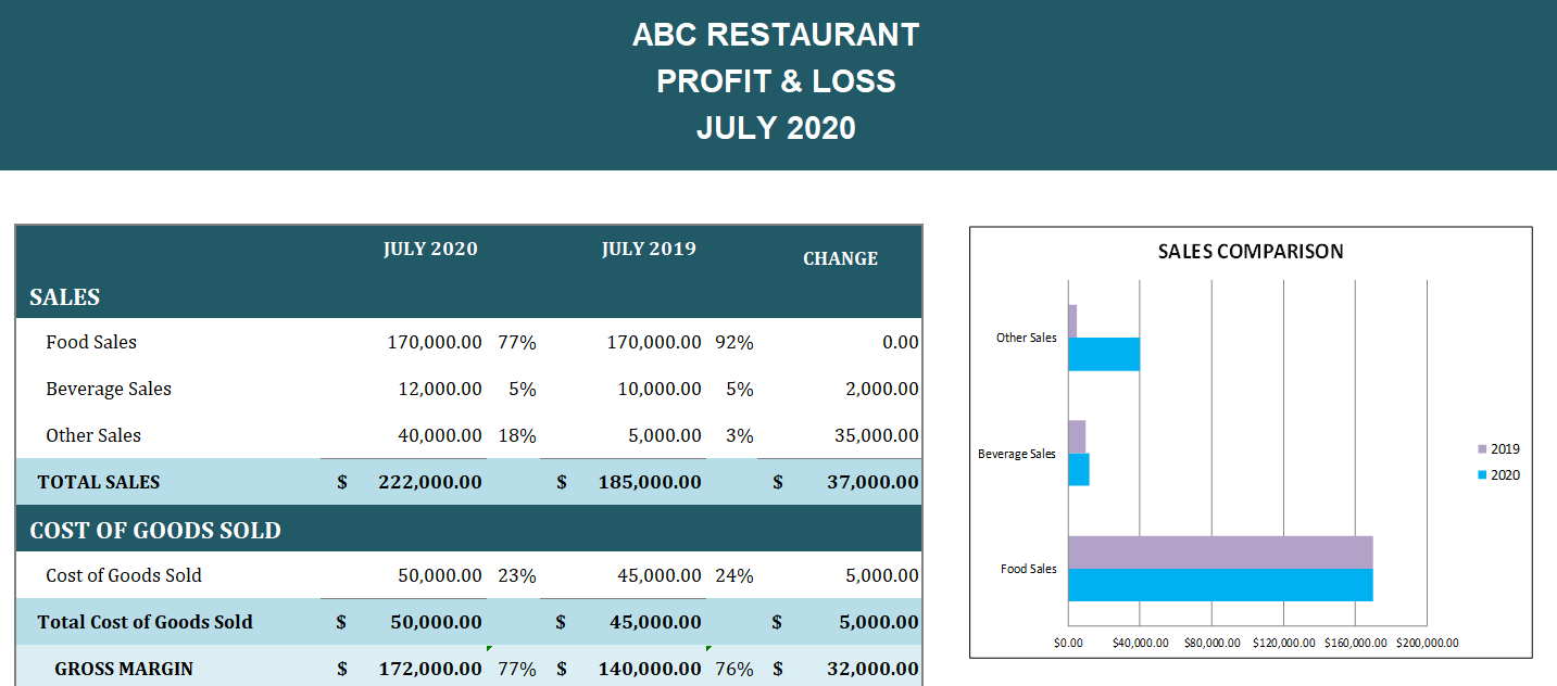
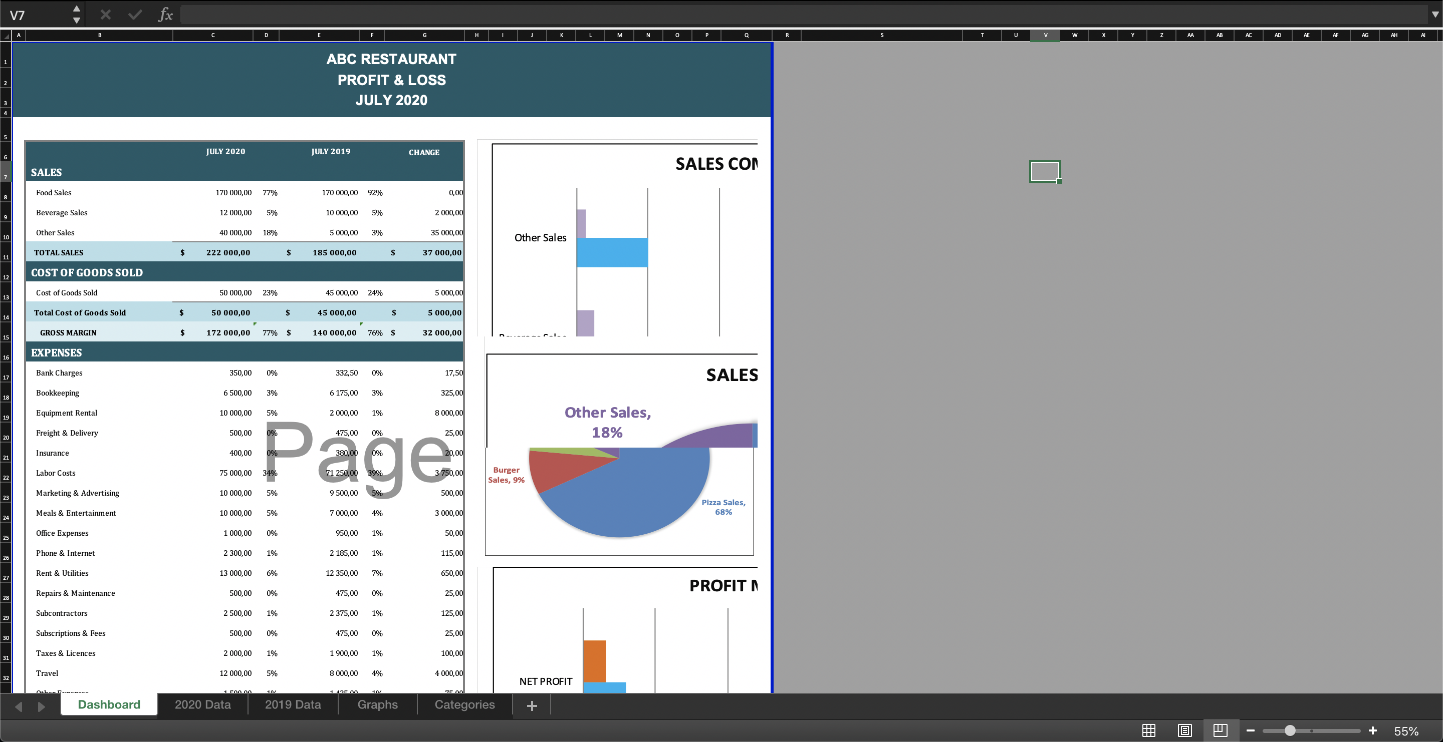
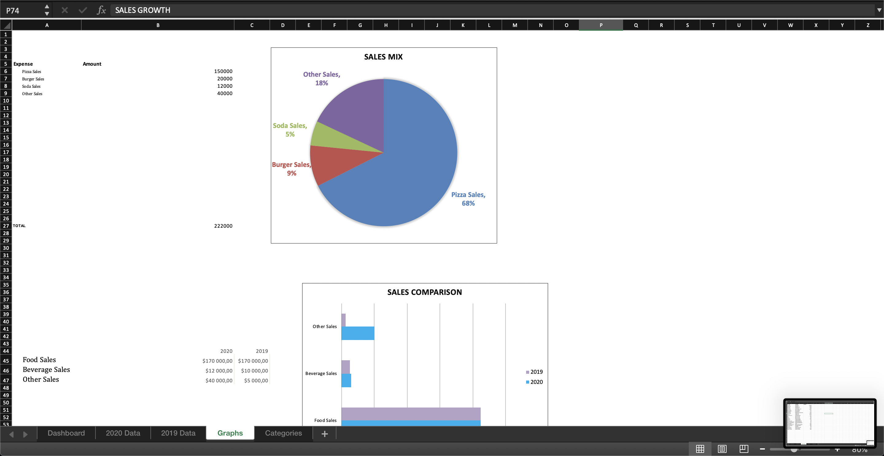
Profit & Loss Dashboard for Restaurant Business
Profit & Loss Statement Dashboard for Restaurant Business in Microsoft Excel.
