Originally published: 08/04/2020 20:36
Last version published: 13/04/2020 16:58
Publication number: ELQ-95968-2
View all versions & Certificate
Last version published: 13/04/2020 16:58
Publication number: ELQ-95968-2
View all versions & Certificate

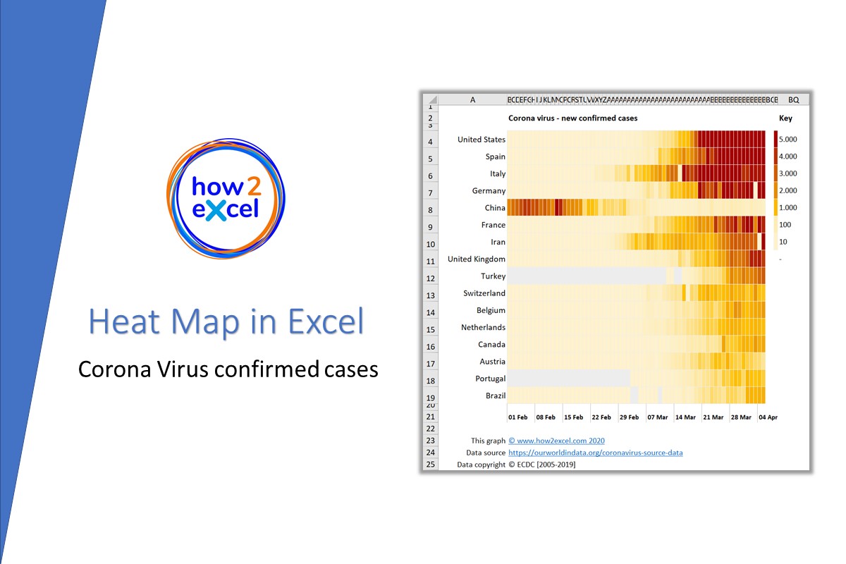
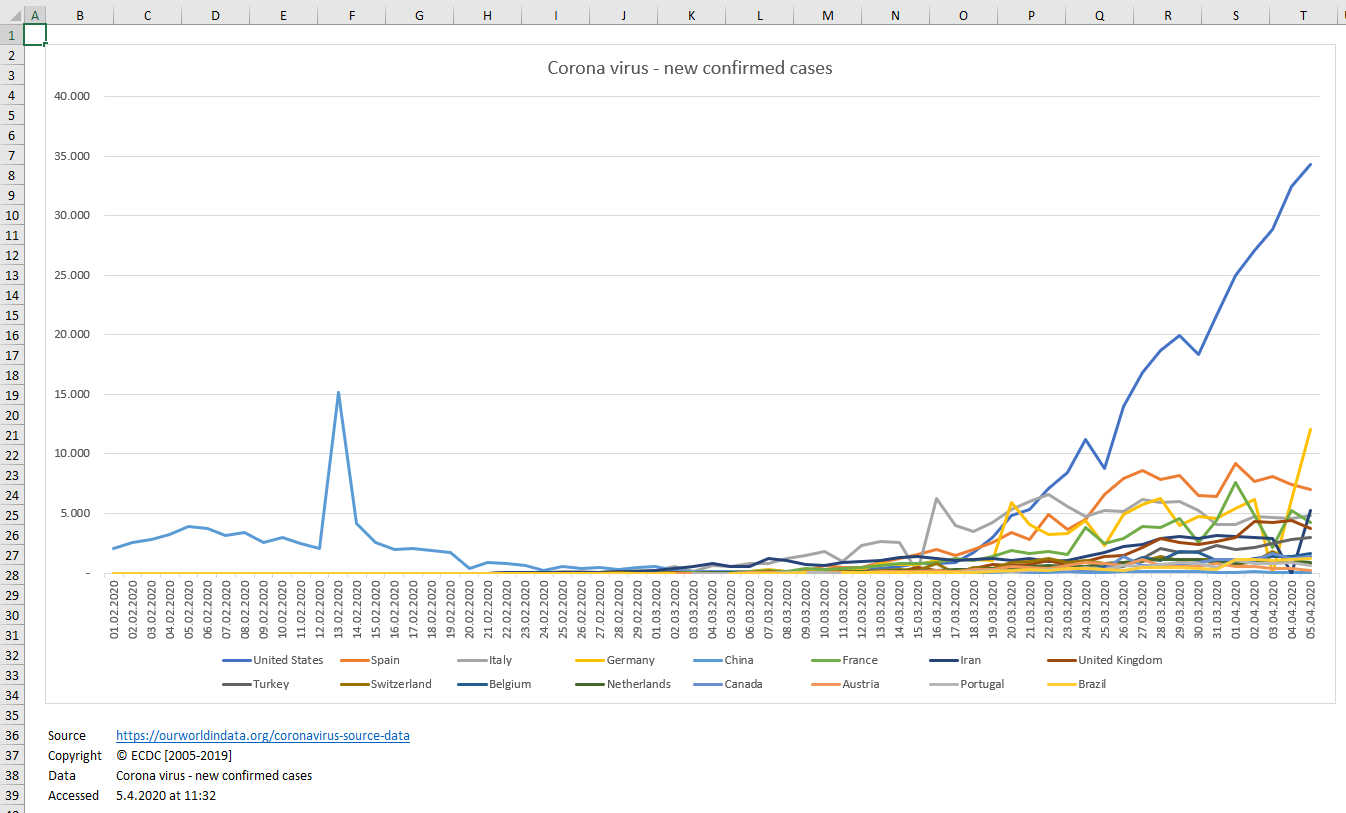
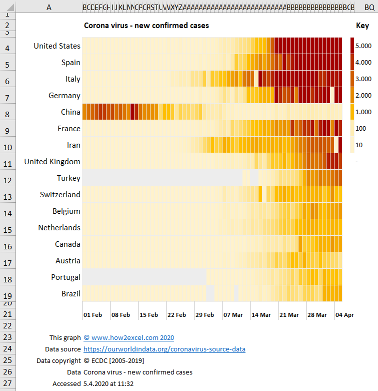
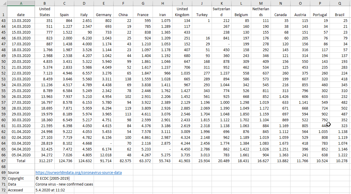
Coronavirus Heat Map Excel Model
Create a heat map to show Corona virus cases
Further information
Enable an understanding of heat map graphics which can be better than other graph types for large amounts of data and to teach users how to build their own
Need Excel and basic skills in Excel
Small data sets
