


Originally published: 09/07/2018 13:06
Last version published: 05/05/2020 12:22
Publication number: ELQ-60966-3
View all versions & Certificate
Last version published: 05/05/2020 12:22
Publication number: ELQ-60966-3
View all versions & Certificate

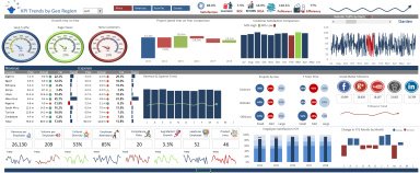
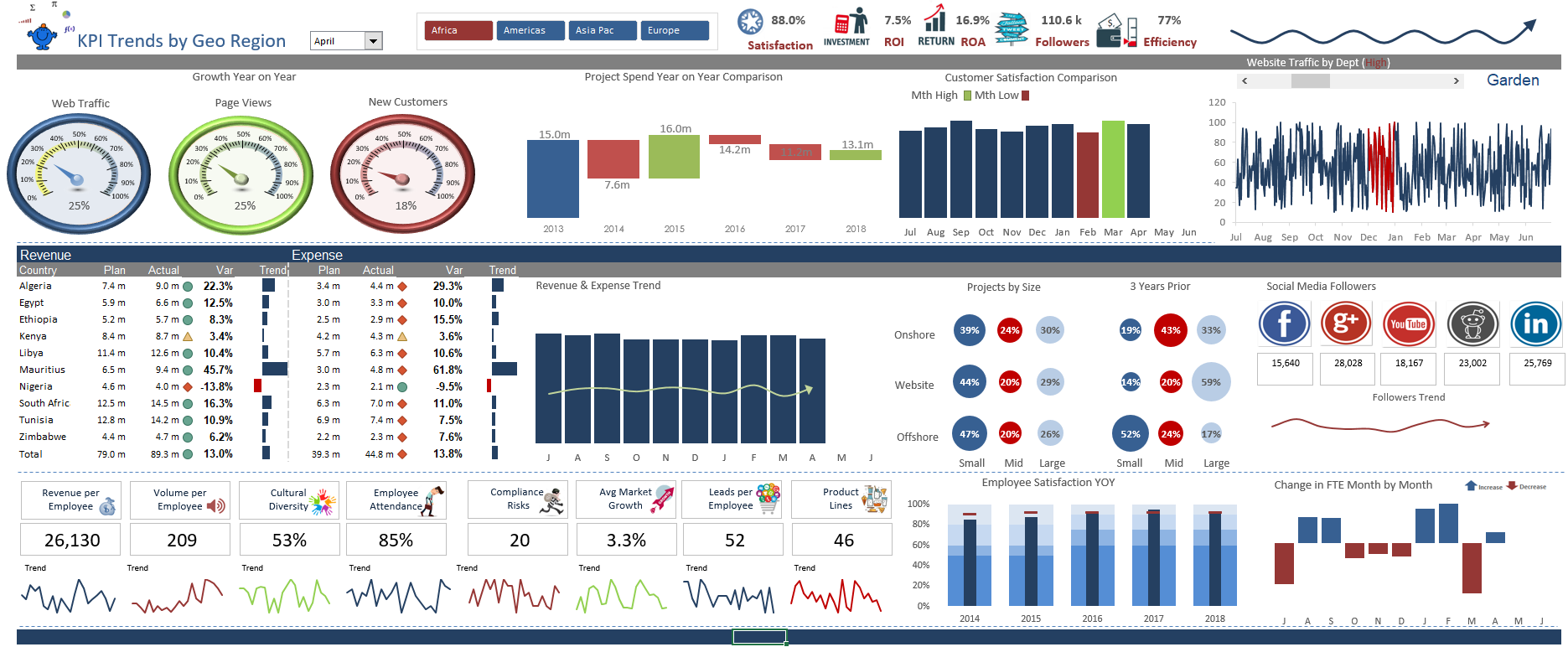
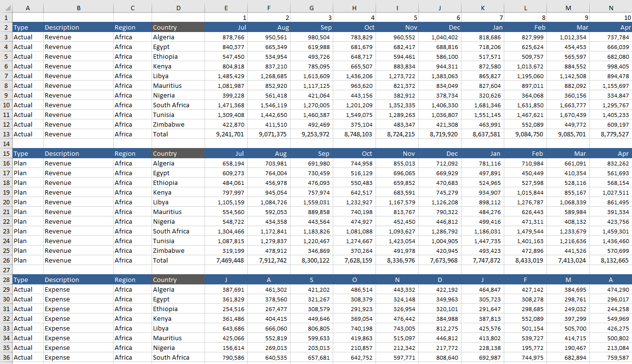
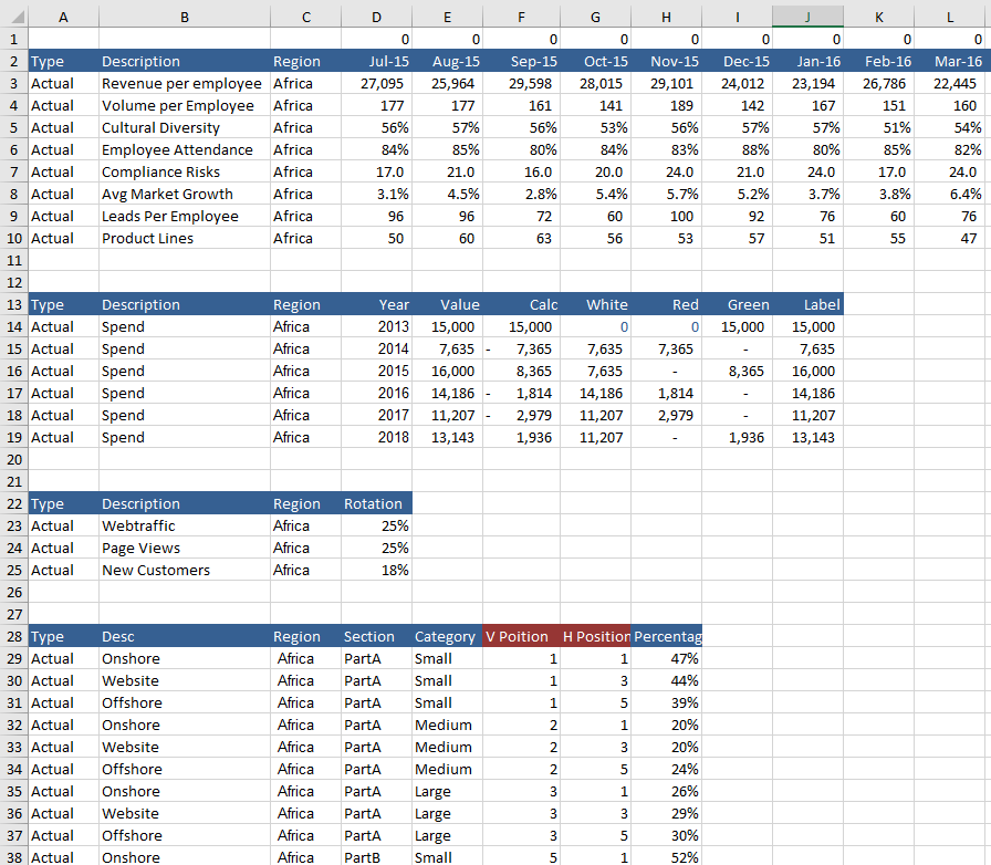
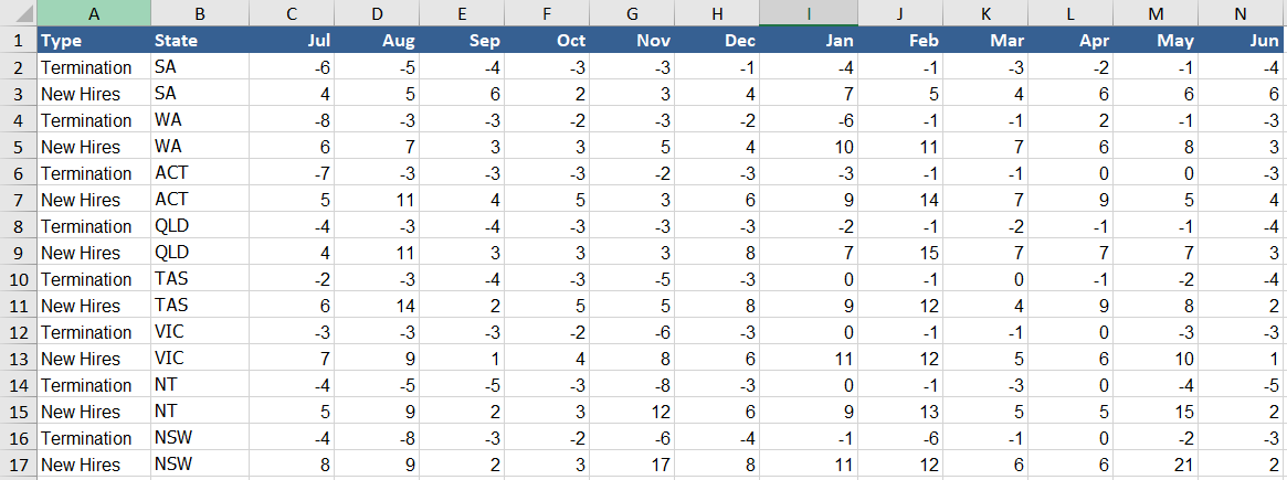
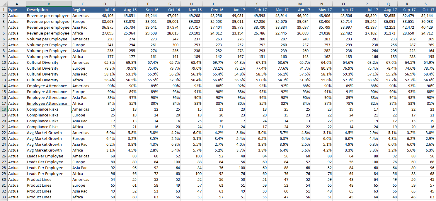
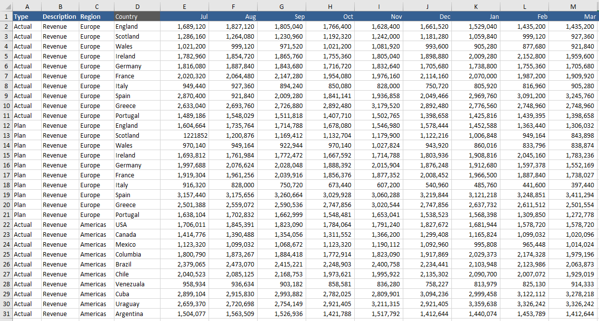
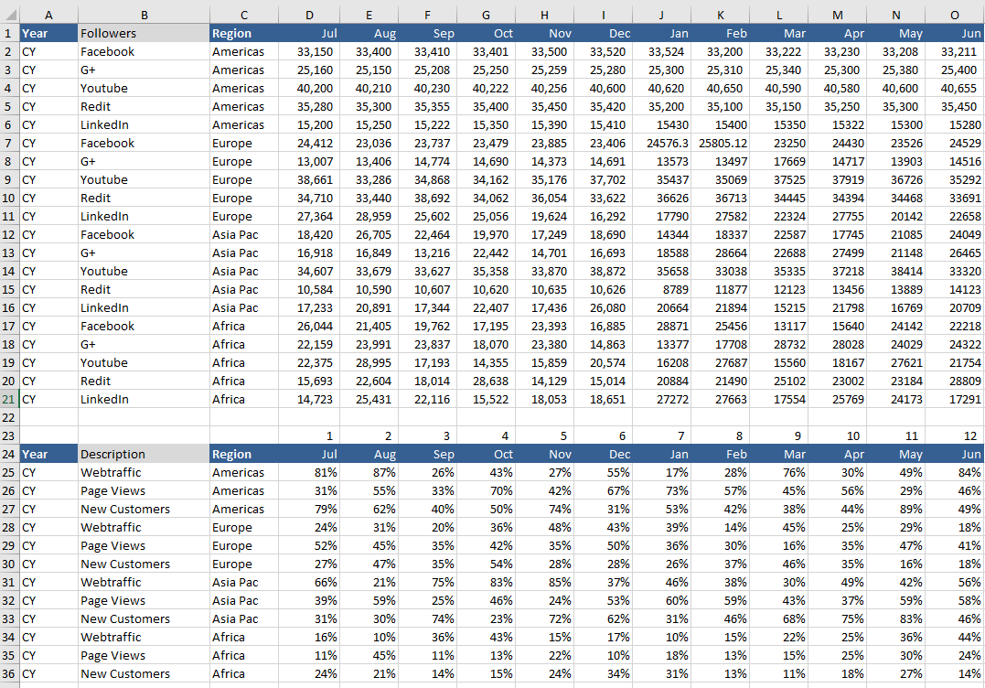
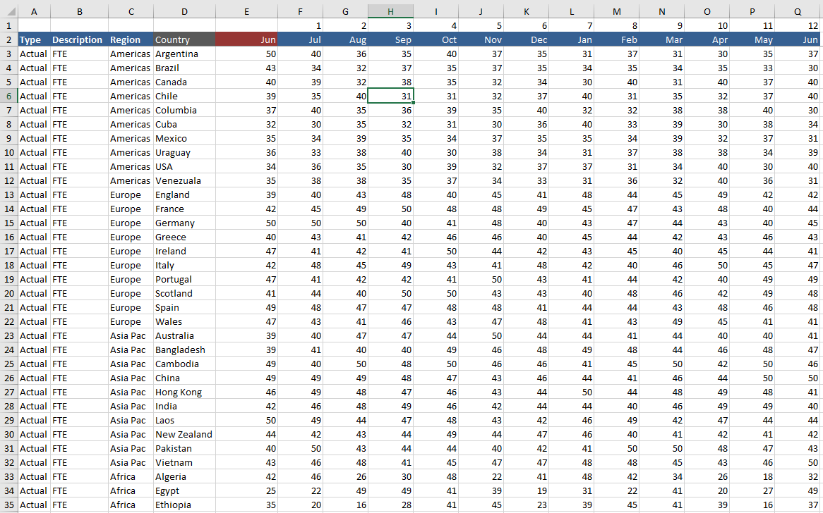
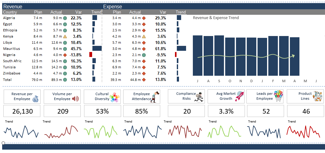
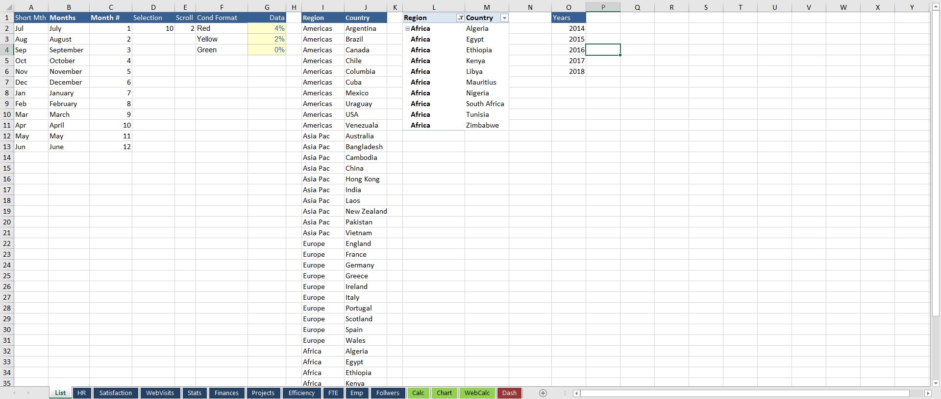
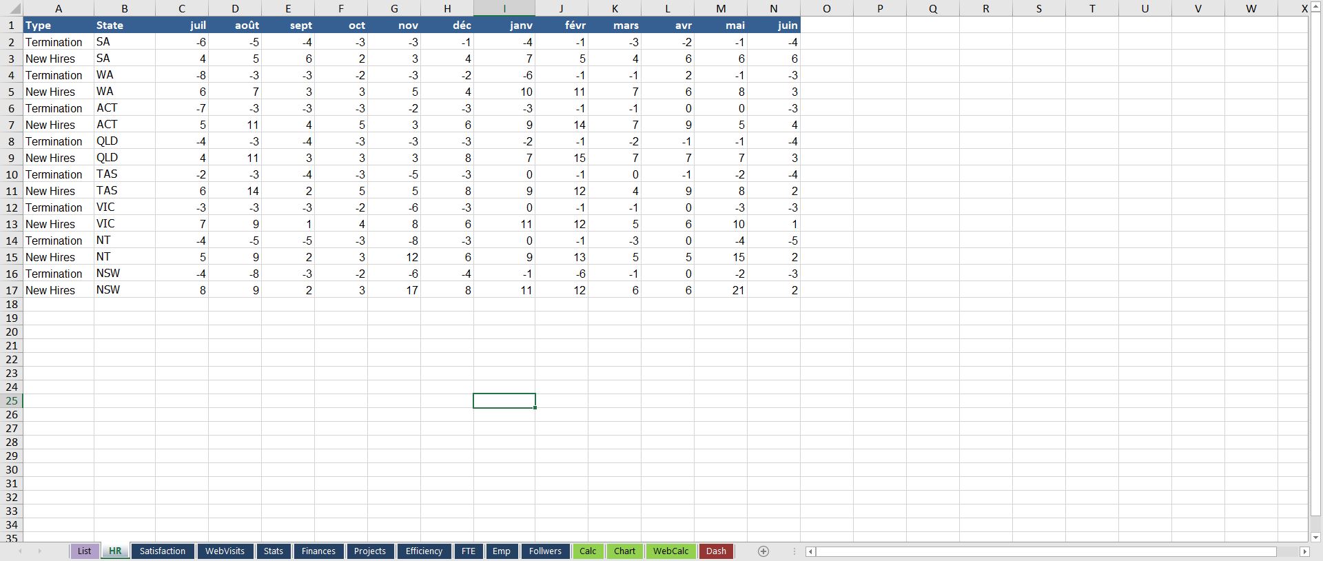
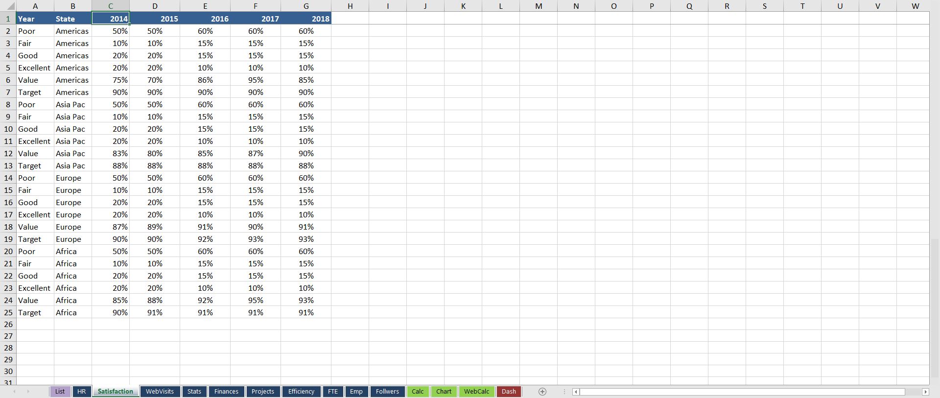
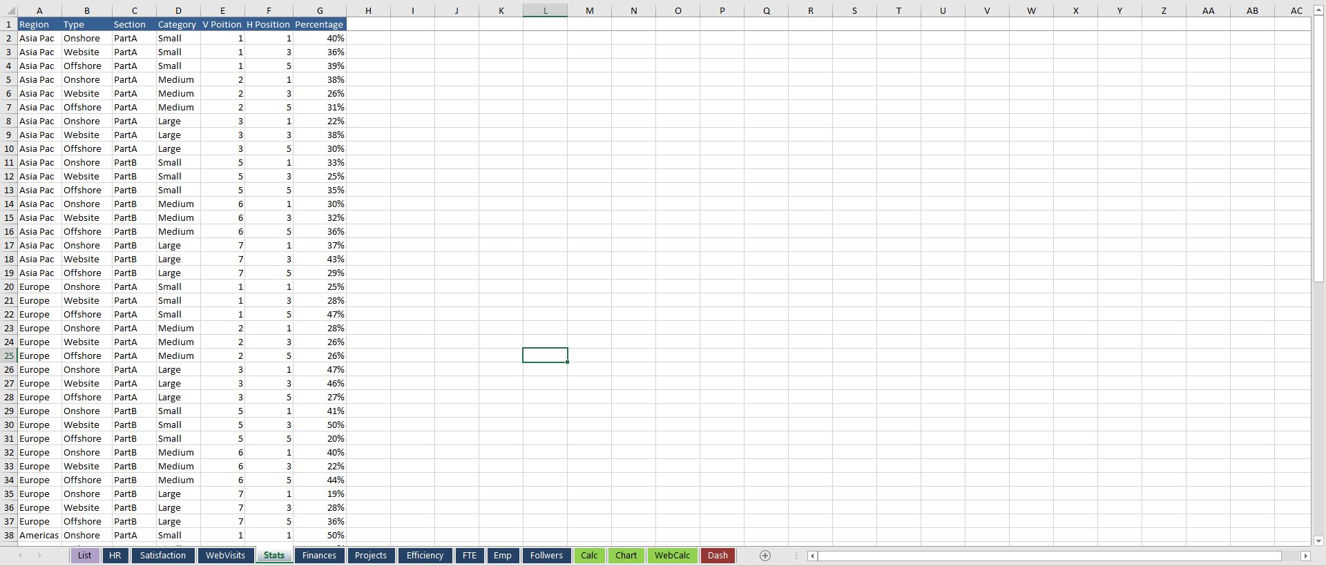
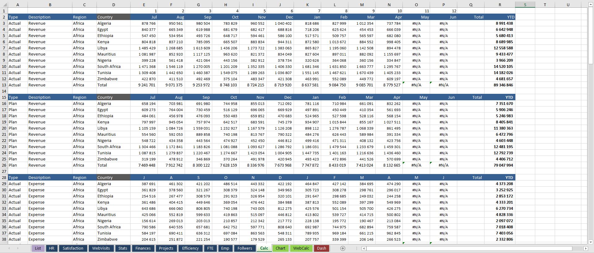
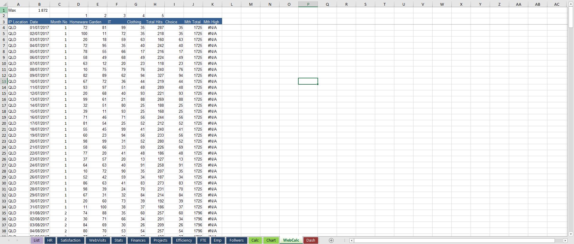
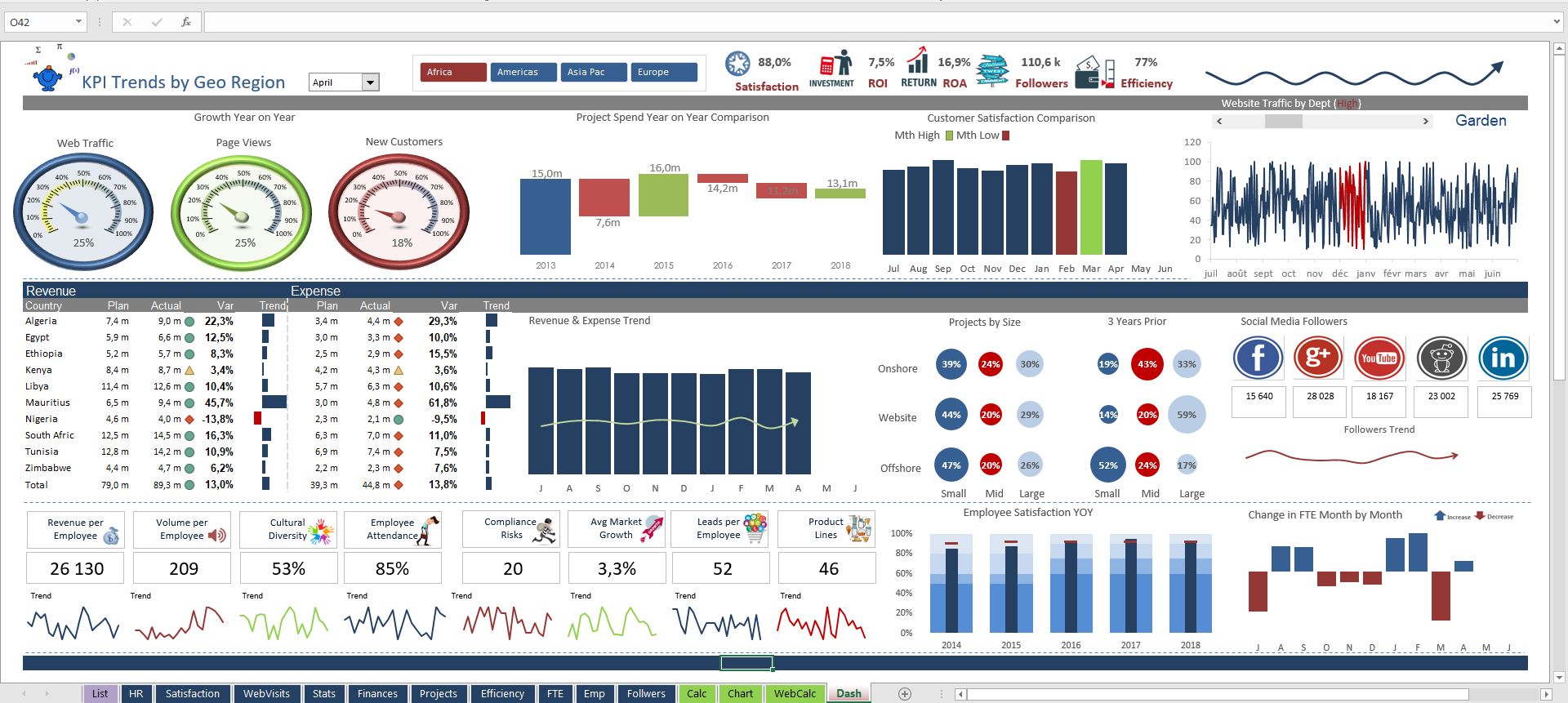
Data Trends by Month Dashboard Excel
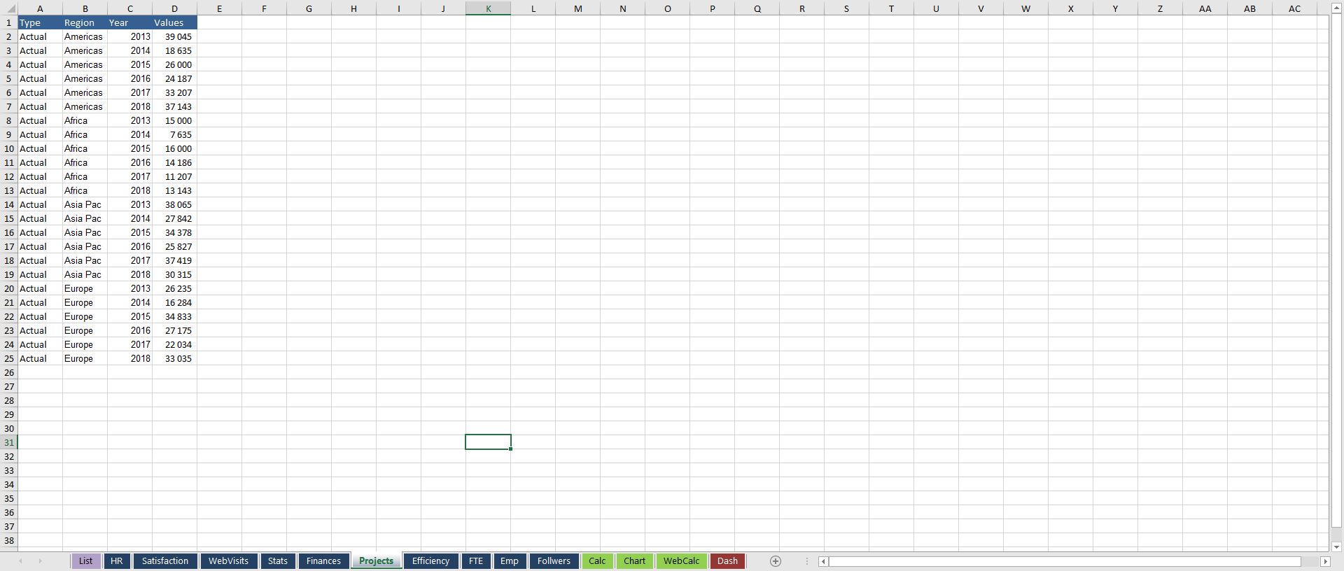
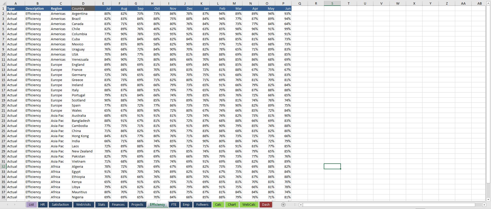
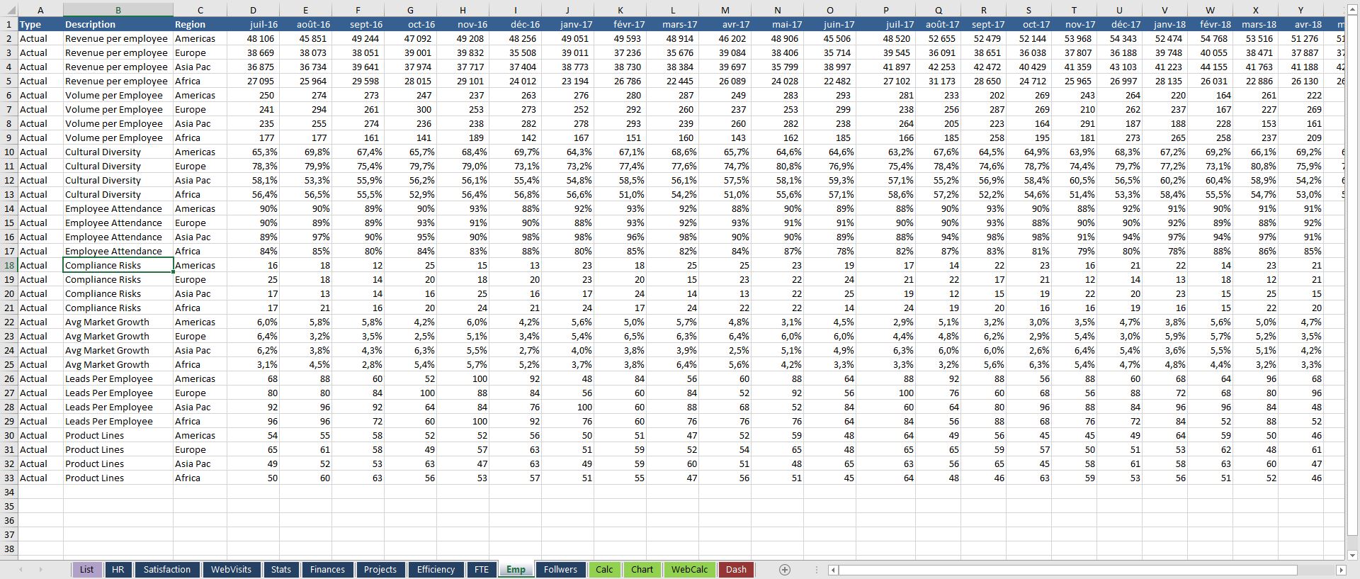
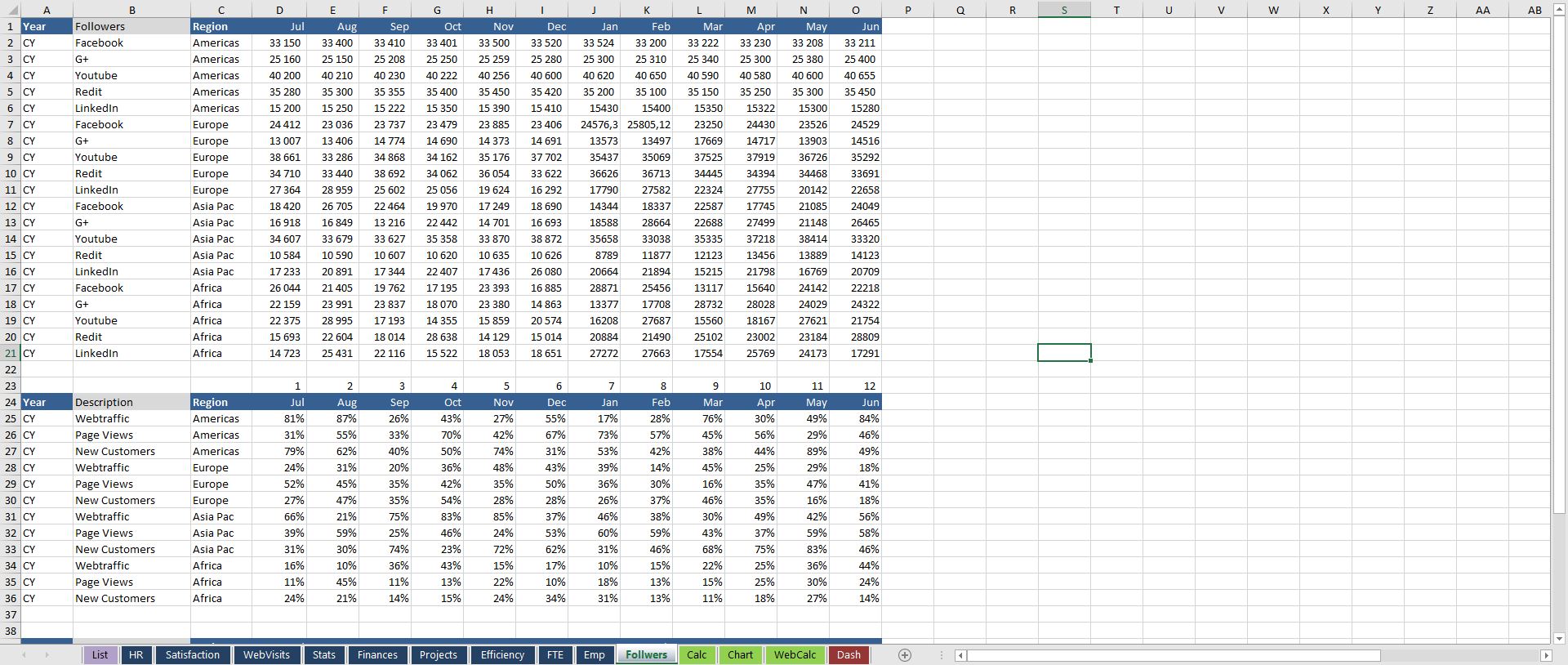
This dashboard shows a range of operational, financial and HR information with comparison, trend and variance to plan.
Further information
Provide highly detailed summary of key financial and non financial metrics in a succinct one page report.
Organisations or individuals who wish to incorporate operational data and make financial comparisons actual v plan and a range of key organisational data.
The file has a clean clear finish and is well laid out from inputs, calcs to outputs. The model is simple to follow and update.
