
Originally published: 06/03/2017 17:13
Publication number: ELQ-98061-1
View all versions & Certificate
Publication number: ELQ-98061-1
View all versions & Certificate

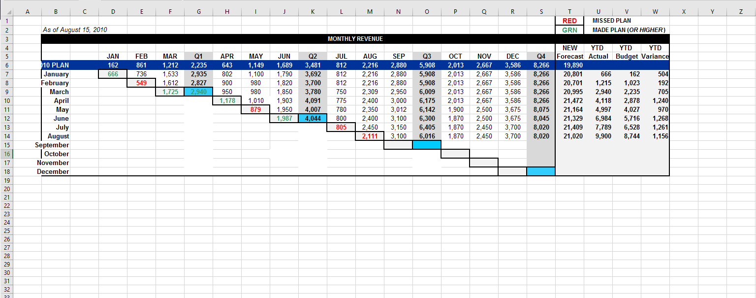
Financial Report Template: Waterfall Chart
Track your financial performance and forecast more efficiently
Description
After facing a tough decision, to either go surf or to blog about my favourite financial reporting tool, I settled for an answer of “both”.
The downloadable tool below is a Waterfall Chart. It allows you to compare the actual performance across time periods (mostly, months or quarters) to your original Plan of Report, additionally to forecasts you have made along the way, as information became more available.
This template is designed to compress a ton of information into a concise format, and to provide management and board members with quick answers to key questions such as:
1. How are we performing compared to the plan? Against what we thought last time we re forecast?
2. What will our potential position be at the end of the fiscal year?
3. Are there improvements in regards to how well we predict our business?
Most of my companies that use this tool track 5-10 key metrics in this form. The usual metrics include:
o Revenue
o New bookings
o Cash on hand
o Operating expenses
o Net income
o Headcount
o Units sold or new customers acquired
o Some measure of deployed/live customers (if a lag exists between a sale and a live customer)
o For internet companies, some measure of the “top of the funnel” such as Unique Visitors or Page Views
Below you will find the online methodology. It includes information on how the tool works, as well as questions most entrepreneurs ask.
Feel free to add your constructive thoughts and feedback in the discussion feed below.
Even if you do or you do not agree with the financial reporting tool, I hope you give it a try and find it useful!
Now I can proceed to surfing…
(This content was originally published on vcwaves.com)
- Brian Ascher
This Best Practice includes
1 Excel sheet, 1 Online Methodology