
Publication number: ELQ-58891-1
View all versions & Certificate

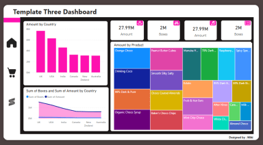
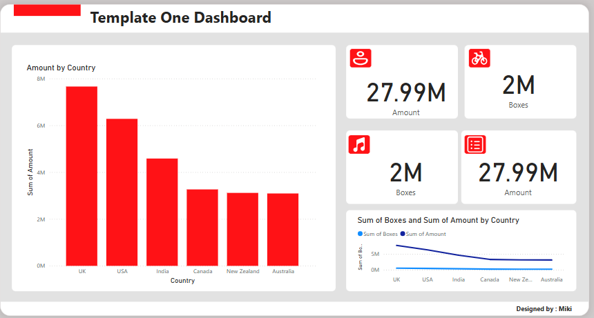
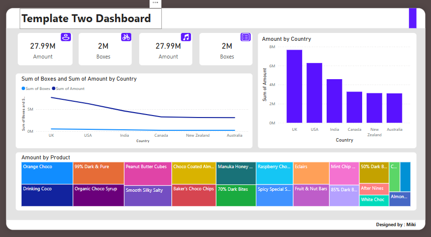
Sales Dashboard Power BI
This Sales Dashboard provides a comprehensive overview of sales performance across different countries and products. It highlights key metrics such as total sal
Further information
This downloadable sales dashboard helps track sales performance, identify top markets and products, monitor trends, and enhance decision-making. It simplifies reporting, supports sales strategy optimization, and boosts efficiency by providing clear, interactive visualizations for quick analysis. Ideal for improving sales insights and driving business success.
- Tracking Regional Sales Performance: Ideal for businesses looking to monitor and compare sales across multiple regions or countries.
- Analyzing Product Sales: Suitable for companies needing to evaluate the performance of various products, helping to identify top sellers and underperforming items.
- Monthly/Quarterly Sales Reporting: Best for regular sales reporting cycles, providing key stakeholders with an easy-to-understand summary of sales metrics.
- Optimizing Sales Strategies: Useful for businesses looking to refine their sales strategies based on data-driven insights, including trend analysis and market performance.
- Decision-Making Support: Works well for decision-makers needing clear and actionable insights to inform business strategies and improve overall sales performance.
- Sales Trend Monitoring: Ideal for organizations aiming to track sales trends over time, allowing for better forecasting and market planning.
- Visual Data Presentation: Perfect for users who need a professional, visually appealing presentation of sales data for client or internal meetings.
This downloadable sales dashboard is not ideal for real-time tracking, highly customizable or niche data needs, small datasets, or non-sales focused metrics. It may require adjustments for specialized industries or manual data entry, and it's less suited for audiences who prefer purely numerical data over visualizations.
