
Student Examination Result Dashboard | Interactive Excel KPI & Performance Analysis Tool
Originally published: 03/03/2026 17:22
Publication number: ELQ-25732-1
View all versions & Certificate
certified

Student Examination Result Dashboard | Interactive Excel KPI & Performance Analysis Tool

Interactive Excel dashboard to analyze student exam results, pass/fail status, class performance, and key academic KPIs.

Description
Student Result Dashboard — Overview
The Student Result Dashboard is an interactive Excel-based reporting tool designed to analyze and visualize students’ academic performance using clean, structured data. It provides clear insights into overall results, class-wise performance, subject averages, and gender-based comparisons.
This dashboard automatically updates all visuals when new data is entered, offering a quick and accurate summary of student results.

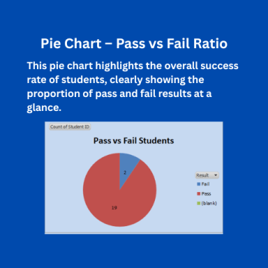
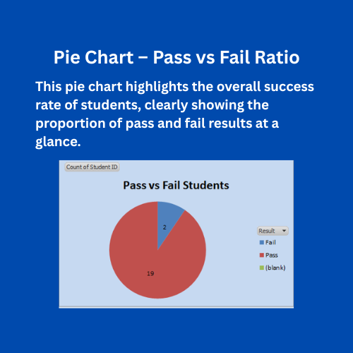
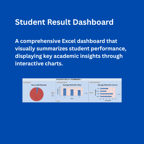
1. Pass vs Fail Students (Sheet 2)
  • Purpose: Displays the overall performance of students by categorizing them as Pass or Fail.
  • Visualization Type: Pie Chart.
  • Insights:
    • Shows the No of passed and failed students .
    • Helps quickly identify the success rate of the entire group.
  • How It Works:
    • Based on the “Result” column in the data sheet.
    • The chart updates automatically when new student results are entered.

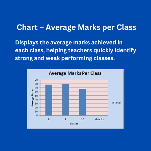
2. Average Marks per Class (Sheet 2)
  • Purpose: Shows how each class (e.g., 8, 9, 10) performs on average.
  • Visualization Type: Column Chart.
  • Insights:
    • Compares the academic performance across different classes.
    • Highlights which class achieved the highest average marks.
  • How It Works:
    • Data is derived from the “Class” and “Percentage” fields.
    • Displays the average marks for each class on the Y-axis.

3. Average Marks per Course (Sheet 2)
  • Purpose: Evaluates subject-level performance to identify strong or weak academic areas.
  • Visualization Type: Bar Chart.
  • Insights:
    • Shows the average marks for each course or subject.
    • Helps teachers and administrators focus on subjects where students need improvement.
  • How It Works:
    • Uses the “Course” and “Percentage” columns from the main dataset.
    • Updates dynamically when new course data is added.

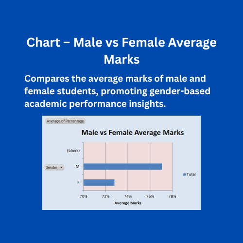
4. Male vs Female Average Marks (Sheet 3)
  • Purpose: Compares academic performance between male and female students.
  • Visualization Type: Bar Chart.
  • Insights:
    • Clearly shows the difference in average marks between genders.
    • Useful for gender-based performance evaluation and academic equality analysis.
  • How It Works:
    • Derived from the “Gender” and “Percentage” columns.
    • Calculates and displays average marks per gender category.

Dashboard Functionality
  • Fully automated using Pivot Tables and Charts.
  • When data is updated in the student list, all charts refresh automatically.
  • Users can:
    • Add, remove, or modify student records.
    • Instantly view updated results and averages.
    • Filter or analyze performance by class, course, or gender.

Usage Instructions
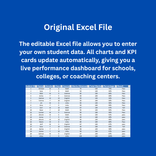
  1. Enter or update student data in the Main Data Sheet No 1.
  2. Press on Refresh Button on sheet 2.
  3. Review insights in each dashboard sheet:
  • Sheet 2 → Pass vs Fail
  • Sheet 2 → Average Marks per Class
  • Sheet 2 → Average Marks per Course
  • Sheet 3 → Male vs Female Average Marks
  • Charts will automatically update to reflect new data.

  • Conclusion
    This dashboard provides a complete performance overview for schools and institutions.
    It helps educators:
    • Monitor academic trends,
    • Identify weak areas,
    • Compare performance across classes, subjects, and genders,
      ensuring data-driven decision-making in student evaluation.

    This Best Practice includes
    1 excel dashboard file (xlsm)

    Acquire business license for $25.00

    Add to cart

    Add to bookmarks

    Discuss

    Further information

    Monitor and analyze student examination performance in a structured and visual format.
    Automatically calculate percentages and determine pass/fail status based on predefined criteria.
    Track class-wise average marks and overall academic trends.
    Identify high-performing and underperforming students quickly.
    Support data-driven academic decision-making for teachers and administrators.
    Reduce manual result preparation time through automated calculations.
    Improve reporting accuracy using dynamic Pivot Tables and charts.
    Generate clear, professional academic performance reports.
    Enable quick comparison between classes or subjects.
    Enhance transparency in examination evaluation and result analysis.

    Schools, colleges, and academic institutions managing examination results in Excel.
    Teachers or administrators tracking student marks, percentages, and pass/fail status.
    Institutions requiring class-wise or subject-wise performance analysis.
    Academic environments using structured tabular data (student name, marks, total marks, etc.).
    Users who need visual dashboards with Pivot Tables, KPIs, and charts for reporting.
    Small to medium institutions that do not use advanced ERP systems.
    Educational analysts preparing performance summaries and academic reports.

    Institutions using fully integrated Student Information Systems (SIS) or ERP platforms with automated reporting.
    Schools requiring real-time database connectivity or cloud-based live updates.
    Organizations needing advanced statistical modeling or predictive analytics.
    Institutions managing extremely large datasets requiring Power BI, SQL, or specialized software.
    Users unfamiliar with basic Excel operations such as data entry and refresh functions.


    0.0 / 5 (0 votes)

    please wait...