

Originally published: 10/12/2021 08:38
Publication number: ELQ-48714-1
View all versions & Certificate
Publication number: ELQ-48714-1
View all versions & Certificate

Bar Chart Excel Template
The Bar Chart Excel Template will enable you to quickly and easily transfer raw data into useful business insights.
Description
Save time by using this effective tool that turns your raw data into meaningful business insights. You can then display these insights with supporting data in an effective format.
Bar charts are successful in analyzing categorical variables by:
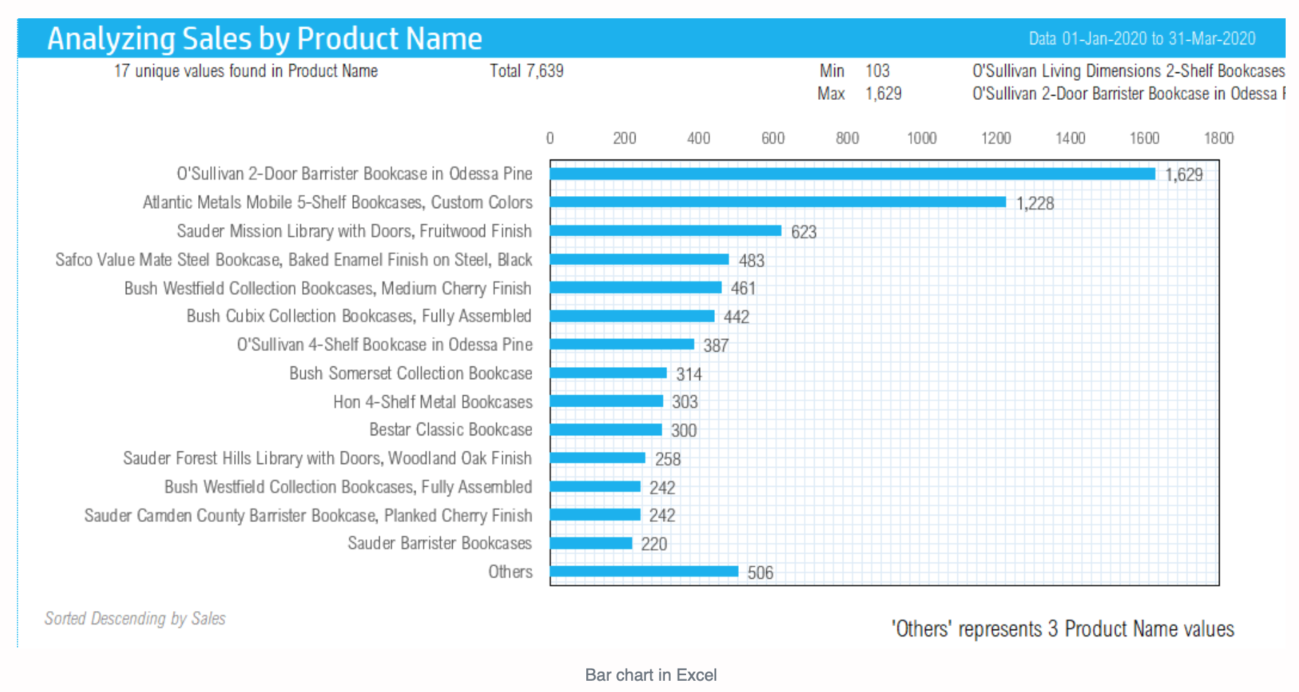
1) Ranking data in order of the position in which an individual category contributes compared to other categories. The ranking of data can therefore show which are the top three and bottom three products regarding sales, which product has the highest or lowest sales, and which region contributes the most sales.
2) Determining part-to-whole percentages, meaning what percentage each category contributes to all categories combined. The part-to-whole analysis can therefore show what percentage of sales derives from each product, and how many and which products contribute to 80% of sales, for example.
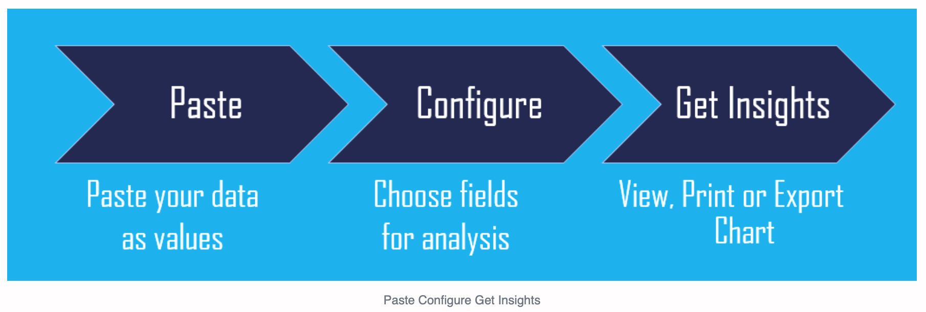
This template is user-friendly and ready-to-use. Simply copy and paste any dataset into the template, configure the fields for analysis, and generate your valuable insights. You can then view, print, or export the column chart.
A huge time-saver is that the template will automatically generate your chart with effective analysis and a clear visual presentation.
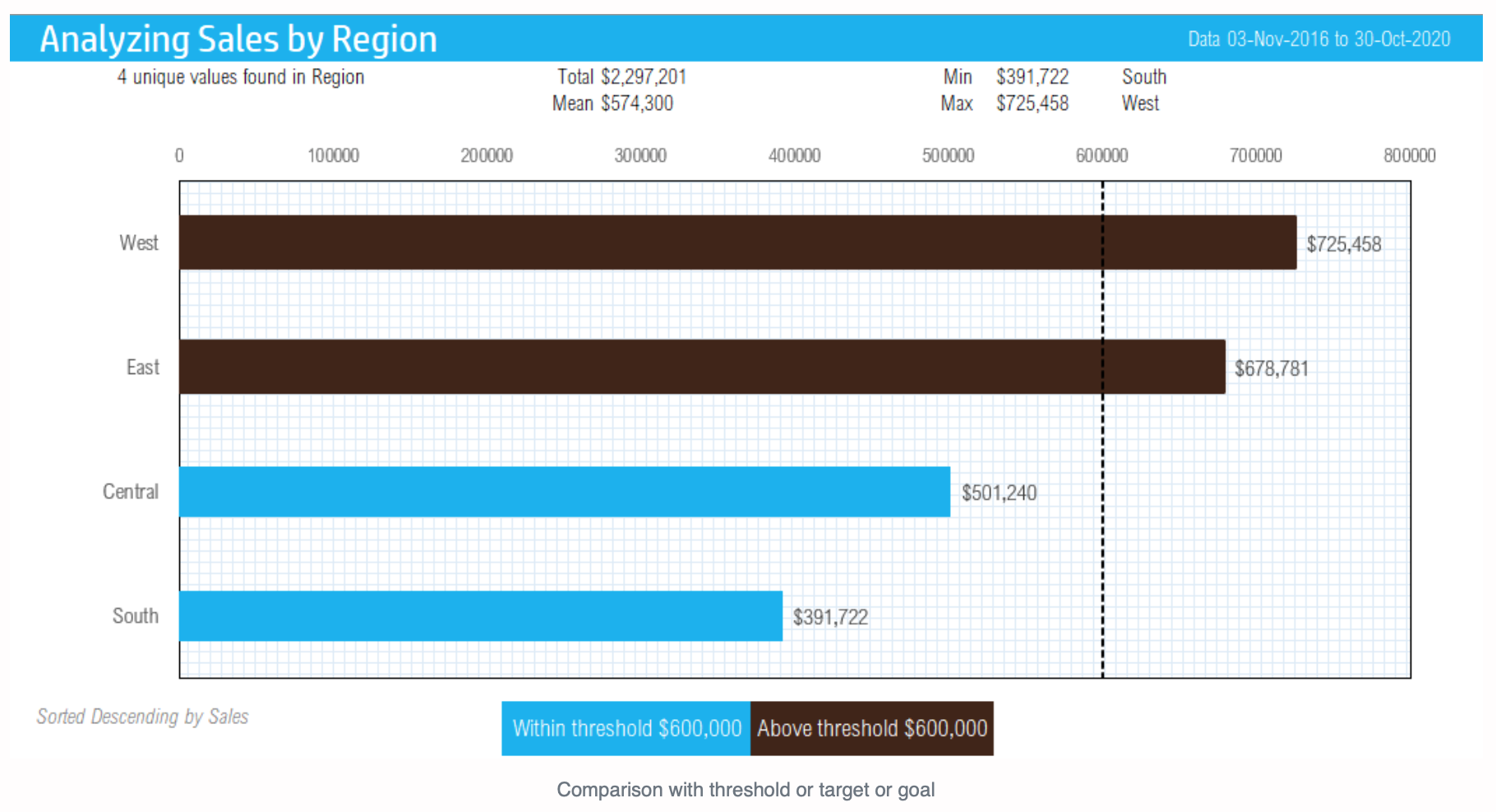
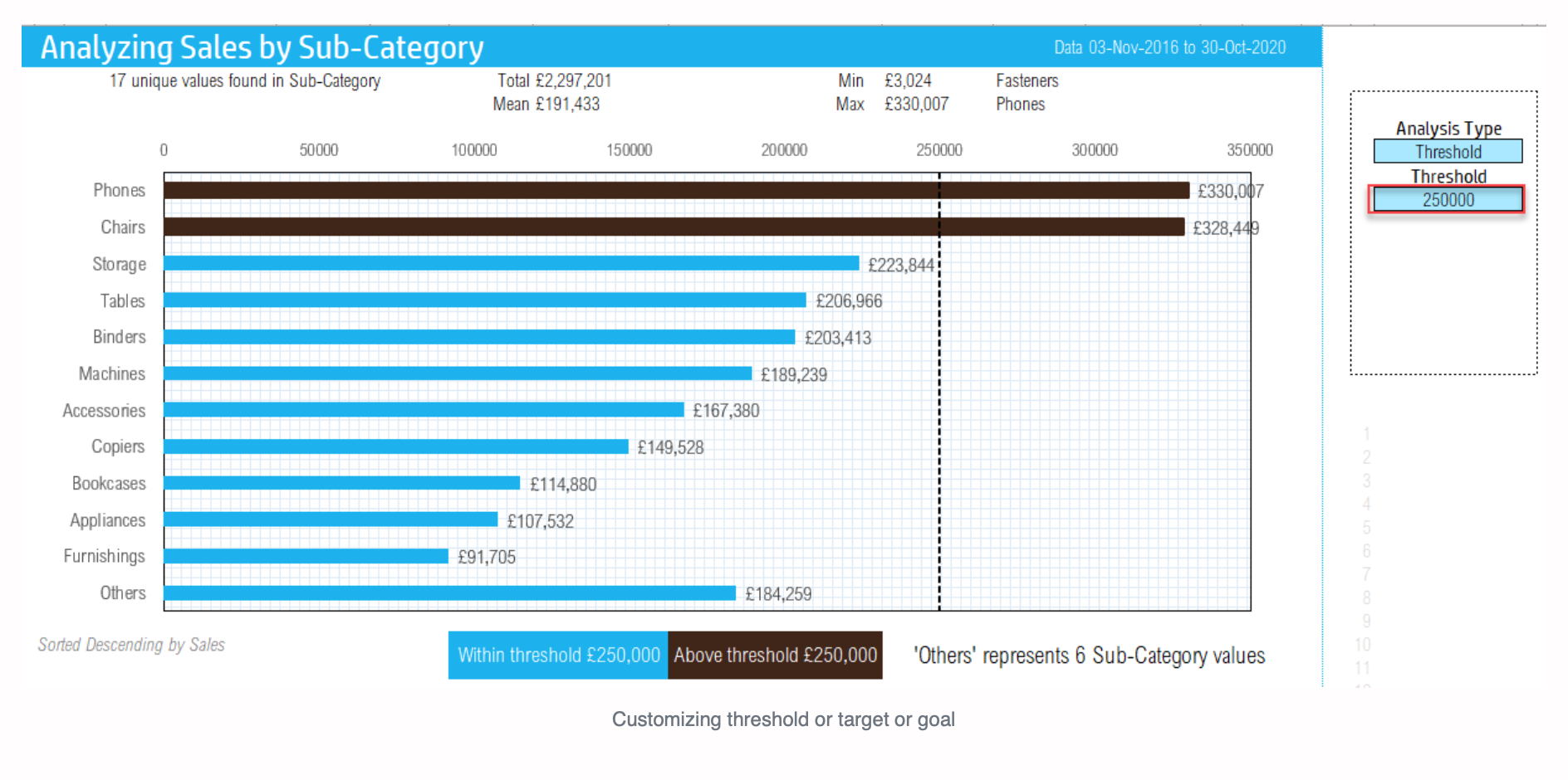
With this template you will also be able to view the categories that exceed a given threshold by comparing factual results against a target threshold. Simply enter in any threshold and the categories that exceed that given threshold will be automatically highlighted along with a threshold line.
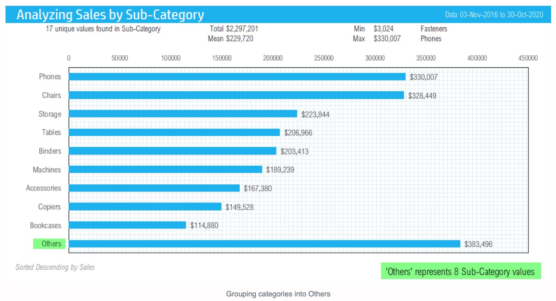
Group categories into an ‘Others’ category to make large sets of data look more presentable.
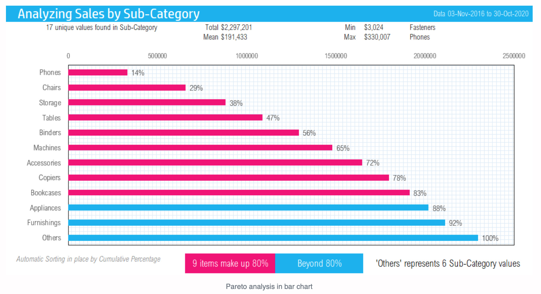
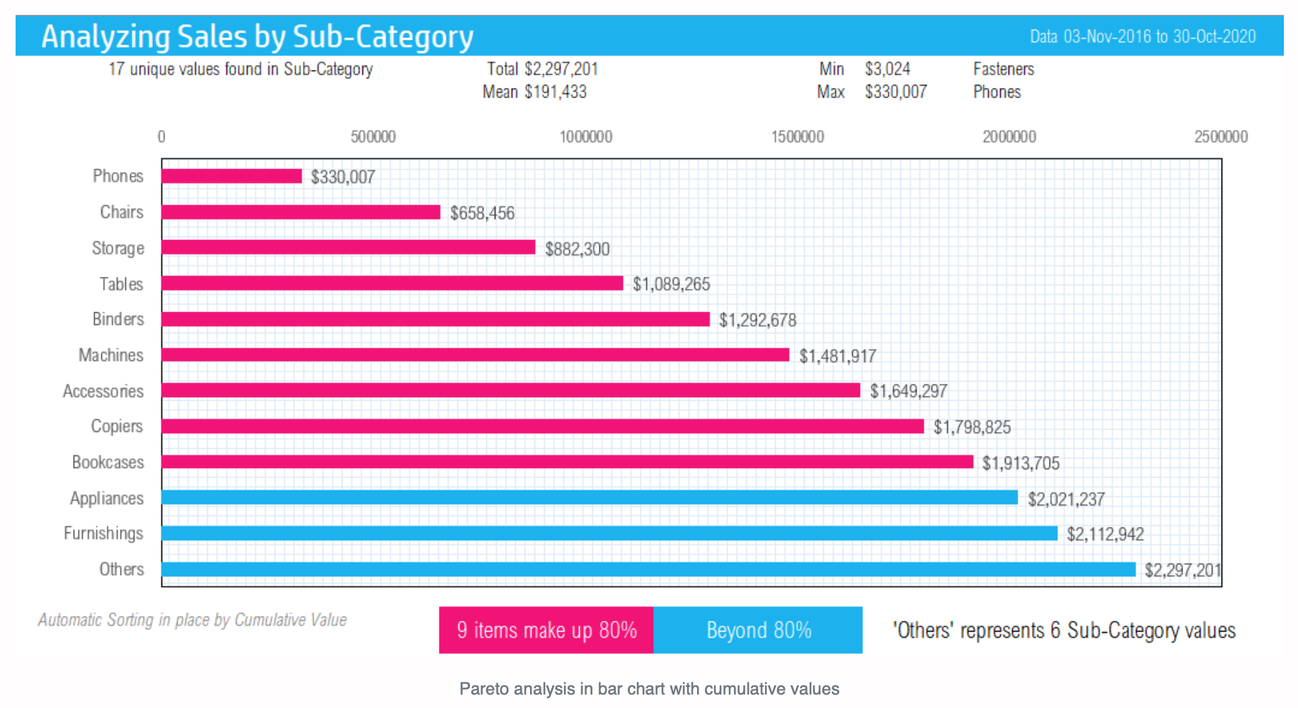
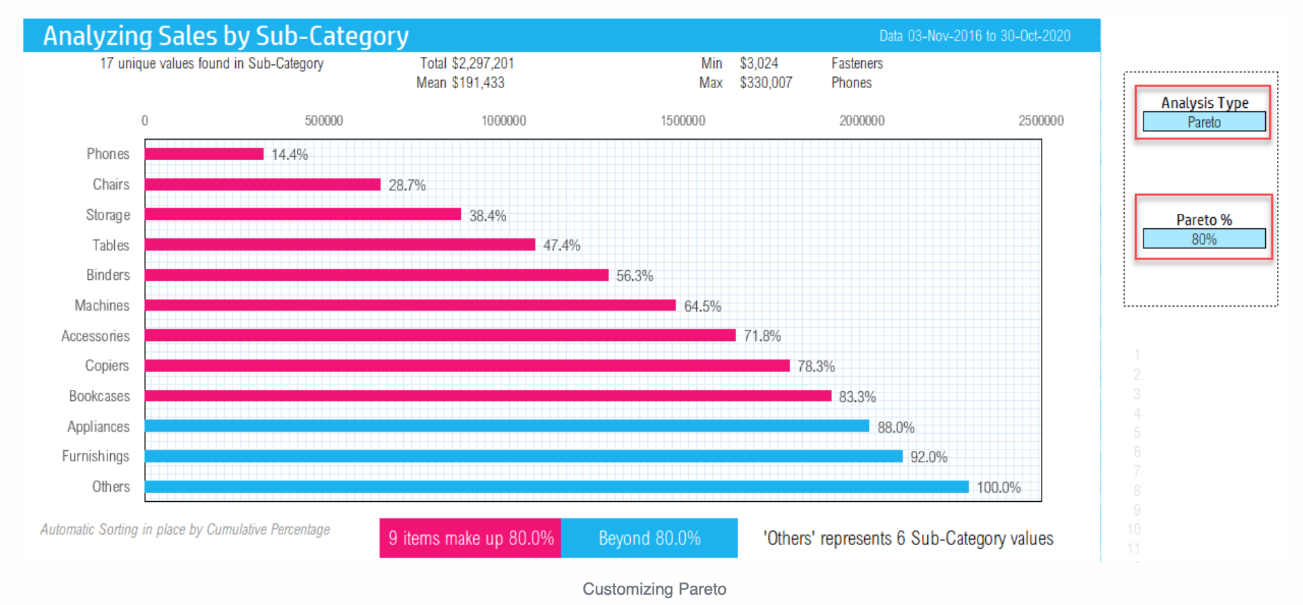
Apply Pareto analysis in one click when large portions of a measure (e.g. 80%) is driven by a small portion (e.g. 20%) of categories.
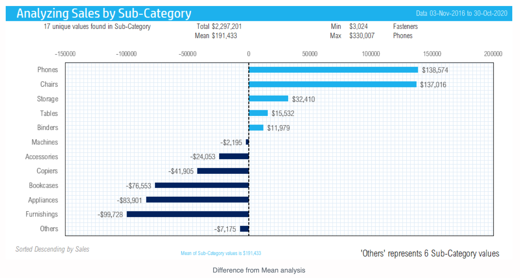
Highlight the categories that are above and below the mean with one click to generate a Different from Mean Analysis.
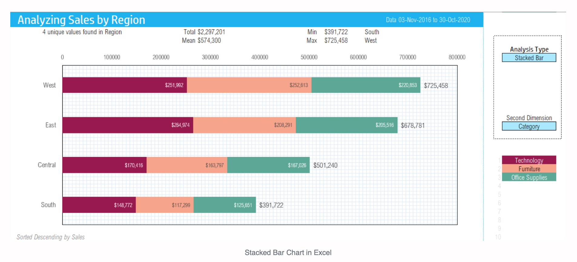
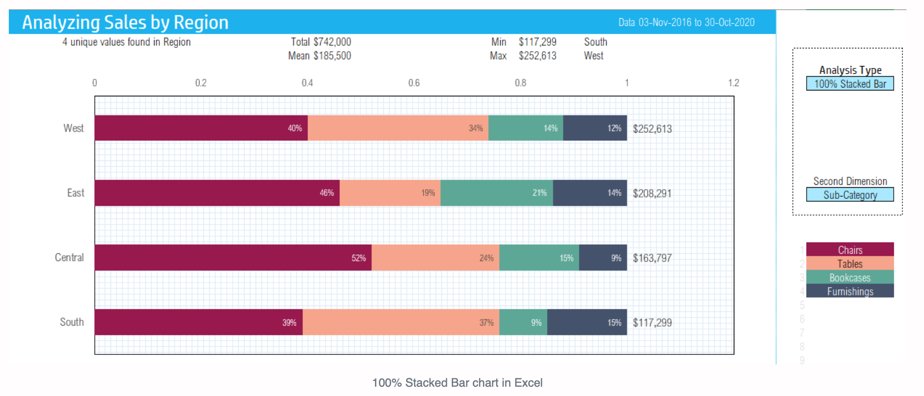
Use the Stacked Bar Chart to gain a deeper understanding of your data by measuring on two dimensions. For example, you could measure your sales by region but within each region view the sales proportioned into each category.
The 100% Stacked Bar Chart will enable you to view the normalized values. Like the Stacked Bar Chart, this chart will measure on two dimensions. You could measure your sales by region like the previous chart, but this time break down the sales in each region to measure percentage of sales by the type of product being sold, e.g., furnishings.
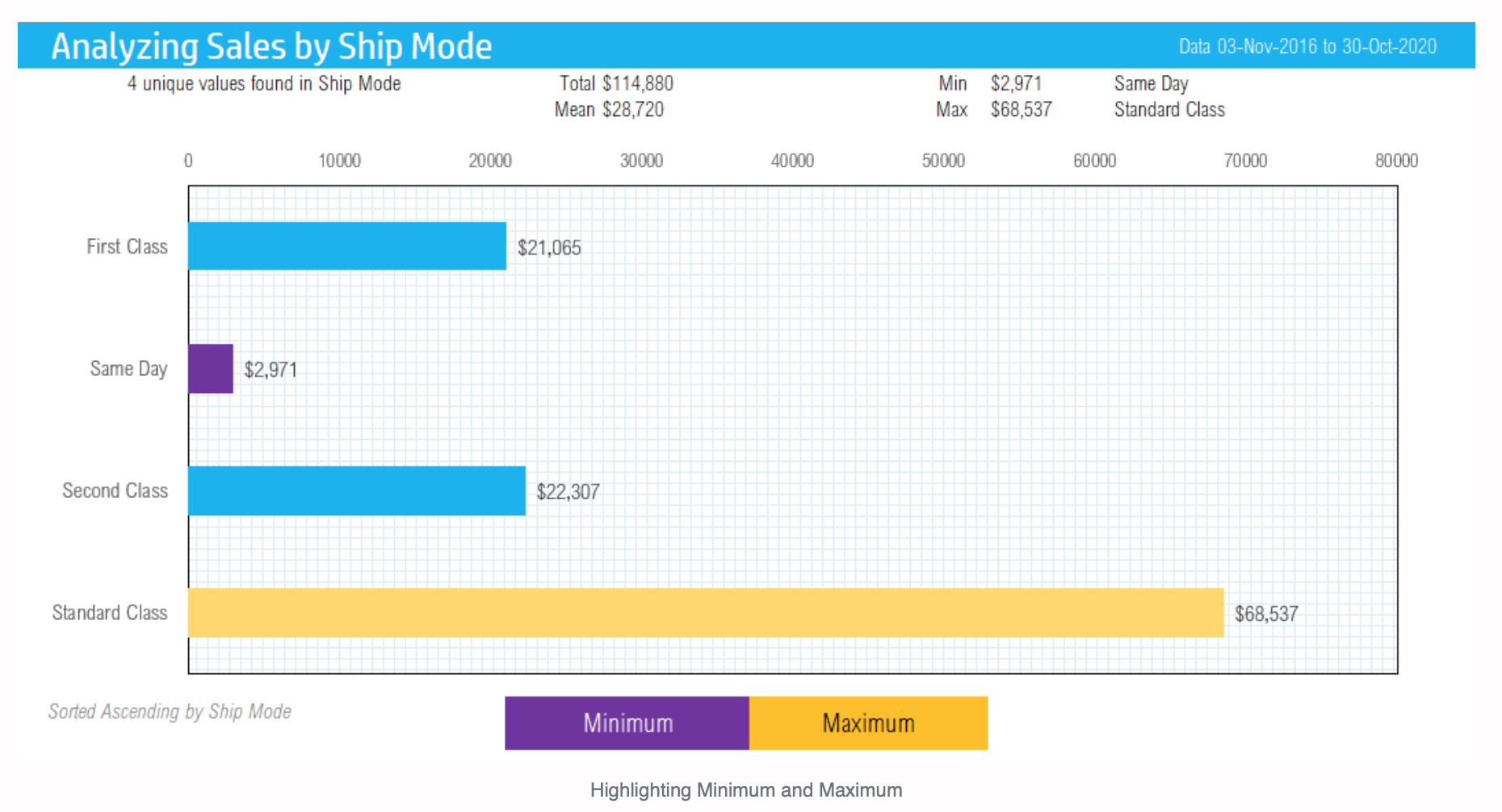
It is also possible to highlight the minimum and maximum categories in different colors.
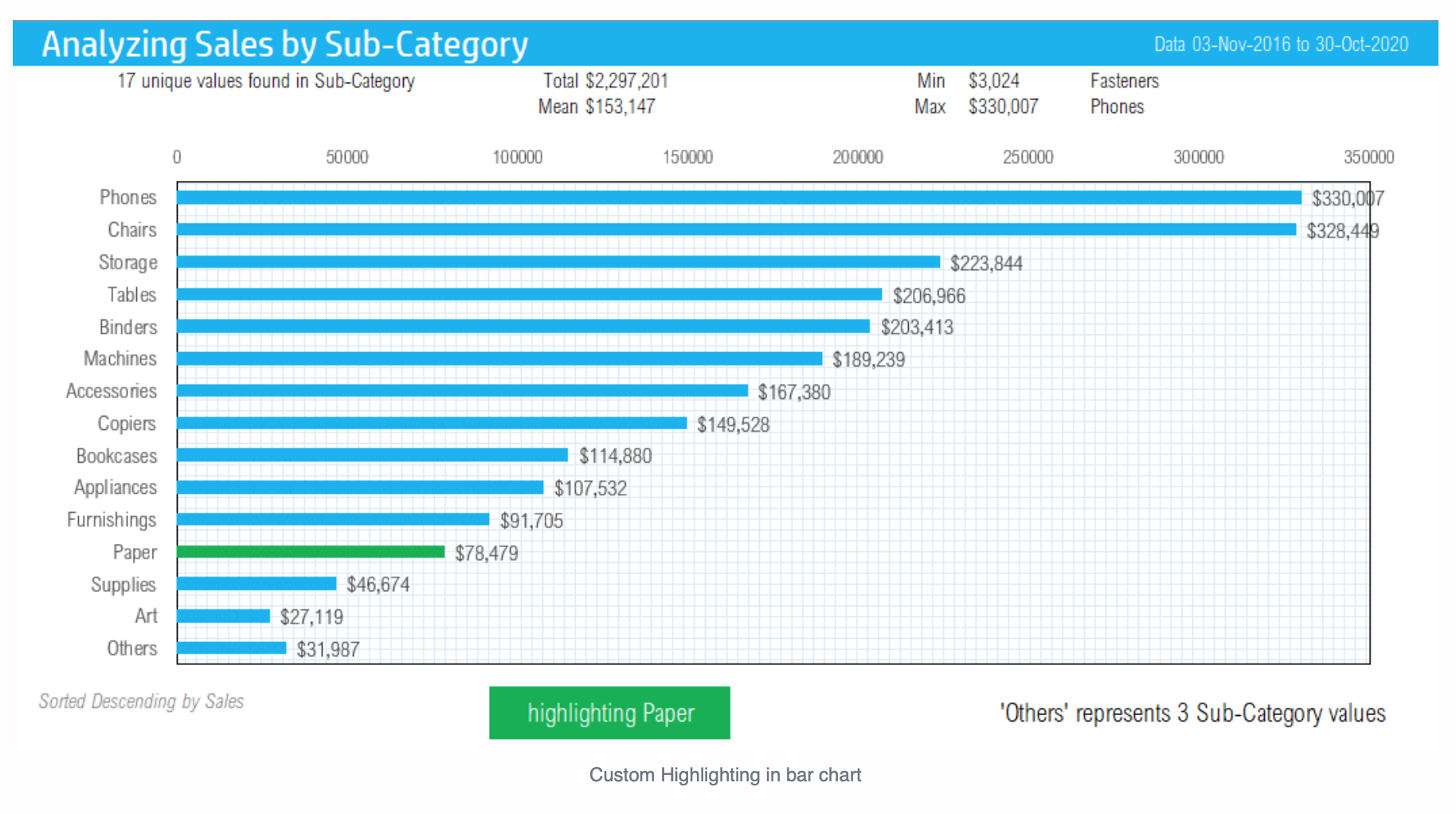
Use the ‘Custom Highlight’ option in the template to highlight the position or rank of a certain category compared to the others.
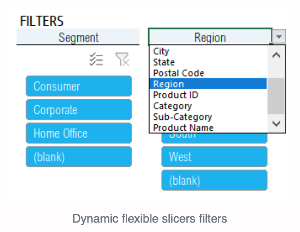
You can also apply dynamic slicers to filter segments of data to your needs.
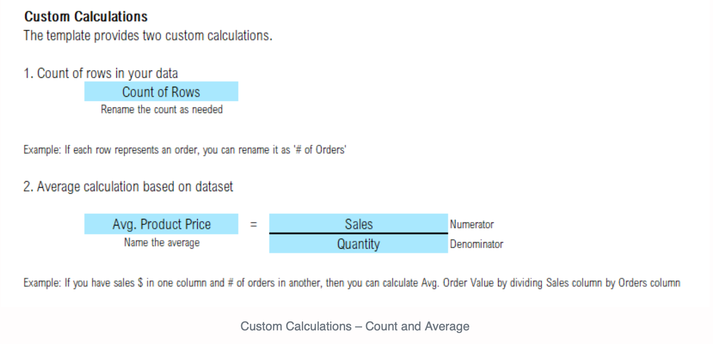
The template can also automatically generate some commonly used aggregation calculations. One of these calculations is the Count of Rows calculation. For example, if your data set concerns orders, this calculation will tell you the exact number of orders.
Another calculation available is the Average calculation. This will generate the sum of one measure/the sum of another measure, for example Sales/Quantity. This can be customized to any two measures of your choosing.
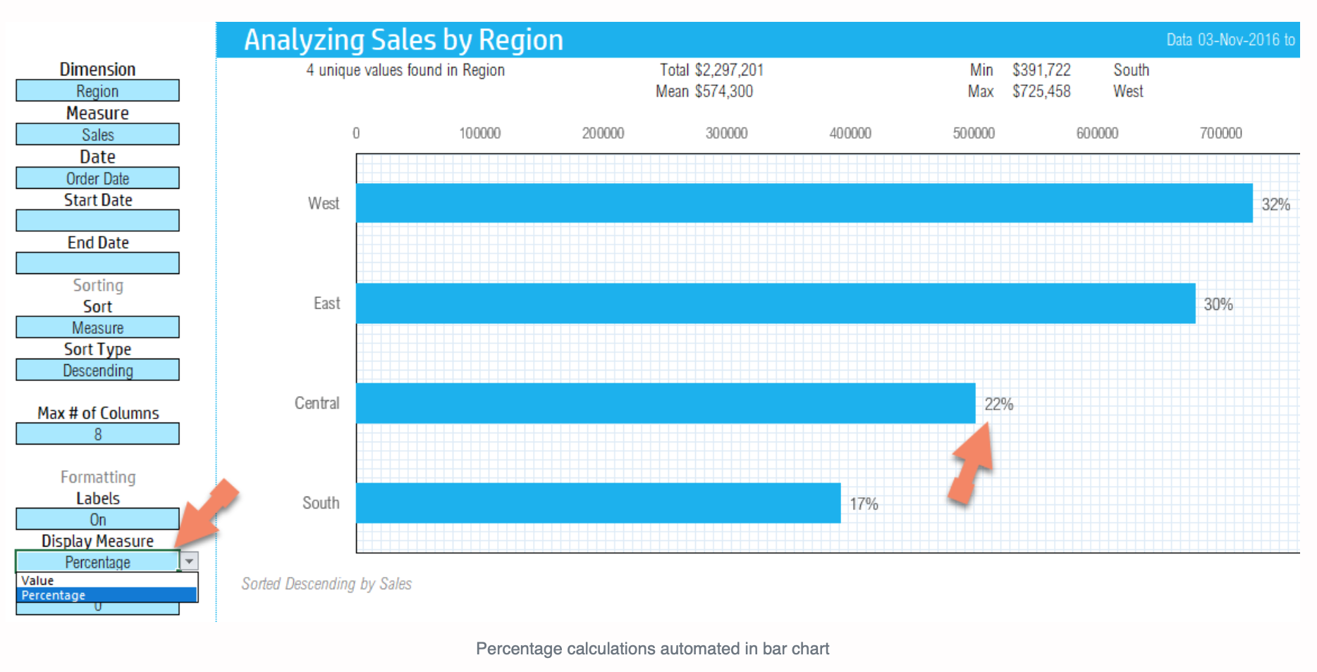
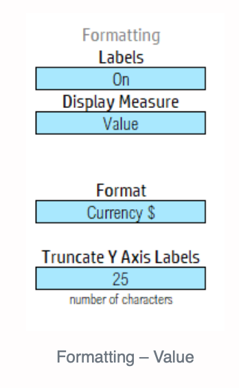
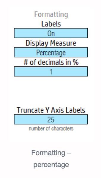
With a single click, you can choose to represent the percentage total, or the numerical figure as the value of each bar.
When generating the Pareto analysis, the template will automatically generate the Cumulative or Running total when you choose ‘Pareto’. You can choose either of these percentages of absolute value.
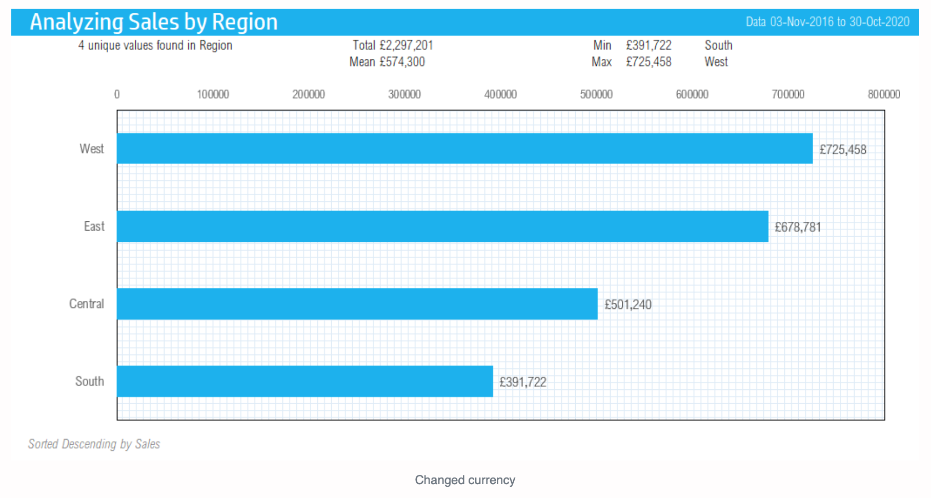
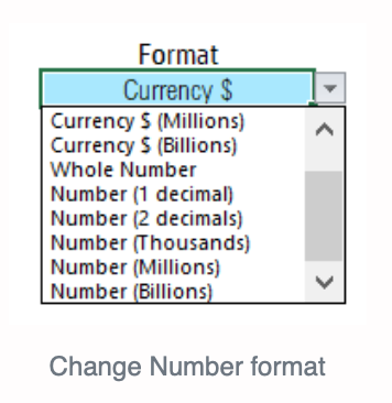
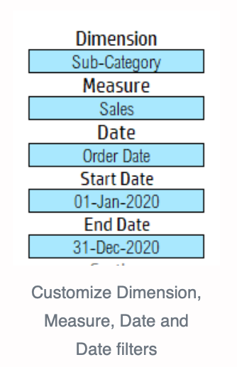
Customize the template to suit your needs by changing the currency. You can also change the formatting options from data labels and choose between Currency, Whole Number and Number with decimals. With one click, you can also change the measure or dimensions, date, and date filters. To narrow your dataset, enter in the start and end dates that you would like to analyze your data between.
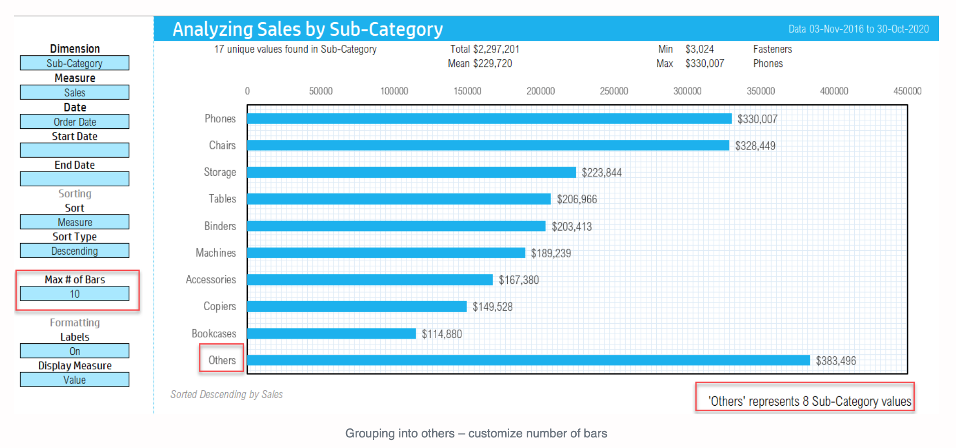
Choose how many bars you would like to display between 5 and 25. The last bar will automatically group your remaining data categories and label it as ‘Others’.
Enter any amount to add the threshold line in your chart. Turn labels displaying the value or percentage on and off when needed.
Requirements: Microsoft 365 Subscription
Limits:
- Dataset size (max 25 columns/fields in dataset, max 25,000 rows by default)
- 25 Bars (distinct values) in Bar Chart
- Max number on unique values in a dimension: 100
Save time by using this effective tool that turns your raw data into meaningful business insights. You can then display these insights with supporting data in an effective format.
Bar charts are successful in analyzing categorical variables by:
1) Ranking data in order of the position in which an individual category contributes compared to other categories. The ranking of data can therefore show which are the top three and bottom three products regarding sales, which product has the highest or lowest sales, and which region contributes the most sales.
2) Determining part-to-whole percentages, meaning what percentage each category contributes to all categories combined. The part-to-whole analysis can therefore show what percentage of sales derives from each product, and how many and which products contribute to 80% of sales, for example.
This template is user-friendly and ready-to-use. Simply copy and paste any dataset into the template, configure the fields for analysis, and generate your valuable insights. You can then view, print, or export the column chart.
A huge time-saver is that the template will automatically generate your chart with effective analysis and a clear visual presentation.
With this template you will also be able to view the categories that exceed a given threshold by comparing factual results against a target threshold. Simply enter in any threshold and the categories that exceed that given threshold will be automatically highlighted along with a threshold line.
Group categories into an ‘Others’ category to make large sets of data look more presentable.
Apply Pareto analysis in one click when large portions of a measure (e.g. 80%) is driven by a small portion (e.g. 20%) of categories.
Highlight the categories that are above and below the mean with one click to generate a Different from Mean Analysis.
Use the Stacked Bar Chart to gain a deeper understanding of your data by measuring on two dimensions. For example, you could measure your sales by region but within each region view the sales proportioned into each category.
The 100% Stacked Bar Chart will enable you to view the normalized values. Like the Stacked Bar Chart, this chart will measure on two dimensions. You could measure your sales by region like the previous chart, but this time break down the sales in each region to measure percentage of sales by the type of product being sold, e.g., furnishings.
It is also possible to highlight the minimum and maximum categories in different colors.
Use the ‘Custom Highlight’ option in the template to highlight the position or rank of a certain category compared to the others.
You can also apply dynamic slicers to filter segments of data to your needs.
The template can also automatically generate some commonly used aggregation calculations. One of these calculations is the Count of Rows calculation. For example, if your data set concerns orders, this calculation will tell you the exact number of orders.
Another calculation available is the Average calculation. This will generate the sum of one measure/the sum of another measure, for example Sales/Quantity. This can be customized to any two measures of your choosing.
With a single click, you can choose to represent the percentage total, or the numerical figure as the value of each bar.
When generating the Pareto analysis, the template will automatically generate the Cumulative or Running total when you choose ‘Pareto’. You can choose either of these percentages of absolute value.
Customize the template to suit your needs by changing the currency. You can also change the formatting options from data labels and choose between Currency, Whole Number and Number with decimals. With one click, you can also change the measure or dimensions, date, and date filters. To narrow your dataset, enter in the start and end dates that you would like to analyze your data between.
Choose how many bars you would like to display between 5 and 25. The last bar will automatically group your remaining data categories and label it as ‘Others’.
Enter any amount to add the threshold line in your chart. Turn labels displaying the value or percentage on and off when needed.
Requirements: Microsoft 365 Subscription
Limits:
- Dataset size (max 25 columns/fields in dataset, max 25,000 rows by default)
- 25 Bars (distinct values) in Bar Chart
- Max number on unique values in a dimension: 100
This Best Practice includes
1 Excel Template
