
Originally published: 10/02/2022 15:06
Publication number: ELQ-17187-1
View all versions & Certificate
Publication number: ELQ-17187-1
View all versions & Certificate

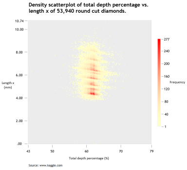
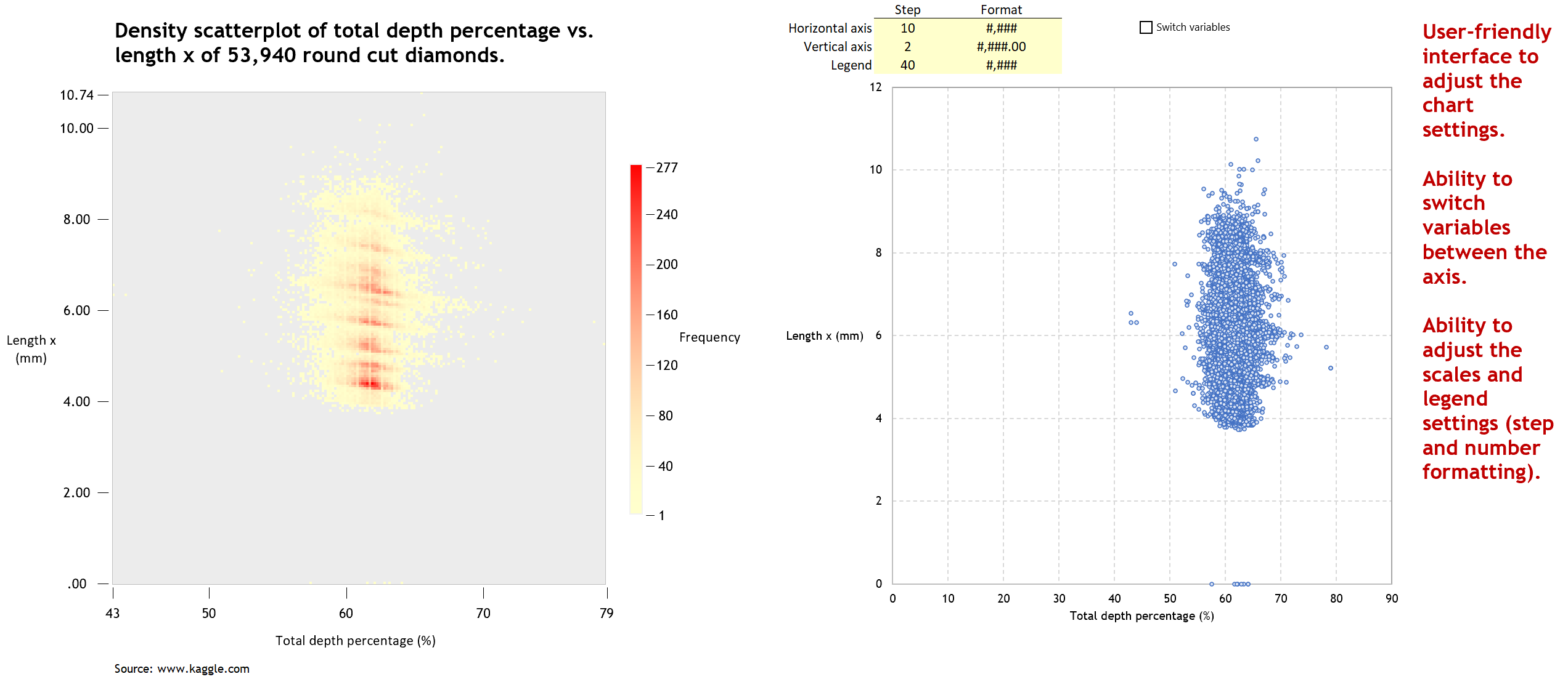
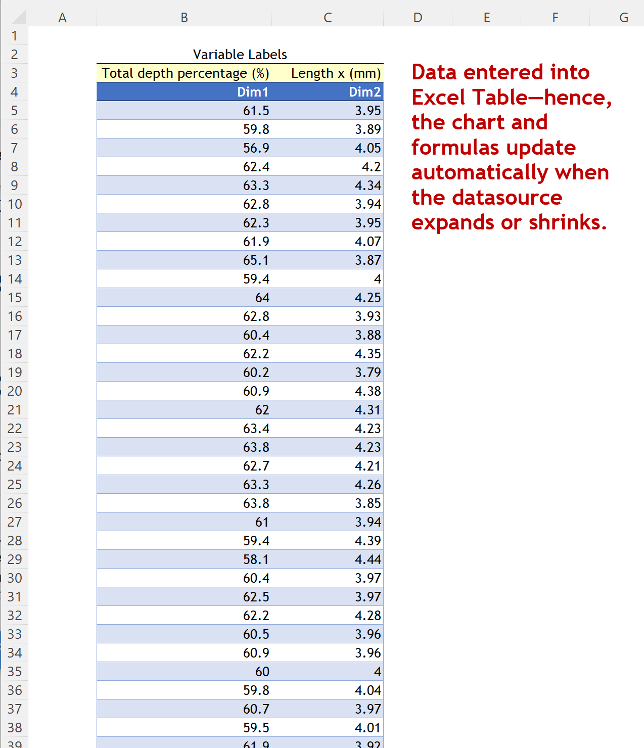
Density Scatterplot in Excel
Excel template to build a Density Scatterplot to solve the problem of over-plotting in statistical graphs.
I build tools that make data analysis, data visualization and real estate investment analysis easier, faster and more fun.Follow
Further information
To enable business analysts, consultants, scientists, statisticians, data visualizers and journalists to produce Density Scatterplots in Excel to solve the problem of over-plotting in statistical graphs.
Exploratory data analysis (EDA), reporting and communication in business, science, statistics, data visualization or data journalism.
Template relies heavily on Excel's Dynamic Arrays capabilities, only available to Office 365 subscribers.
