Cycle Plot in Excel
Originally published: 29/03/2021 07:38
Last version published: 13/04/2021 11:41
Publication number: ELQ-42041-6
View all versions & Certificate
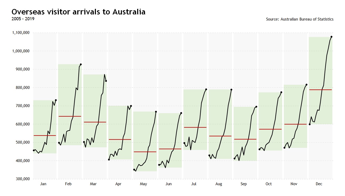
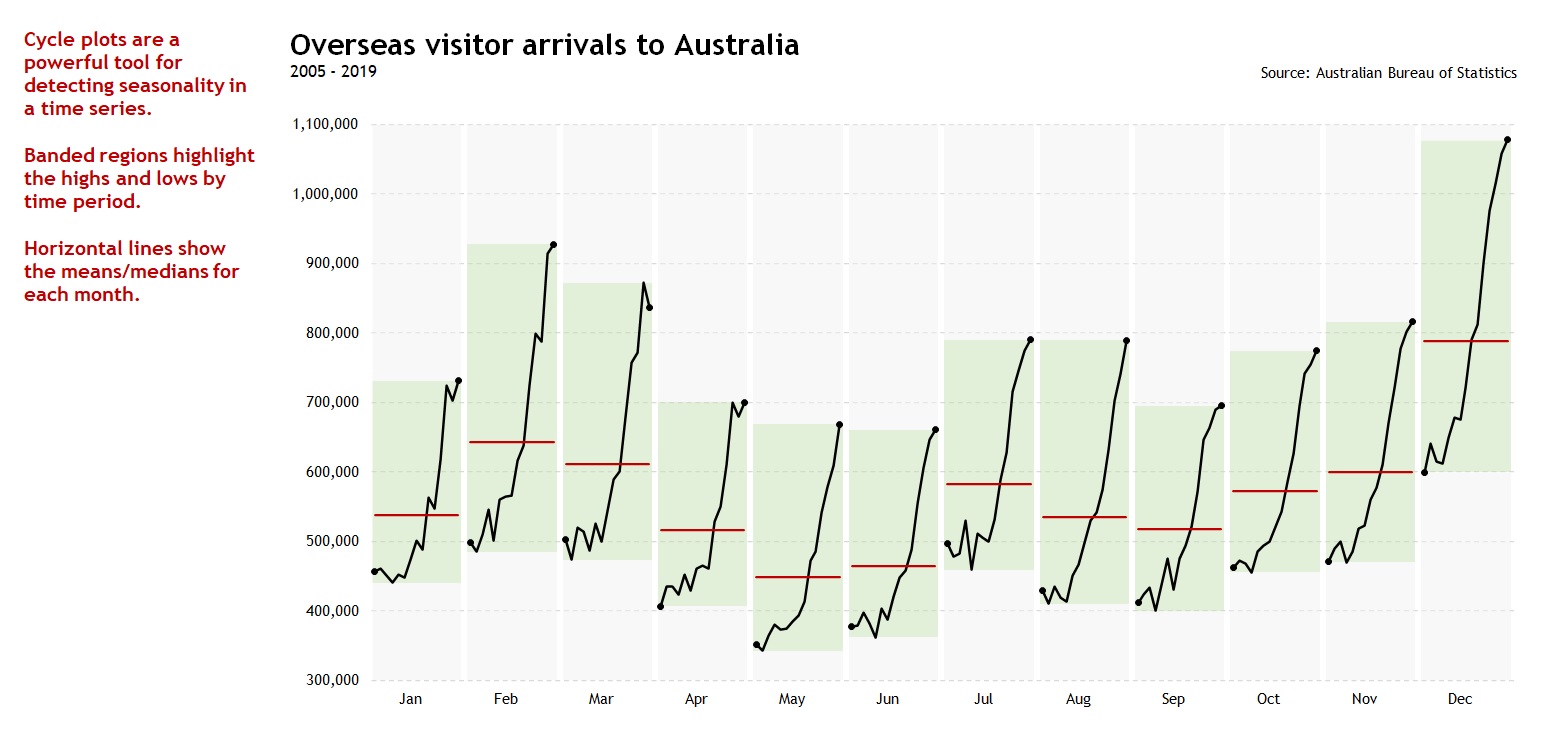
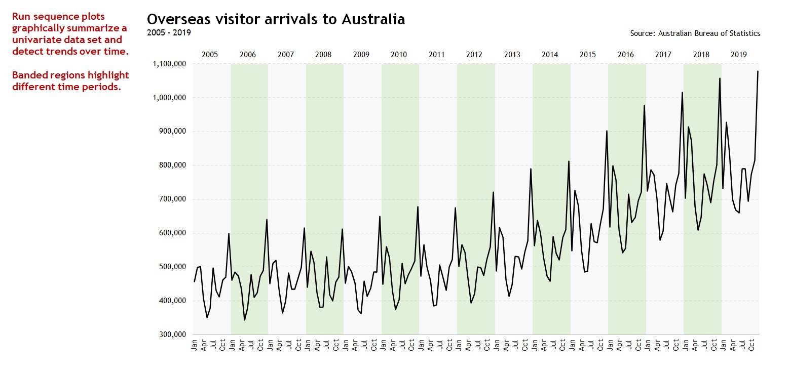
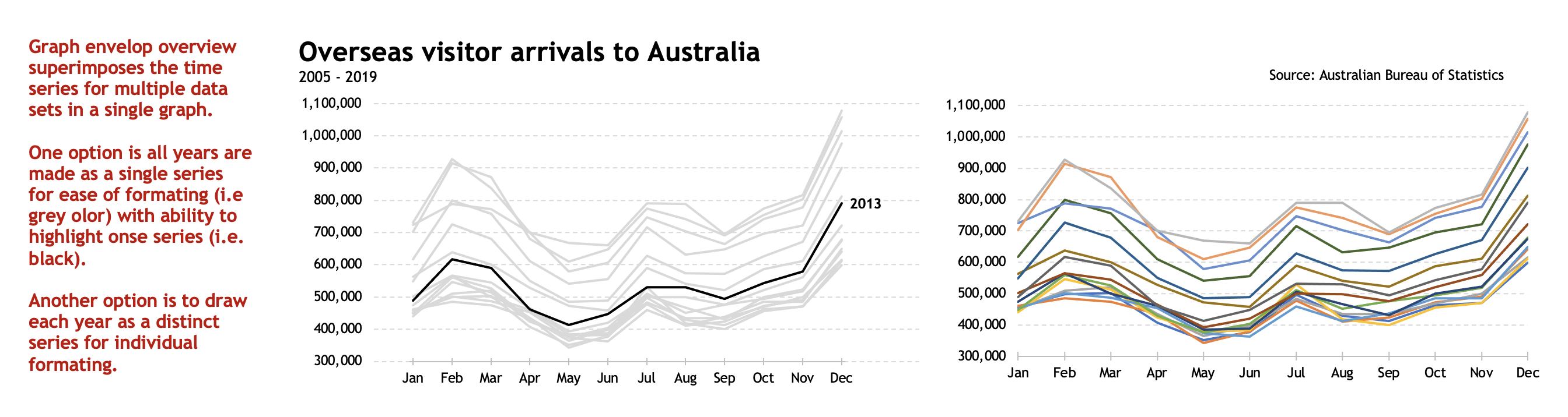
certified

Cycle Plot in Excel

Excel/PowerPoint template to build Cycle Plots, Run Sequence Plots and Graph Envelope Overview to detect seasonality.

Description
We've always been fascinated by the concept of “time”. It's probably the most important concept known to mankind and has long been a major subject of study in religion, philosophy, and science. No wonder that our ancestor's oldest attempt to represent data graphically was a time series.

Trend, cyclicality, seasonality and irregularity are patterns of interest to decision makers. And cycle plots are a powerful tool for detecting seasonality in a time series. They can provide answers to questions such as:

1. Do the data exhibit any regular seasonal behavior?
2. What is the nature of the seasonality?
3. Is there a within-group pattern (e.g., do February and August exhibit similar patterns)?
4. Are there any unusual observations?

So here I'm offering you an Excel template that takes a dataset as an input and creates a Cycle Plot. You will also get a PowerPoint template for the same graph. The Excel model has a summary worksheet (named PowerPoint) that organizes the data in a way compatible with the data input required by the PowerPoint template.

The Excel model has the following capabilities:

- Cycle plot with banded regions defining highs and lows by time period.
- Average lines (mean, median or user defined) by time period.
- Run Sequence Plot with banded regions highlighting different time periods—useful for detecting trends over time.
- Graph Envelope Overview—enables the underlying seasonal pattern to be seen more clearly, and also allows any substantial departures from the seasonal pattern to be easily identified.
- Ability to highlight one series using a dropdown list.
- The period of seasonality could be 4 quarters per year, 7 days of week, 12 months of year, 24 hours per day or 52 weeks per year.
- Data entered into Excel Table—hence the chart and formulas update automatically when the datasource expands or shrinks.
- The size of the data matrix is only limited by Excel's charting and calculating capabilities.
- Fully customizable chart using standard Excel functionality.
- Unlocked workbook/worksheets with ability to expand template to suit your needs.

What's the refund policy?

If what you see is not what you expected, just reply to the download email within 30 days, and you'll get a full refund. No questions asked.

NOTE: THE TEMPLATE RELIES HEAVILY ON EXCEL'S DYNAMIC ARRAYS CAPABILITIES, ONLY AVAILABLE TO OFFICE 365 SUBSCRIBERS.

This Best Practice includes
1 Excel model and 1 PowerPoint template

Acquire business license for $10.00

Add to cart

Add to bookmarks

Discuss

Further information

To enable business analysts, scientists, statisticians, data visualizers and journalists to produce Cycle Plots in Excel along with the Run Sequence Plot and the Graph Envelope Overview to detect seasonality.

Forecasting, Exploratory data analysis (EDA), reporting and communication in business, science, statistics, data visualization or data journalism.

Template relies heavily on Excel's Dynamic Arrays capabilities, only available to Office 365 subscribers.


0.0 / 5 (0 votes)

please wait...