


Originally published: 15/04/2021 07:54
Publication number: ELQ-65351-1
View all versions & Certificate
Publication number: ELQ-65351-1
View all versions & Certificate

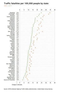
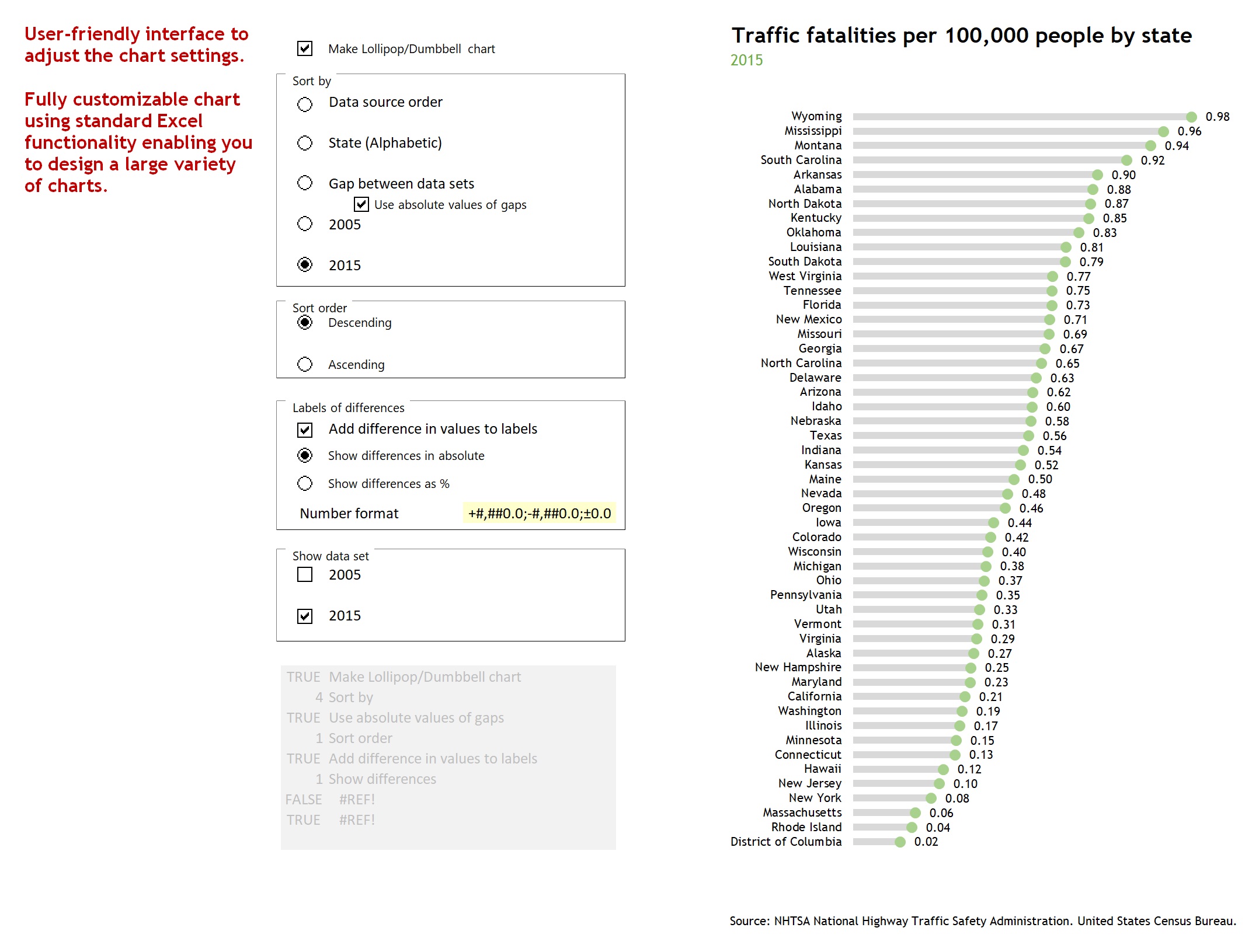
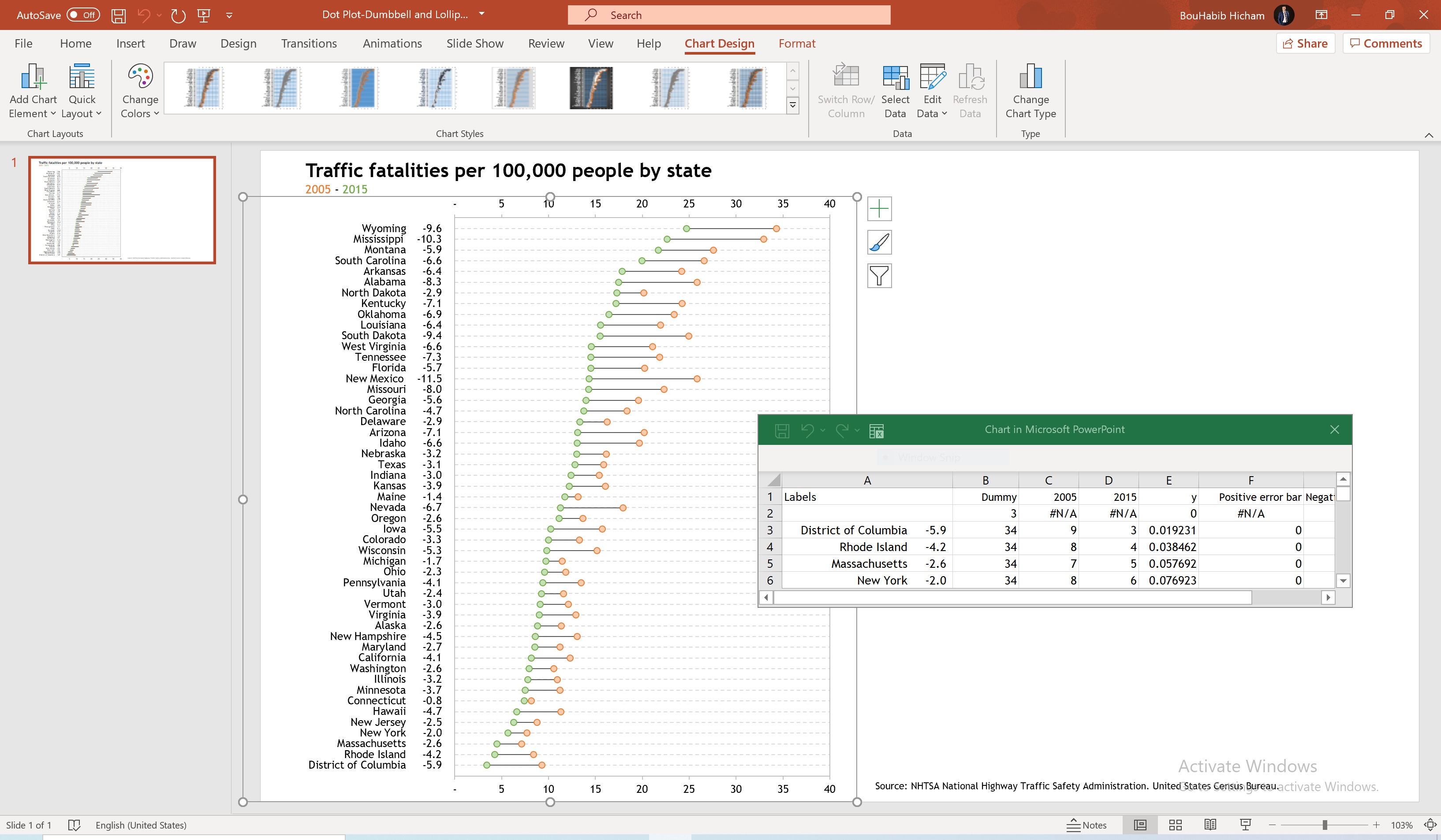
Dot plot / Dumbbell and Lollipop charts in Excel
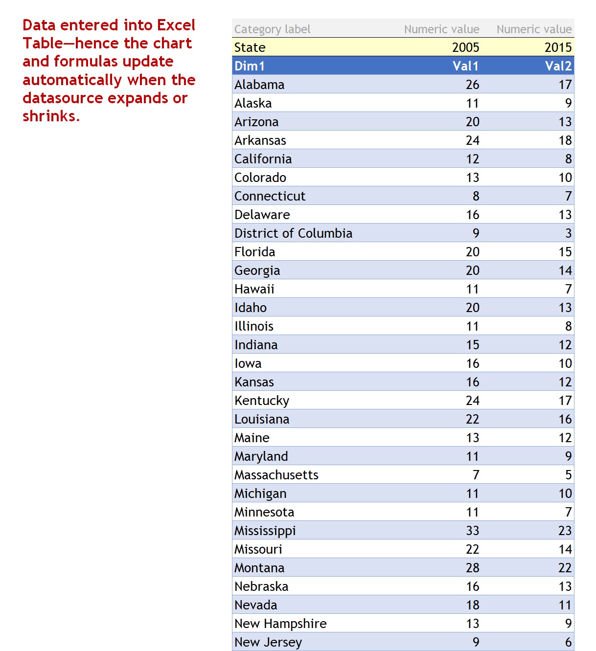
Excel/PowerPoint template to create Dot Plots, Dumbbell and Lollipop charts to rank one or two data series.
I build tools that make data analysis, data visualization and real estate investment analysis easier, faster and more fun.Follow
Further information
To enable business analysts, consultants, scientists, statisticians, data visualizers and journalists to produce Dot plots, Dumbbell and Lollipop charts in Excel and PowerPoint to rank one or two data series.
Exploratory data analysis (EDA), reporting and communication in business, science, statistics, data visualization or data journalism.
Template relies heavily on Excel's Dynamic Arrays capabilities, only available to Office 365 subscribers.
