Originally published: 21/07/2024 14:52
Publication number: ELQ-81143-1
View all versions & Certificate
Publication number: ELQ-81143-1
View all versions & Certificate

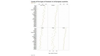
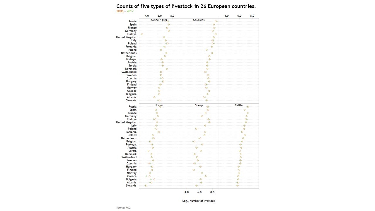
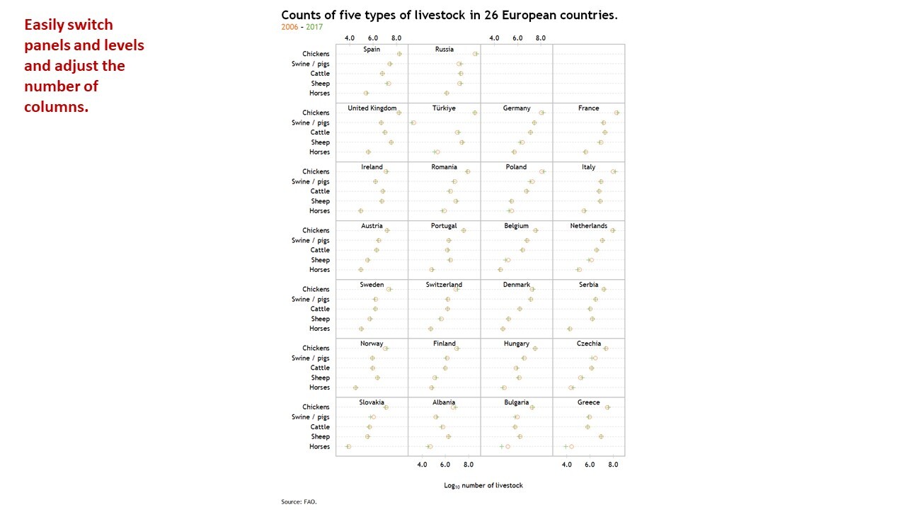
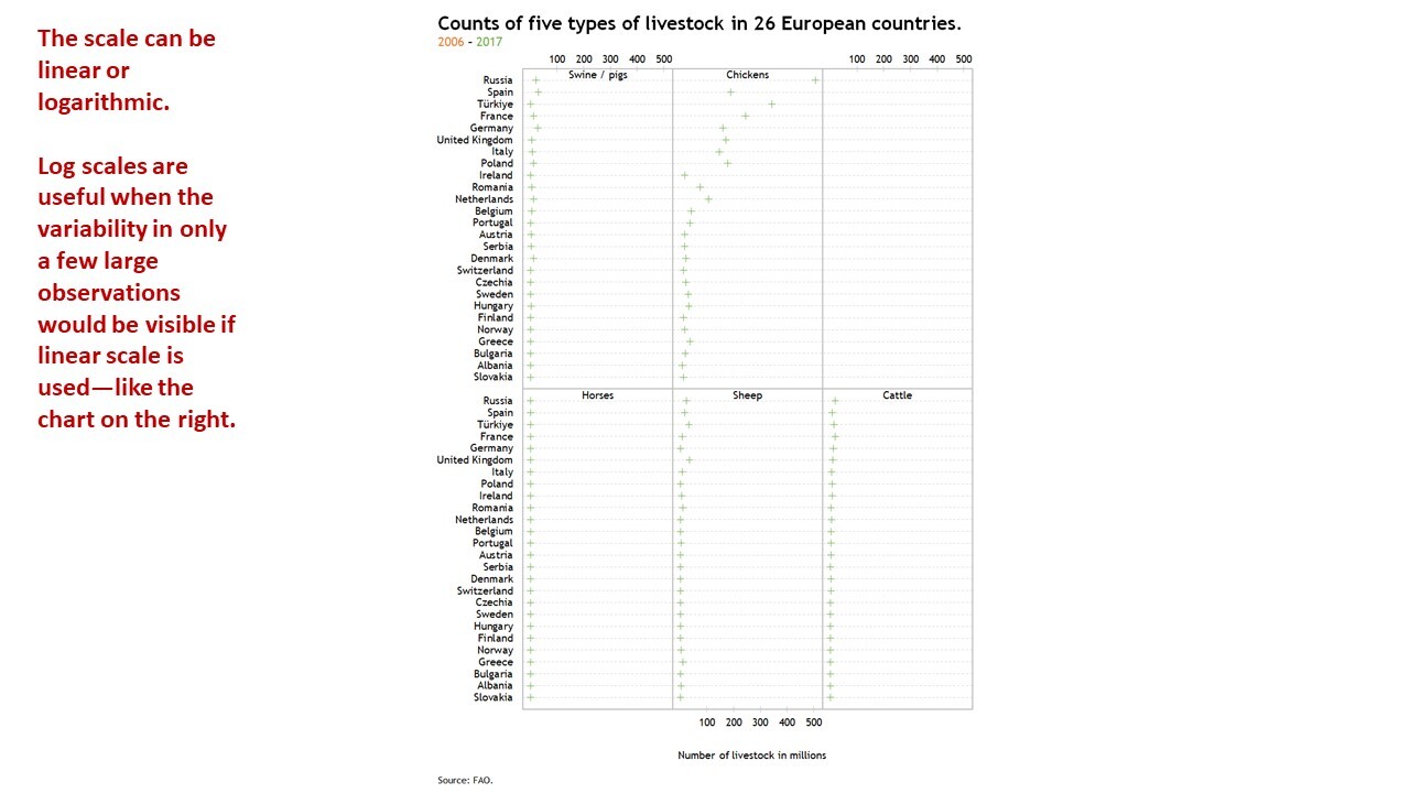
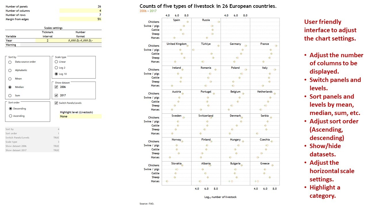
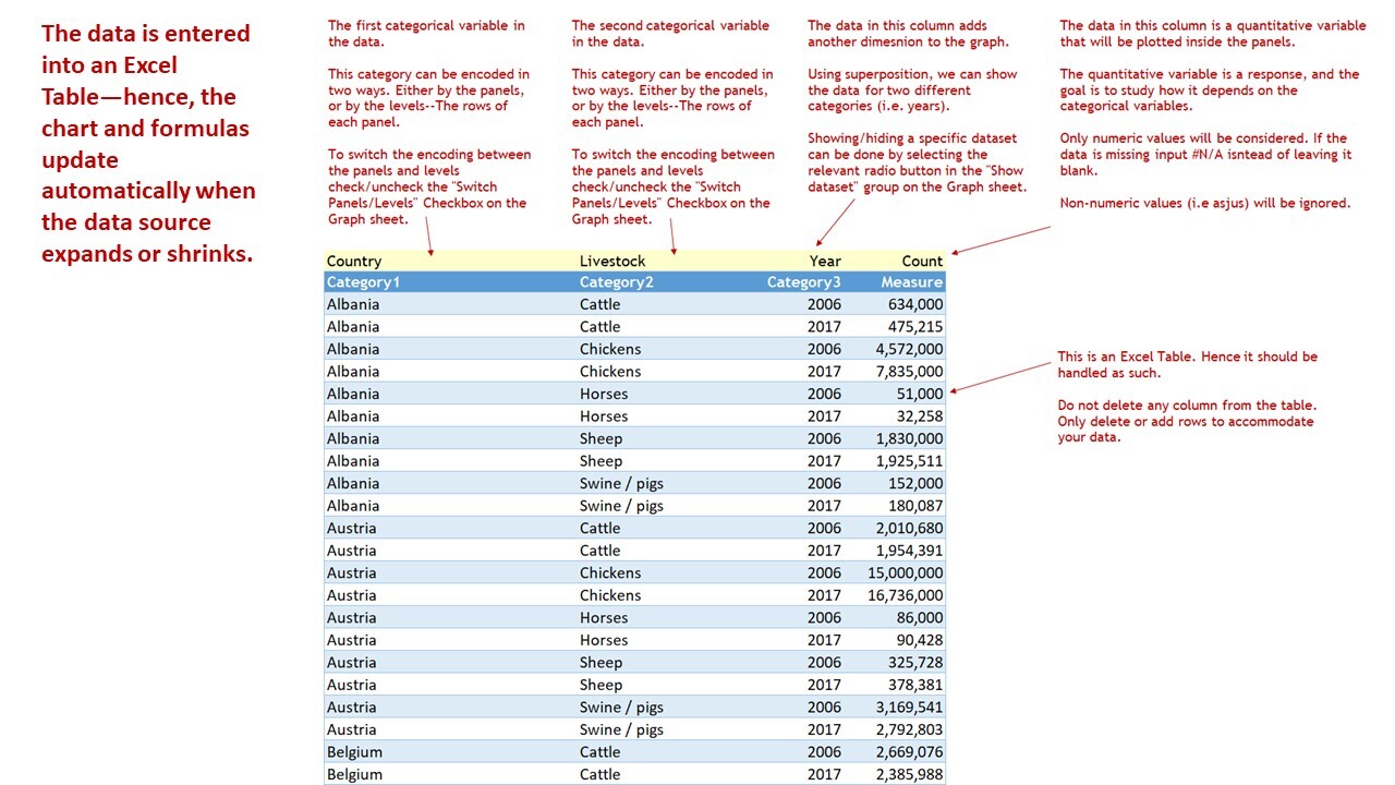
Multiway Dot Plot in Excel
Excel template to build a Multiway Dot Plot—in one chart—for ease of analysis and formatting.
I build tools that make data analysis, data visualization and real estate investment analysis easier, faster and more fun.Follow
Further information
To enable business analysts, consultants, scientists, statisticians, data visualizers and journalists to produce Multiway Dot Plots in Excel to study how a response variable depends on two categorical variables.
Exploratory data analysis (EDA), reporting and communication in business, science, statistics, data visualization or data journalism.
Template relies heavily on Excel's Dynamic Arrays capabilities, only available to Microsoft 365 subscribers.
