Originally published: 25/05/2021 11:47
Publication number: ELQ-36941-1
View all versions & Certificate
Publication number: ELQ-36941-1
View all versions & Certificate

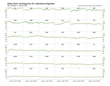
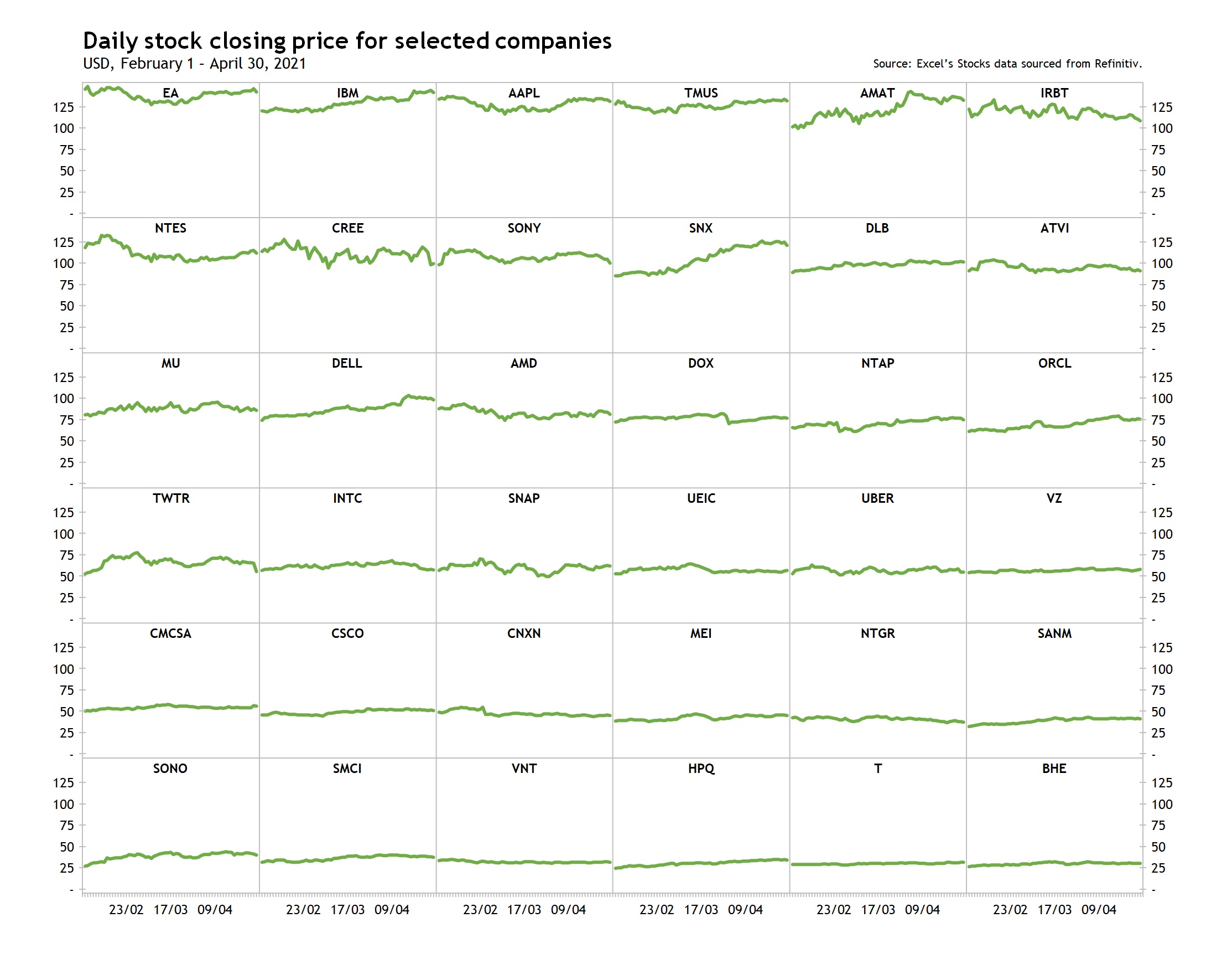
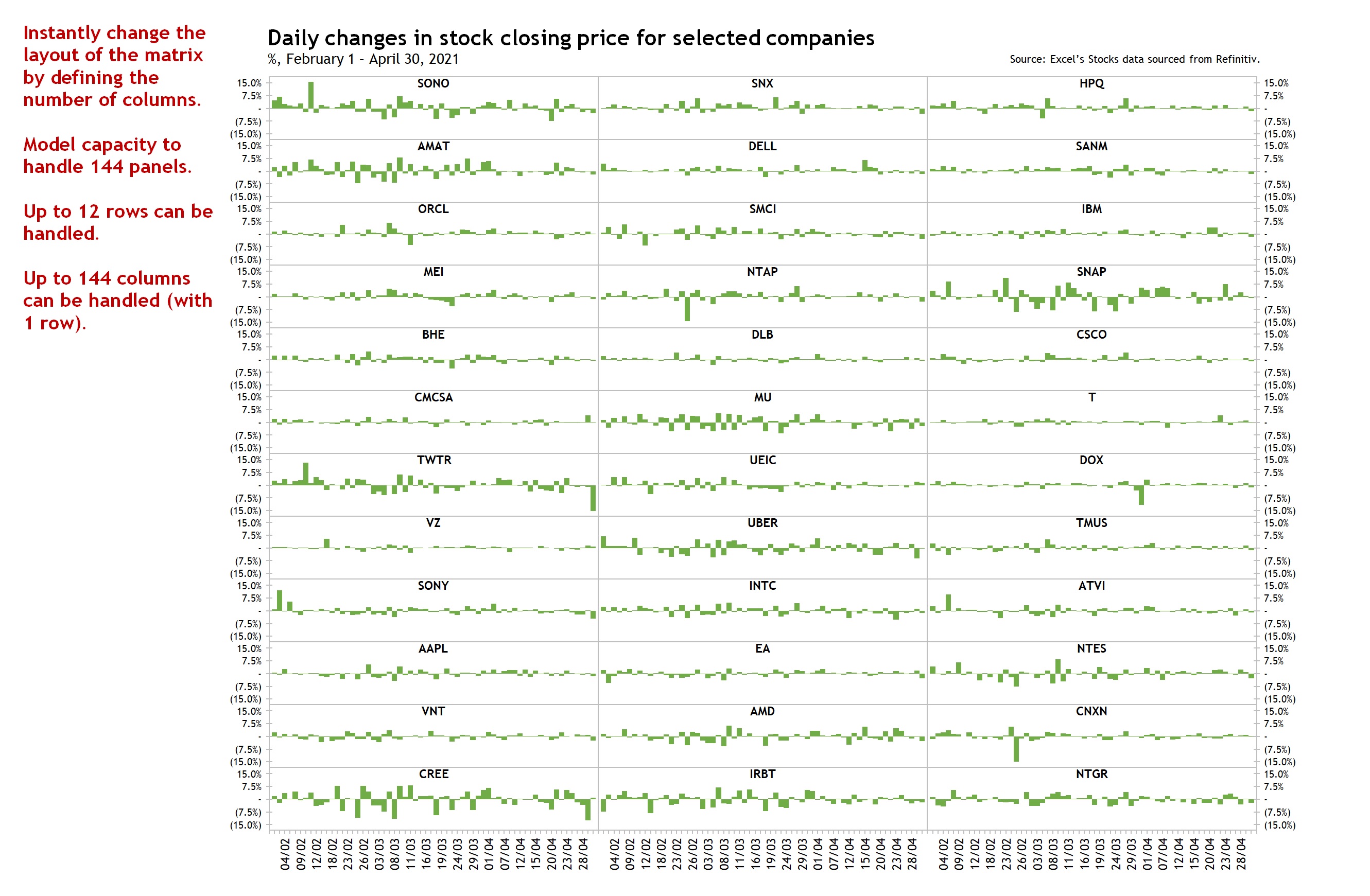
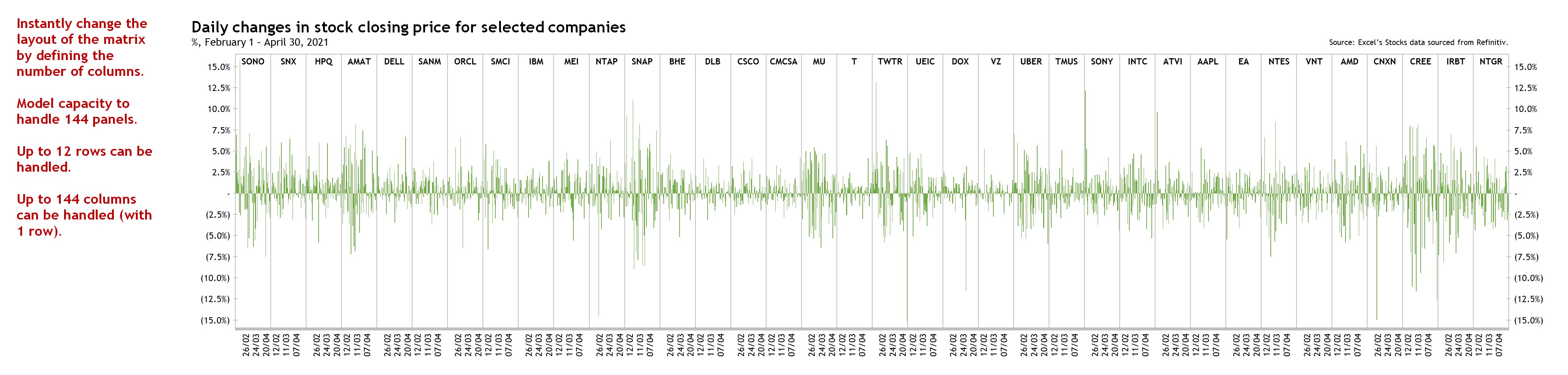
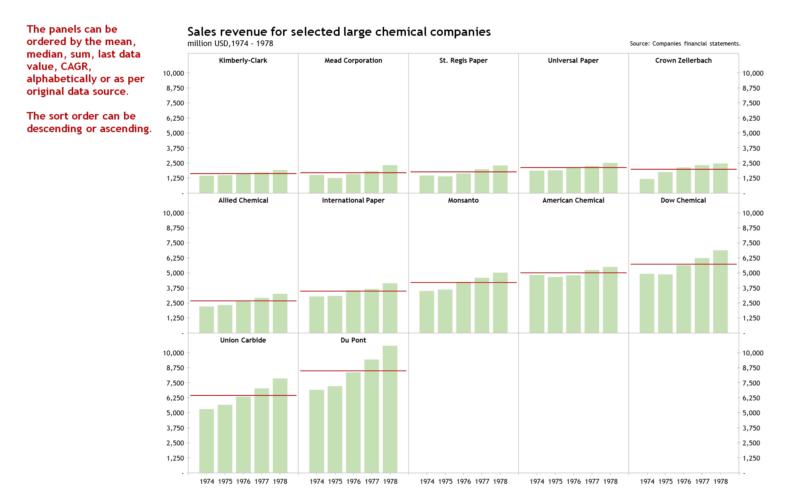
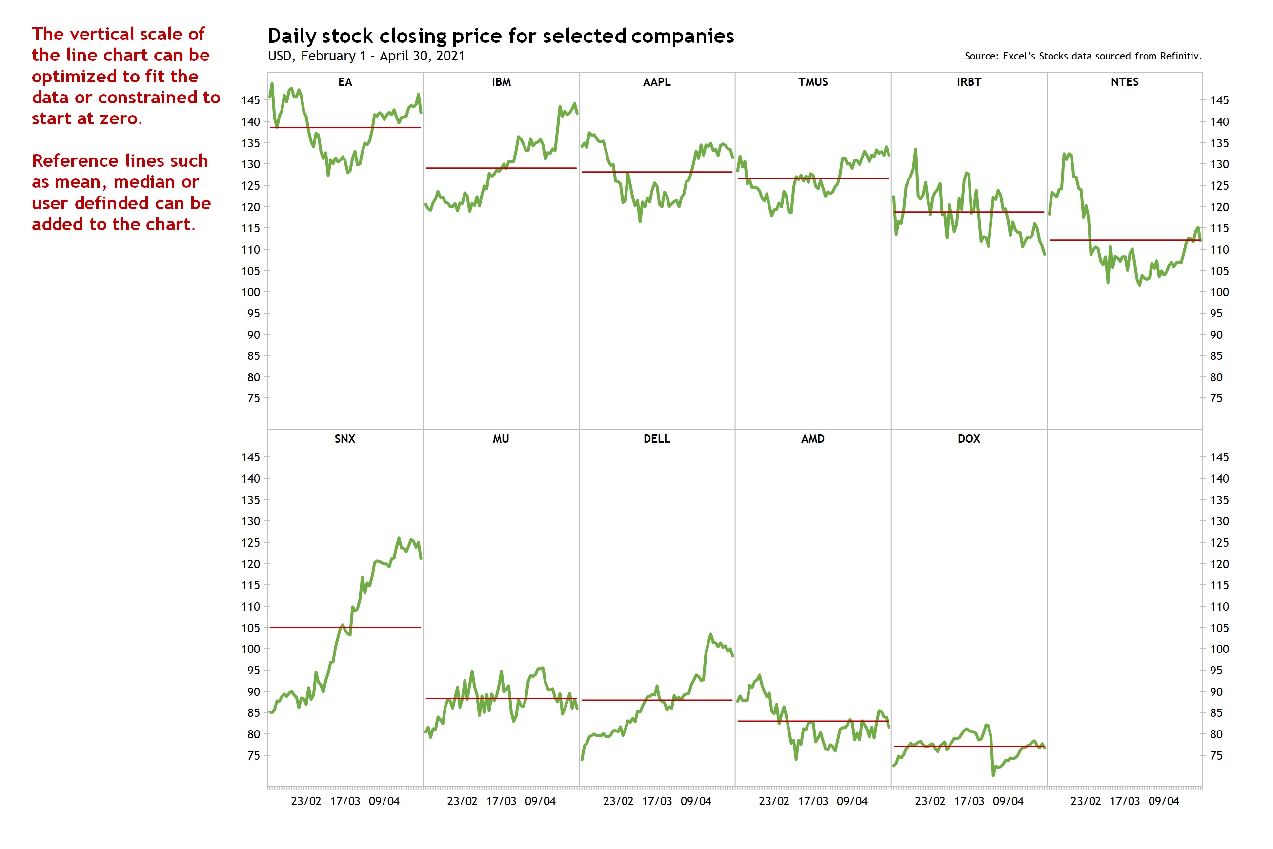
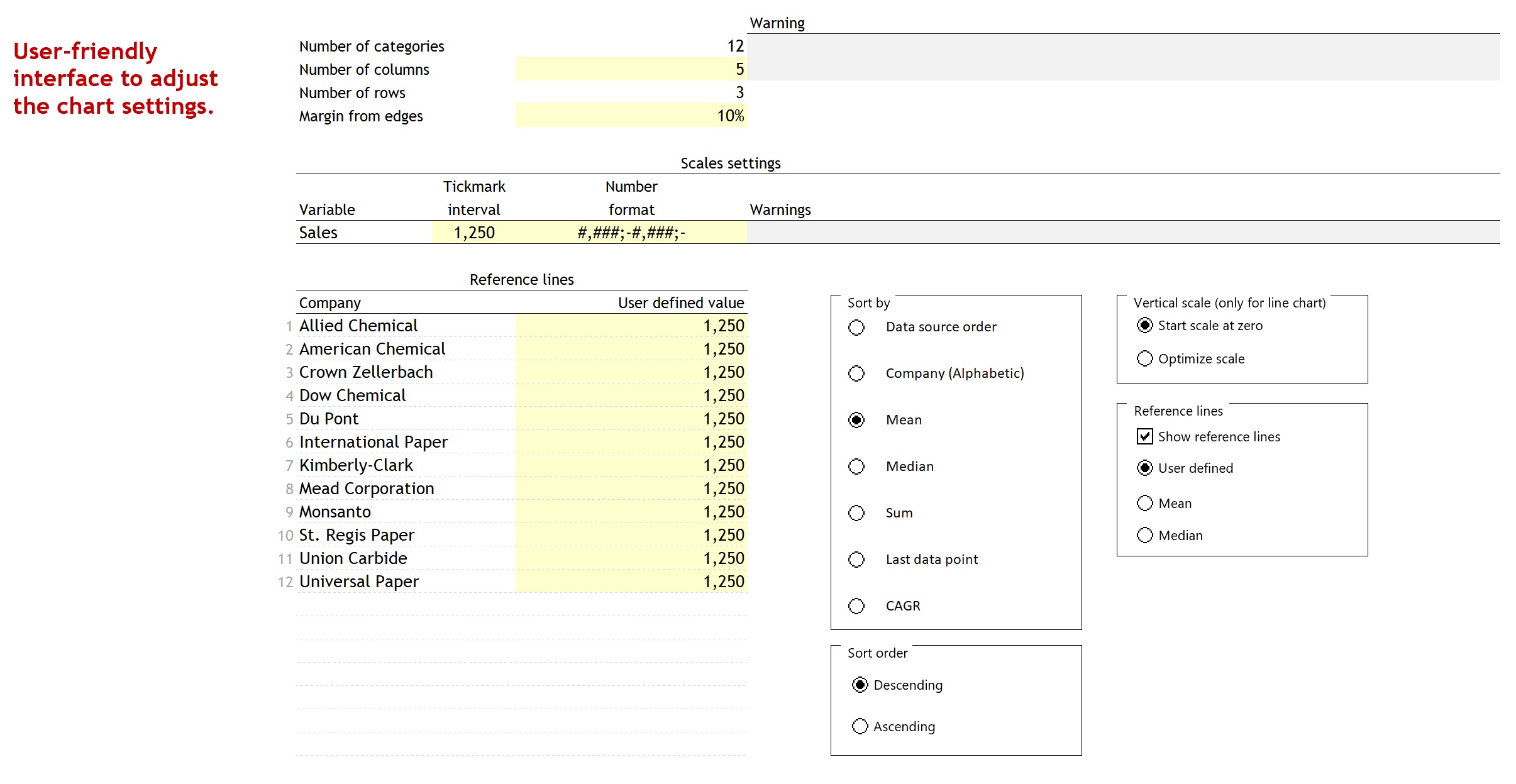
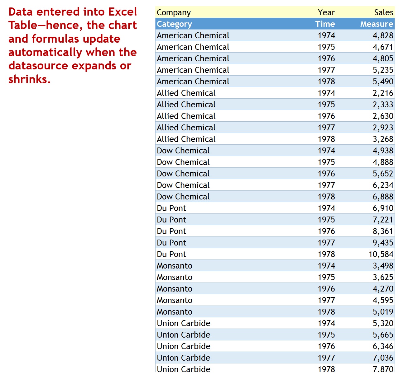
Small Multiple of Bar Graphs or Line Charts in Excel (Trellis / Coplot)
Excel template to build a Small Multiple of Bar Graphs or Line Charts—in one chart—for ease of analysis and formatting.
I build tools that make data analysis, data visualization and real estate investment analysis easier, faster and more fun.Follow
Further information
To enable business analysts, consultants, scientists, statisticians, data visualizers and journalists to produce , Small Multiples (Trellis / Coplot) of Bar Graphs or Line Charts in Excel to show change between two points in time.
Exploratory data analysis (EDA), reporting and communication in business, science, statistics, data visualization or data journalism.
Template relies heavily on Excel's Dynamic Arrays capabilities, only available to Office 365 subscribers.
