
Originally published: 30/11/2021 17:49
Last version published: 16/05/2024 09:05
Publication number: ELQ-12722-19
View all versions & Certificate
Last version published: 16/05/2024 09:05
Publication number: ELQ-12722-19
View all versions & Certificate

McKinsey's Industry Cost Curve Graph Model Template
A PowerPoint Template to modelize McKinsey's Industry Cost Curve to evaluate which actors will be able to serve a market with a given Price and Global Demand.
show more keyboard_arrow_down
Other credits: Don C. Watters (Director Emeritus at McKinsey& Company)
mckinsey & companycost curve frameworkdon c. watterspricingdemandcost analysispricing analysismicroeconomics
Description
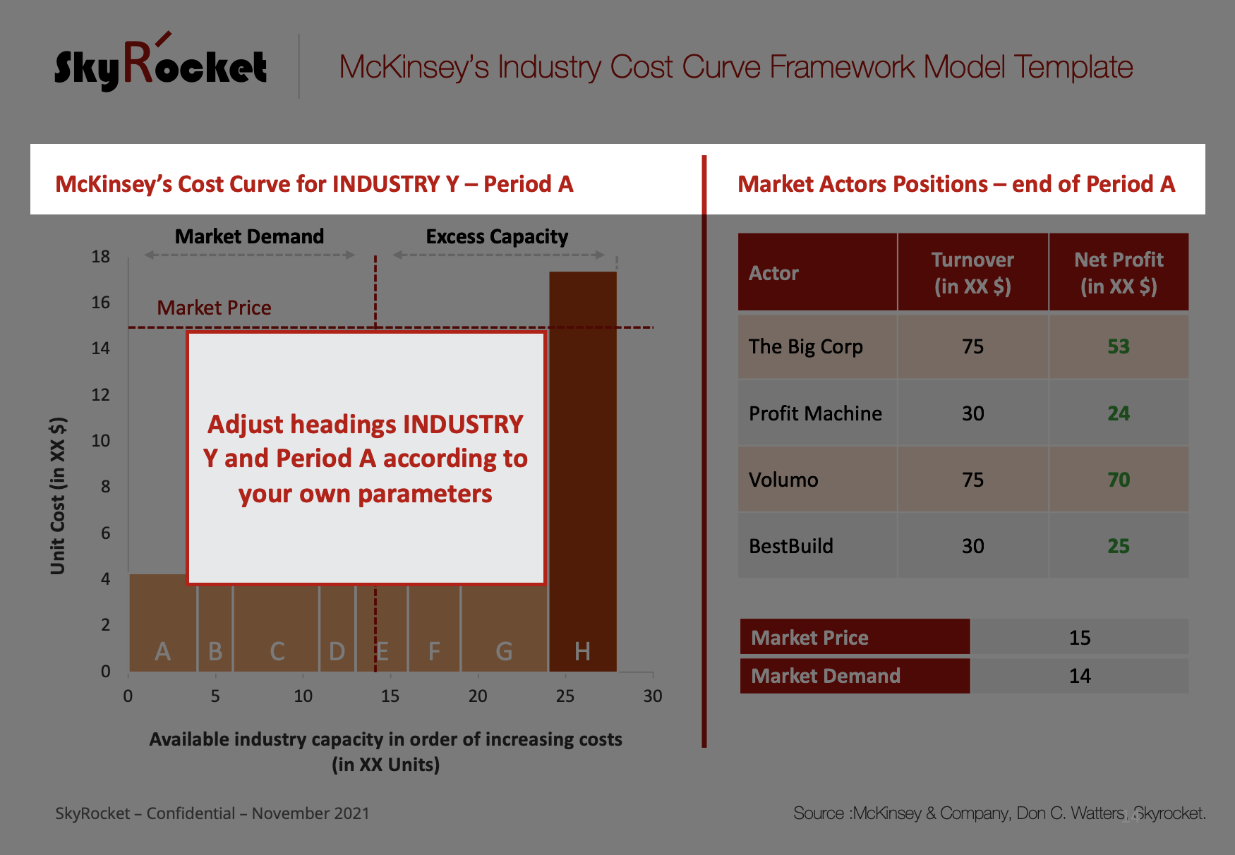
Originally developed by Ted Hall's San Francisco McKinsey & Company office, the Industry Cost Curve was formalised in a staff paper by director Don C. Watters in 1981. A must have for a performance improvement professional, the framework was built to orient strategic decisions in terms of capacity and production made by actors in substantially high and heavy fixed cost industries. It is a "classic" business school model to understand pricing, easily applicable to competitive markets.
See original 2009 article here.
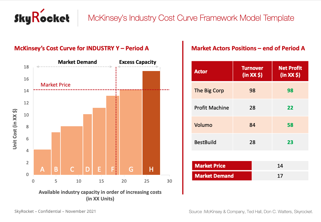
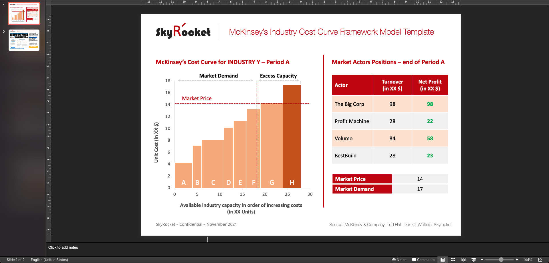
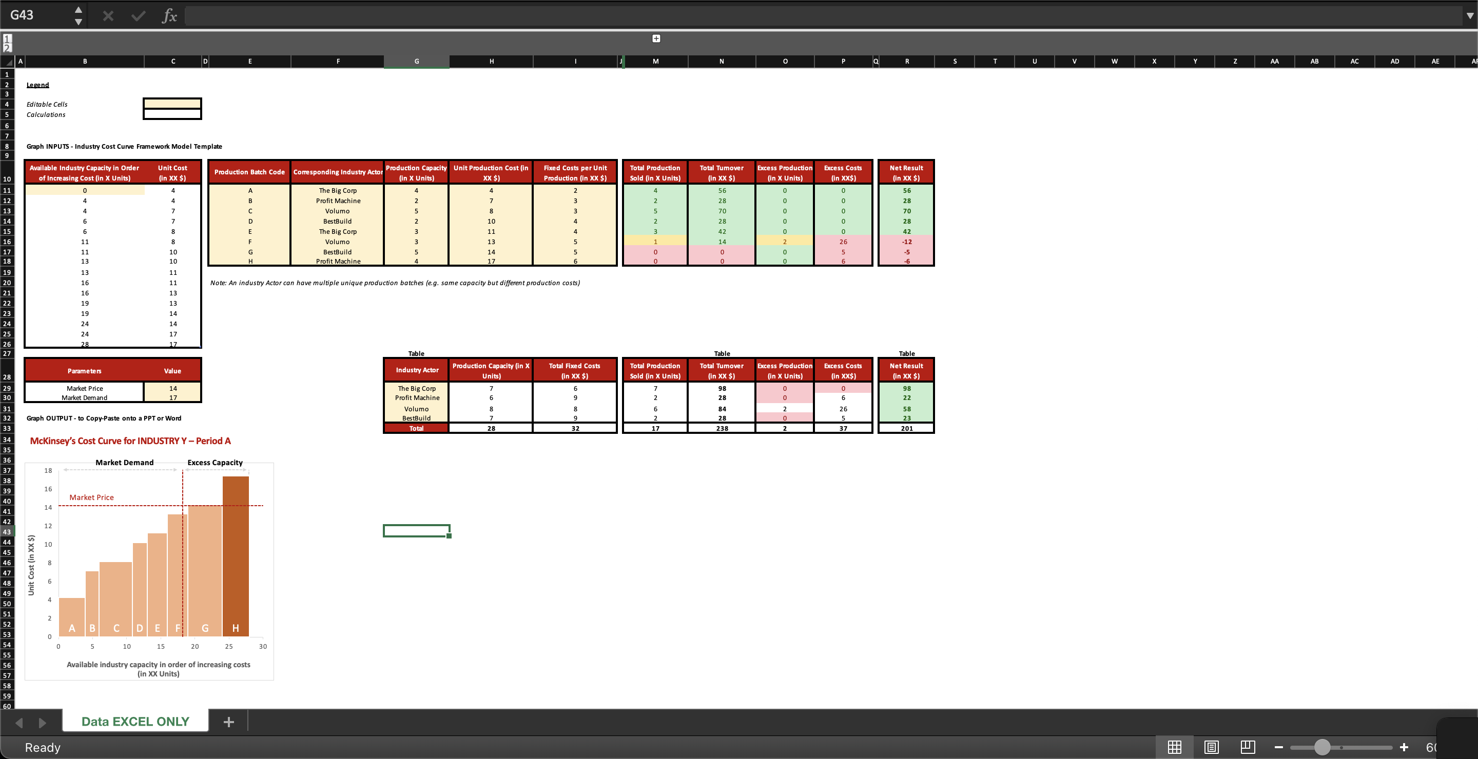
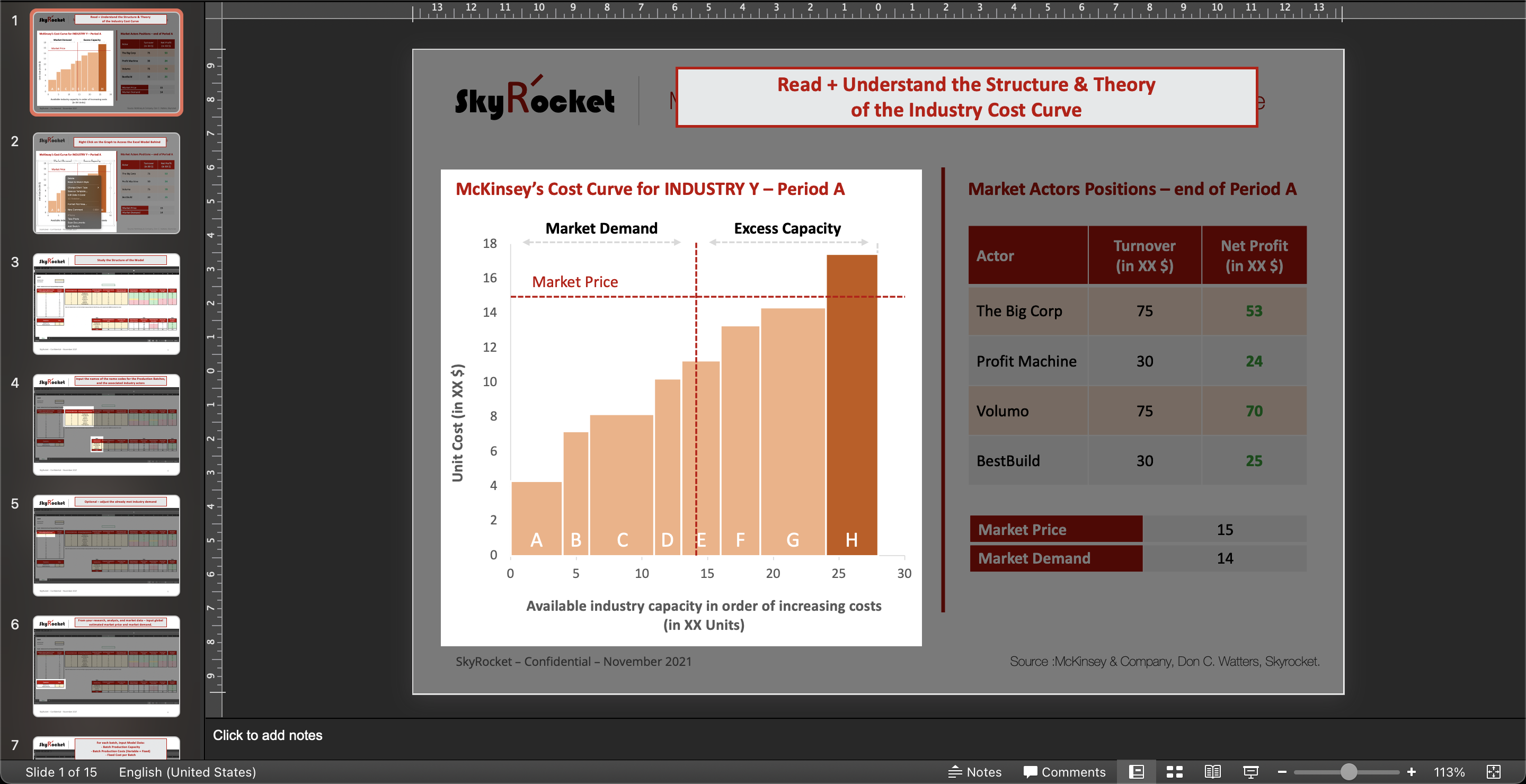
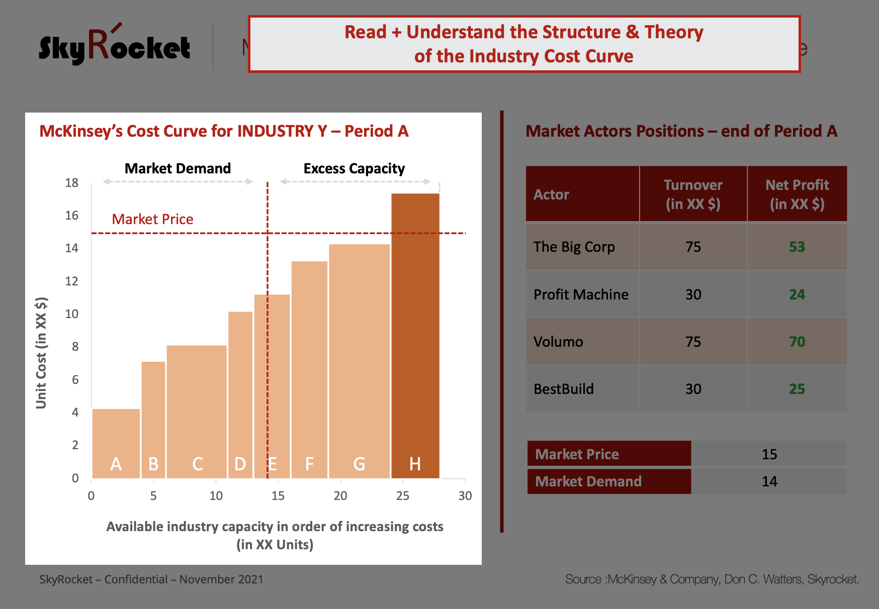
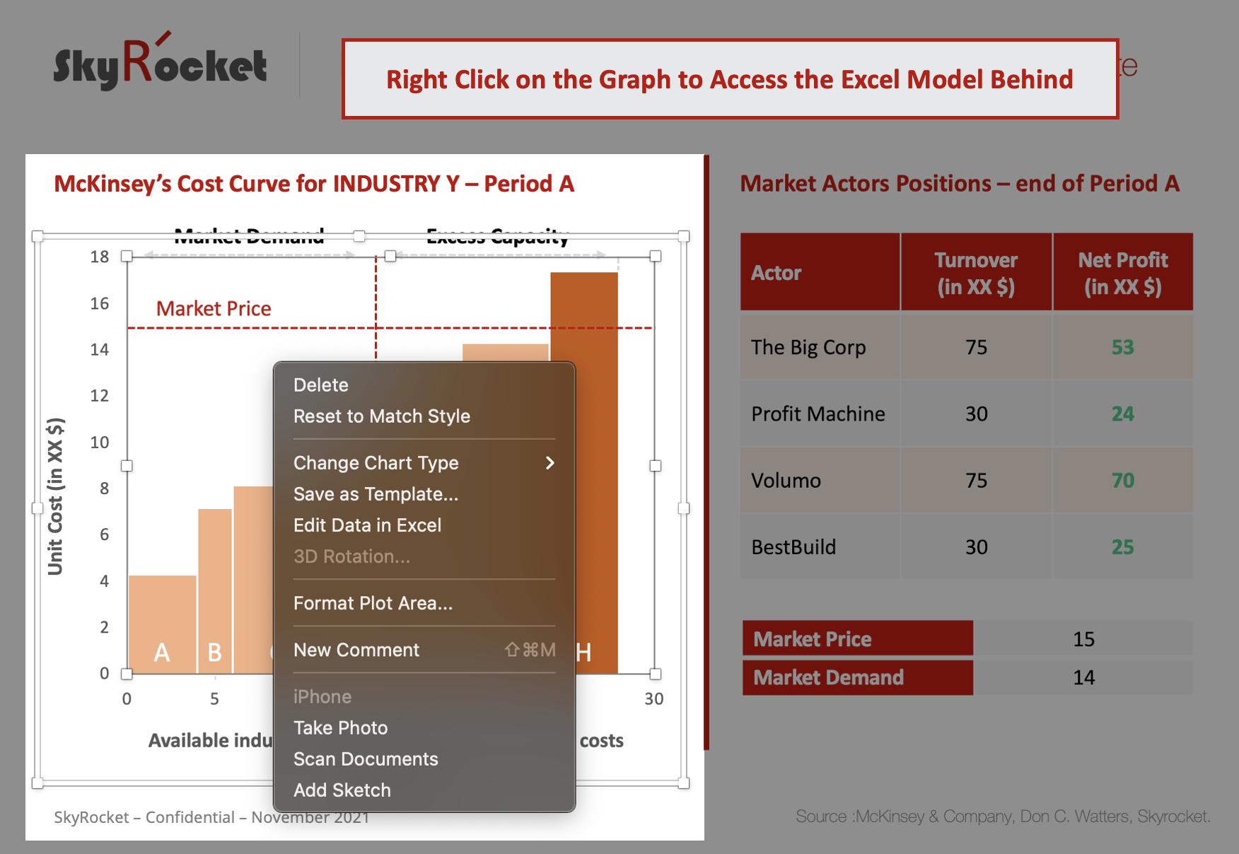
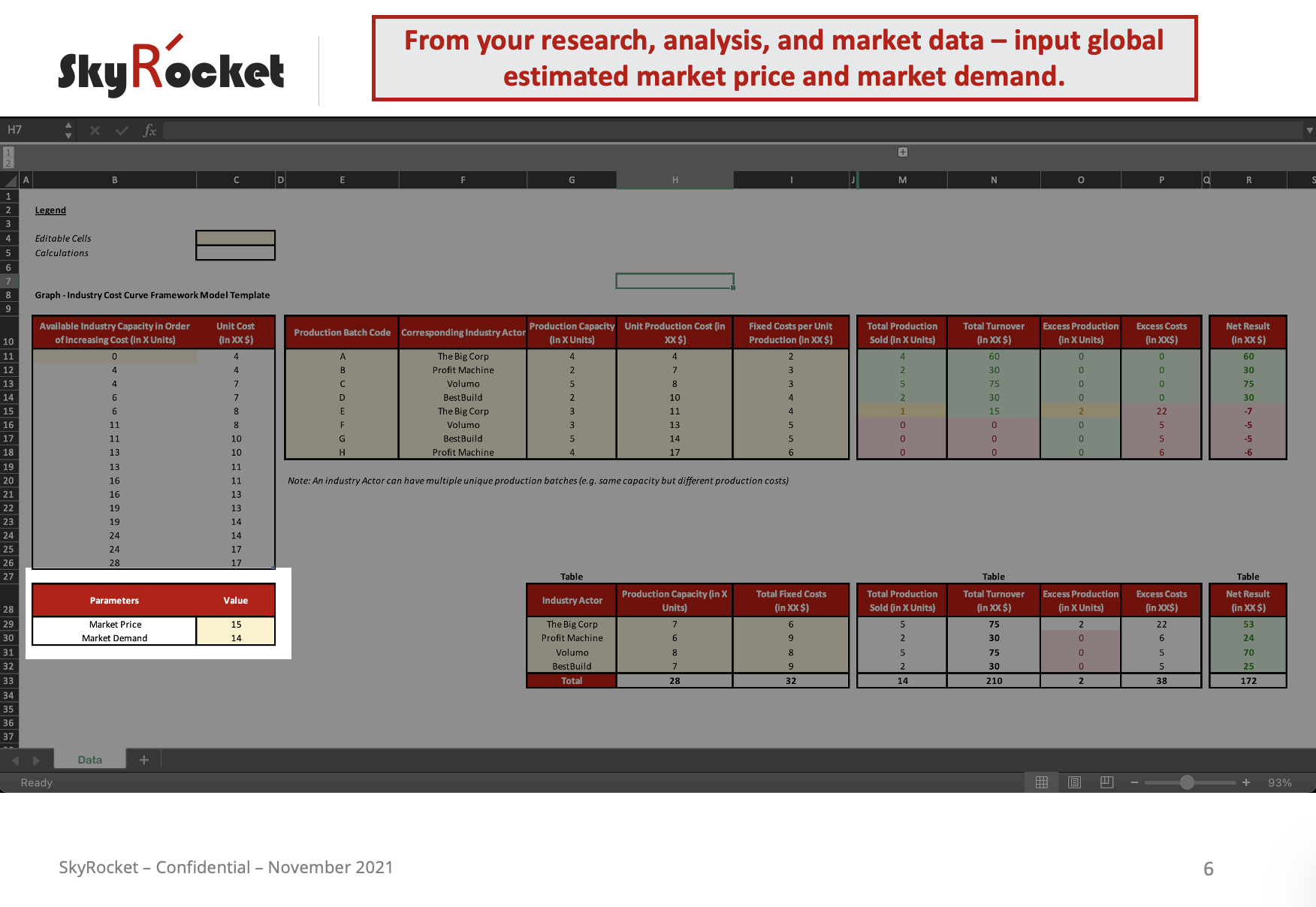
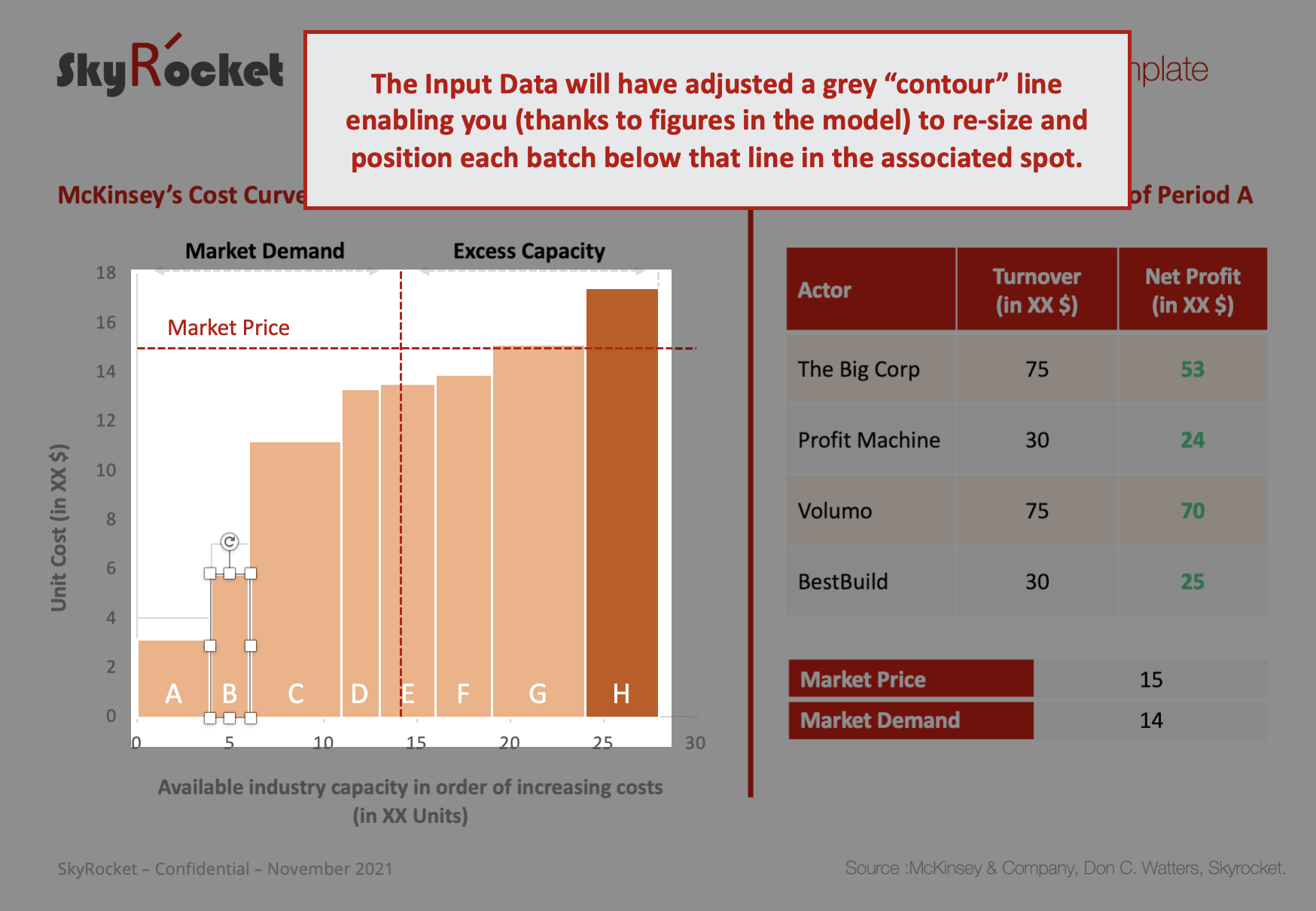
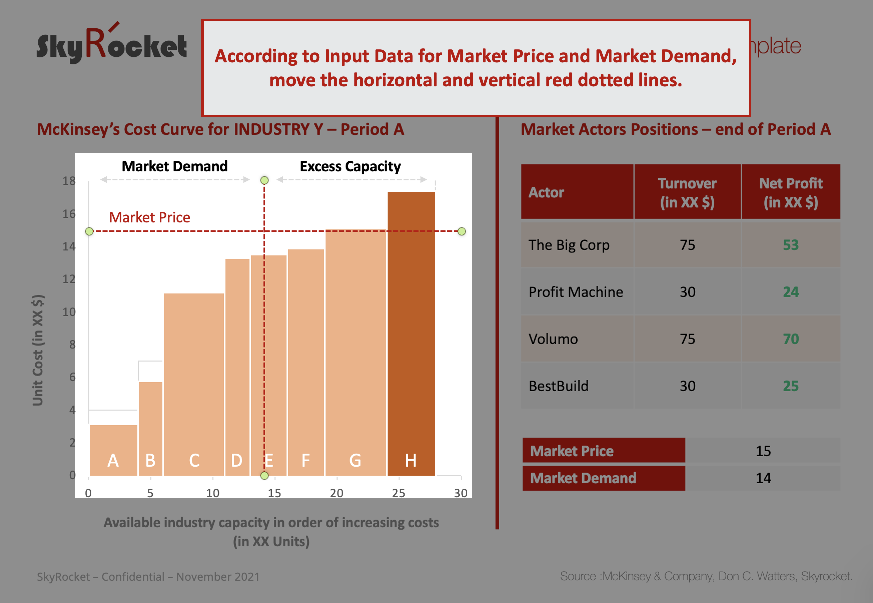
The Industry cost curve, is a microeconomic graph enabling to map production capacities for a given product in order of increasing costs, thus positioning the market price for the industry. Indeed, to determine the market price, you combine the threshold where the demand for the industry's/market's product is met, and the cost of the next available suppliers capacity .
For example: if capacities that serve the market move, what impact is there going to be on market price? What happens if a given company decreases its fixed costs? Variable costs? Is it worth investing now into new capacity at a cost level just below market price?
Before the framework was launched in the 1980s by McKinsey consultants, businesses tended to make decisions on intuition rather than careful analytics and modeling. The arrival of this framework combined with linear programming, helped to depict options and potential moves by market actors.
The framework is mostly pertinent for:
- commodity products
- near commodity products (customers get roughly the same value from the product, even if the supplier varies)
- markets where quantifiable differences in value are prevalent (e.g. travel times)
- climate change models (carbon emmissions etc.)
Another great illustration of the industry cost curve in use and an extract of Watter's work, can be found here.
Given the historical pertinence of this model in the business world over the last 50 years, I decided to create a simple universal template that any analyst, production planner or forecaster can play with.
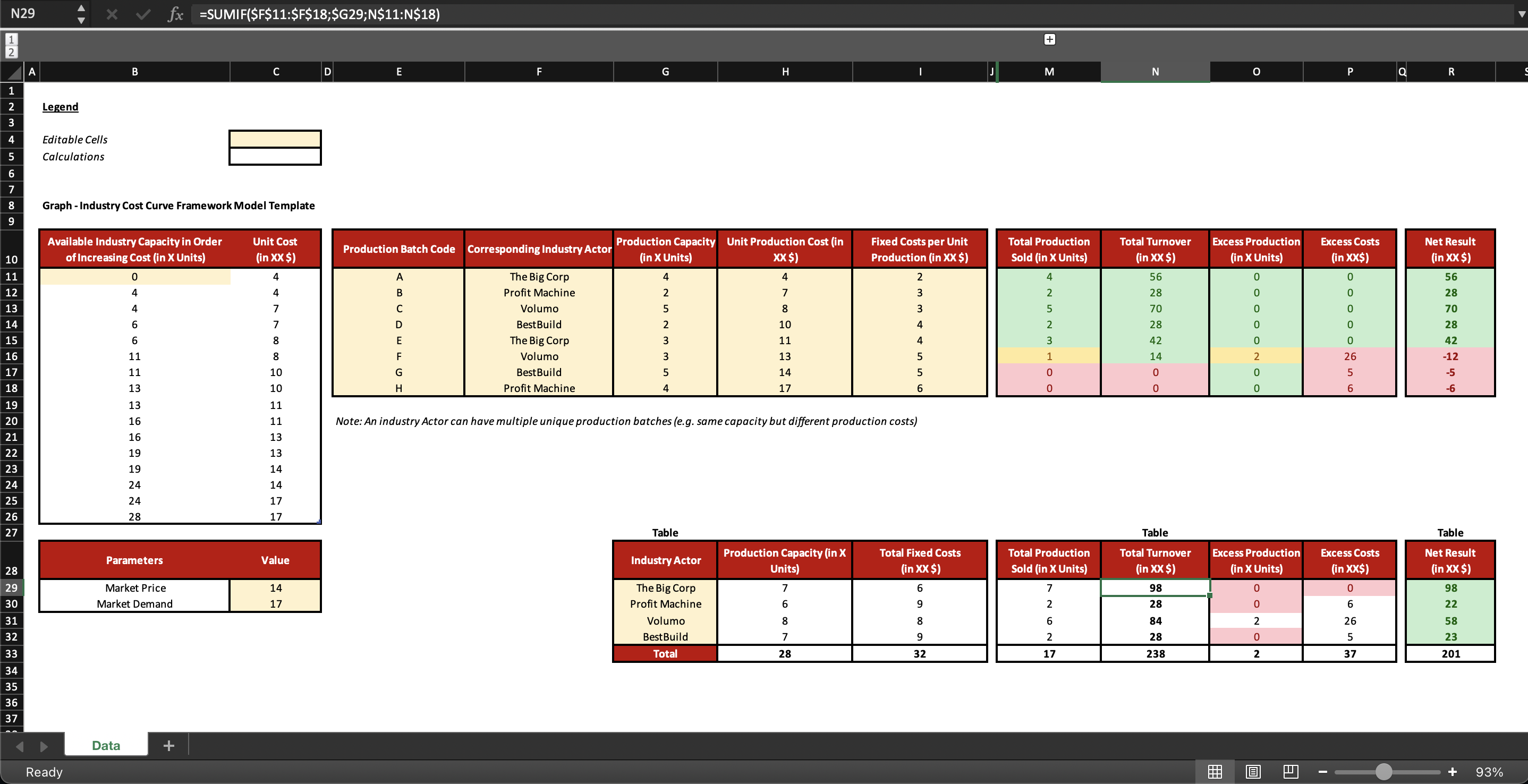
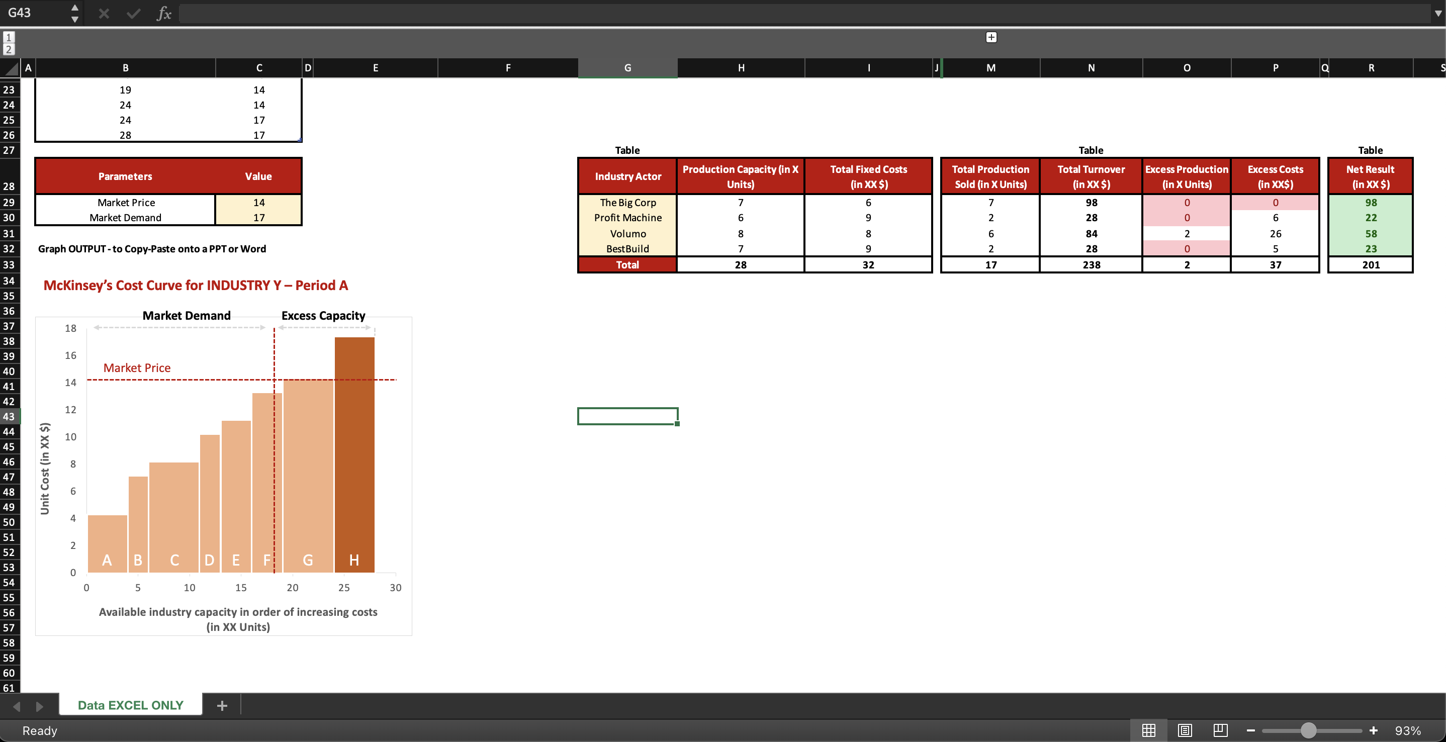
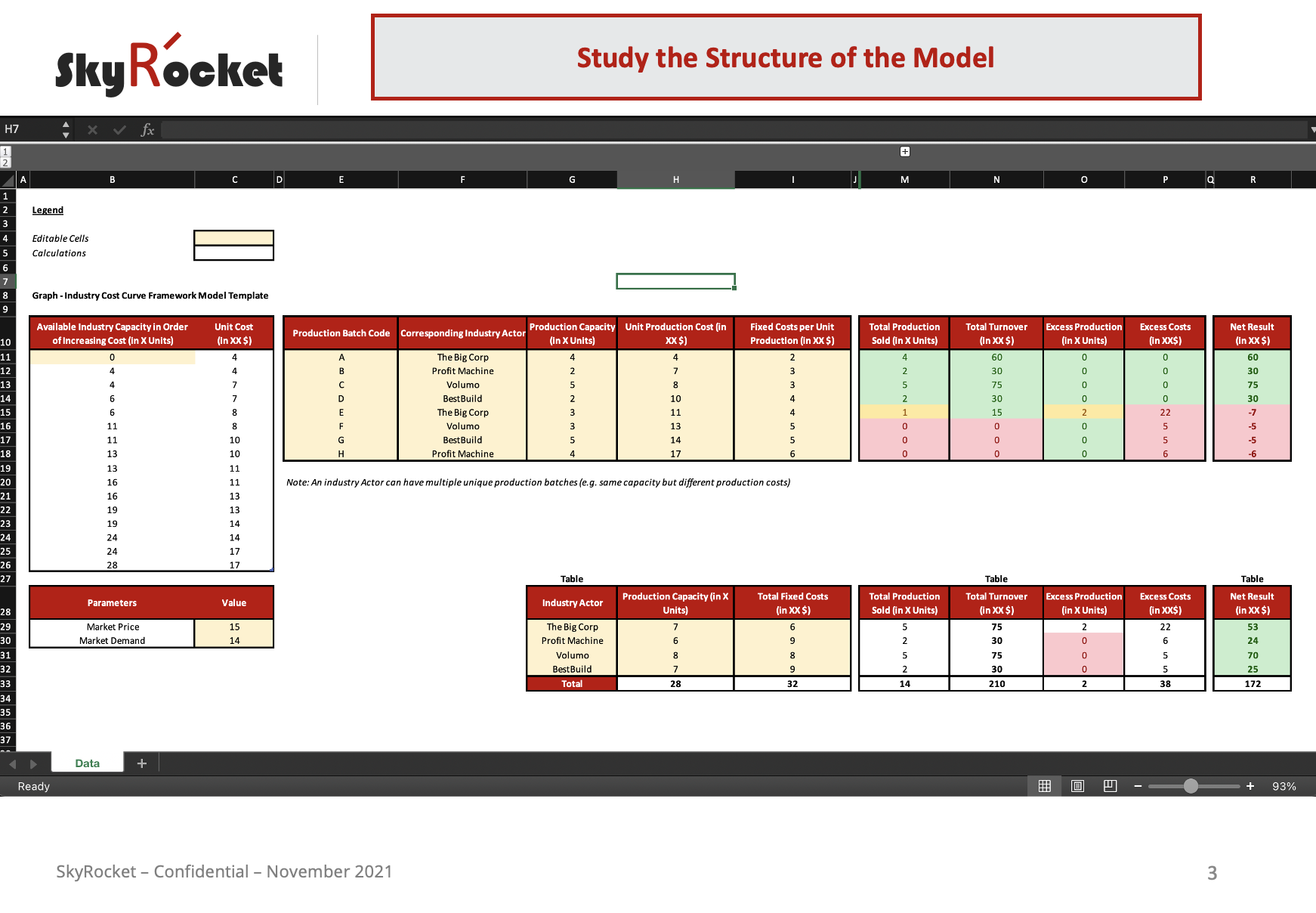
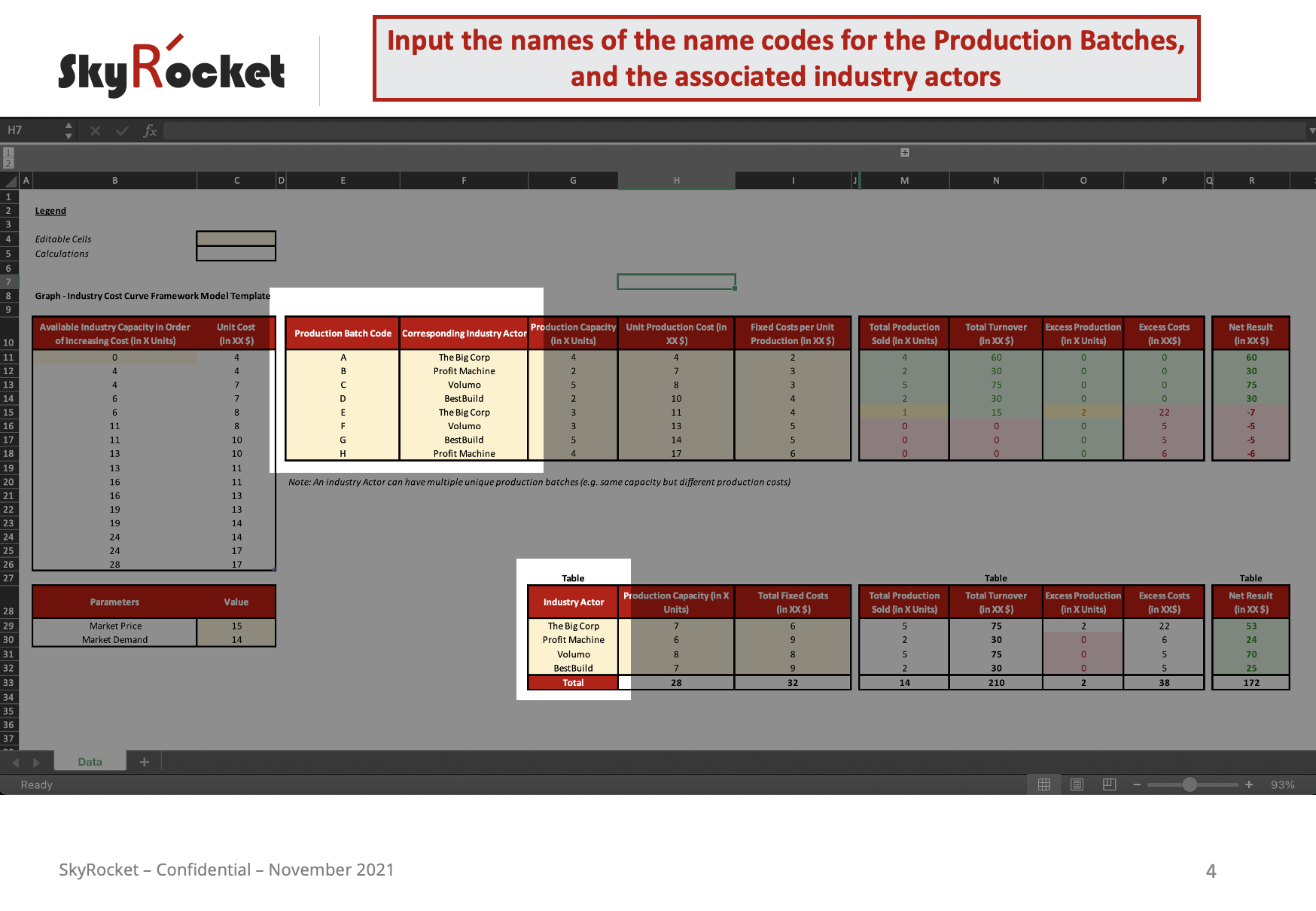
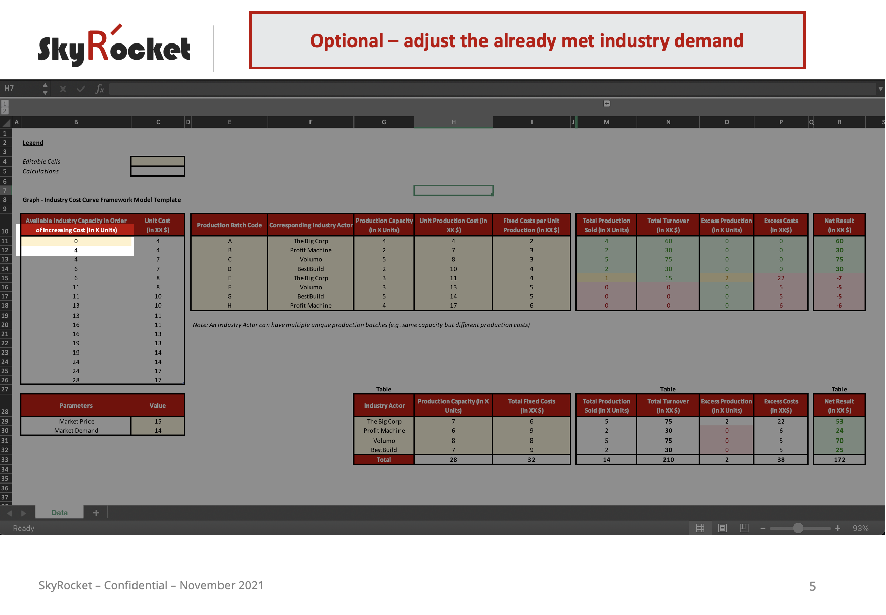
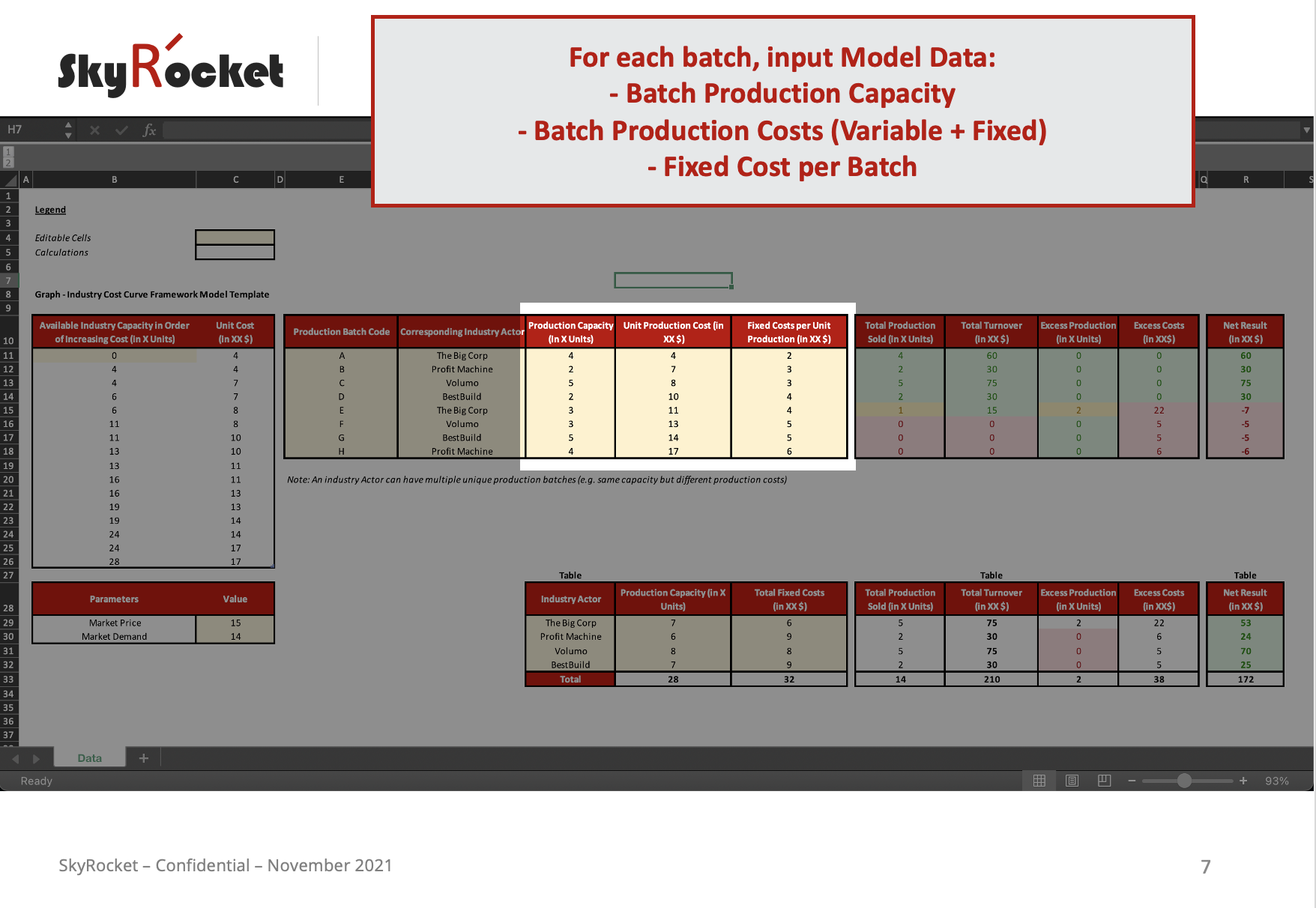
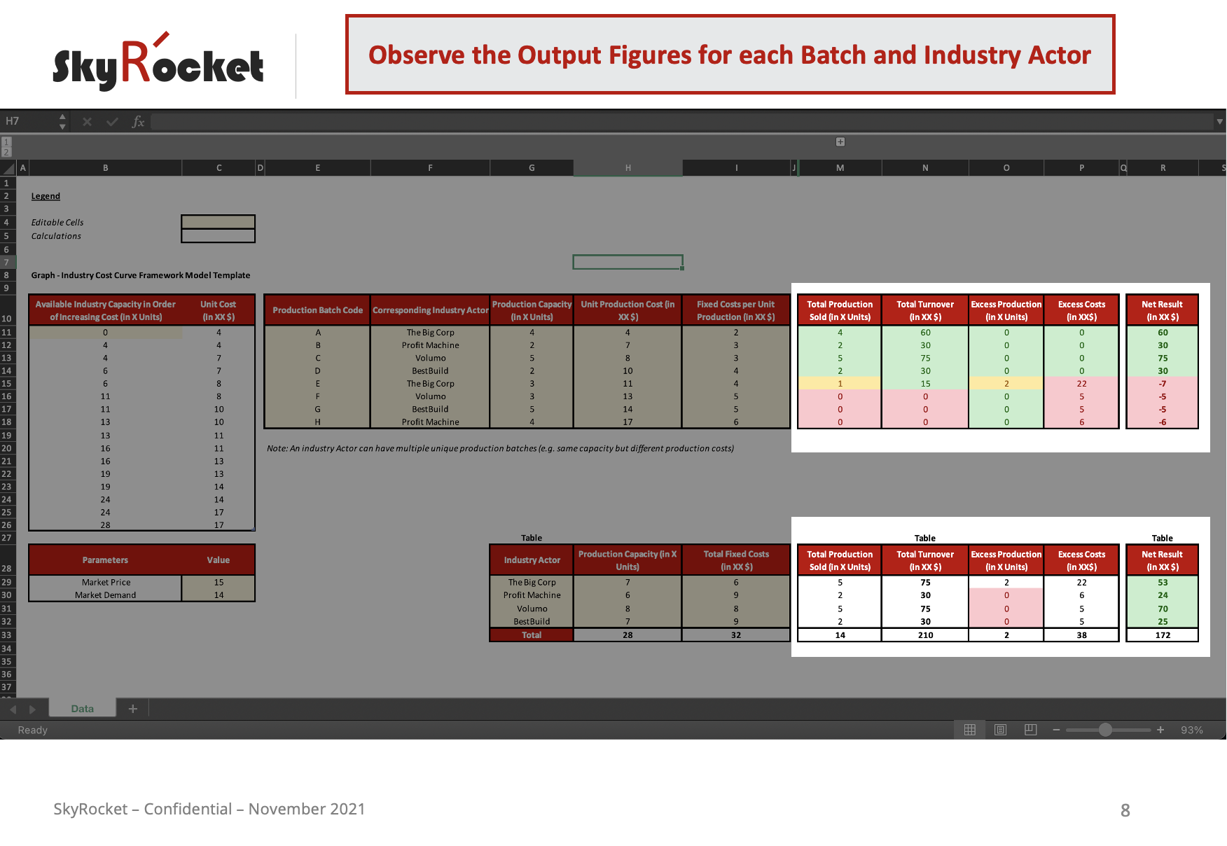
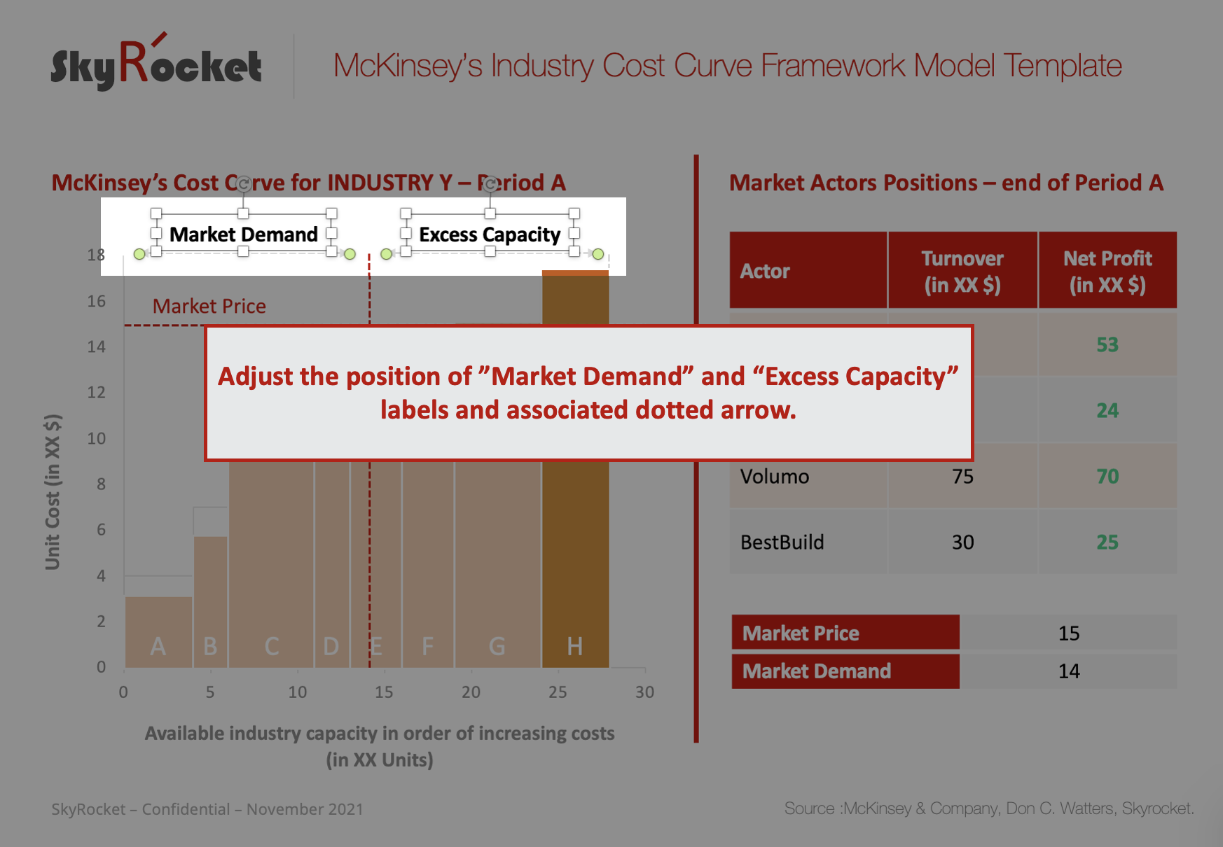
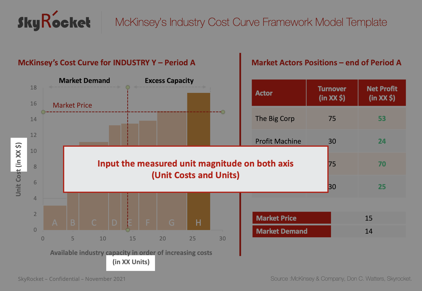
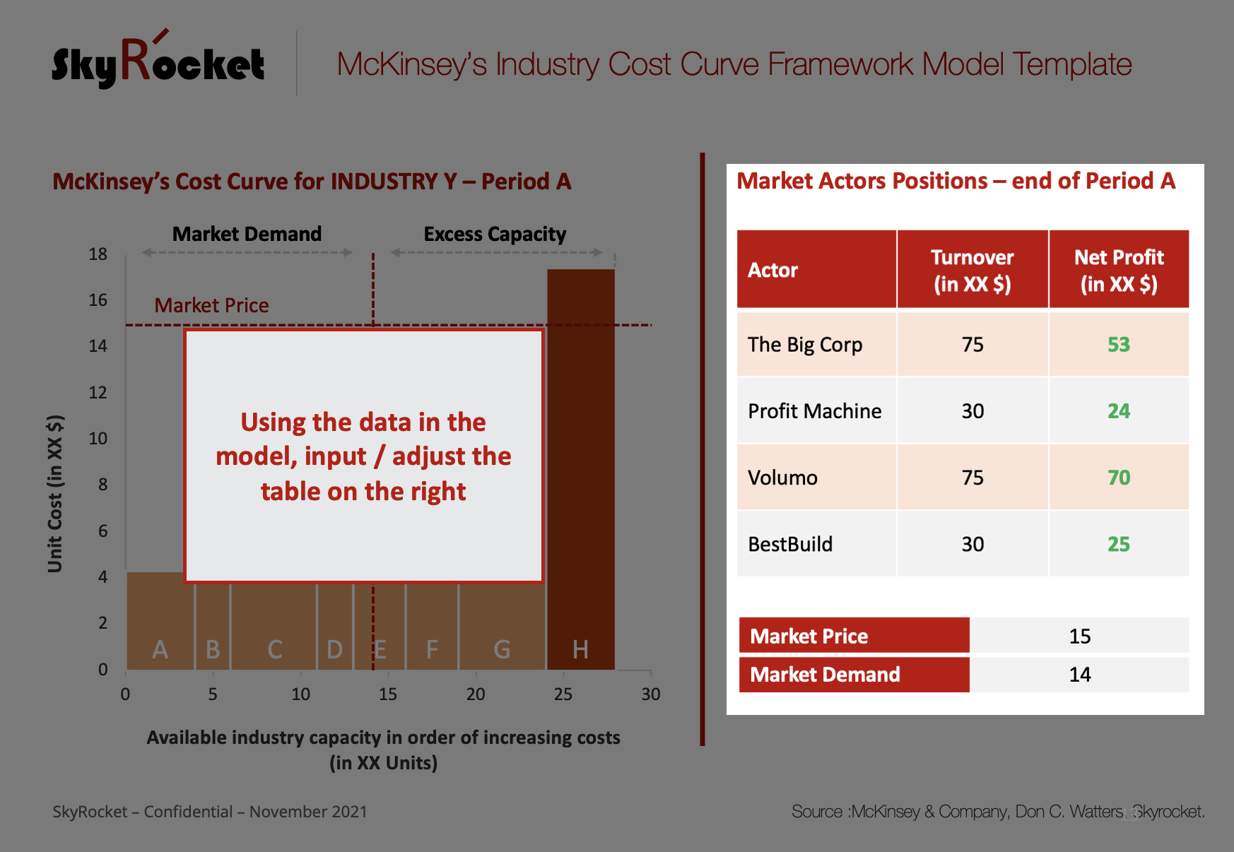
By inputing market and company data in the underlying excel model, the cost curve can be drawn and market capacities per "batch" visualised (by moving the PPT square orange boxes).
The Best Practice is:
- an editable Microsoft PowerPoint Template Slide
- 1 associated/attached Excel Model to plot the graph
- 1 EXCEL Only Version
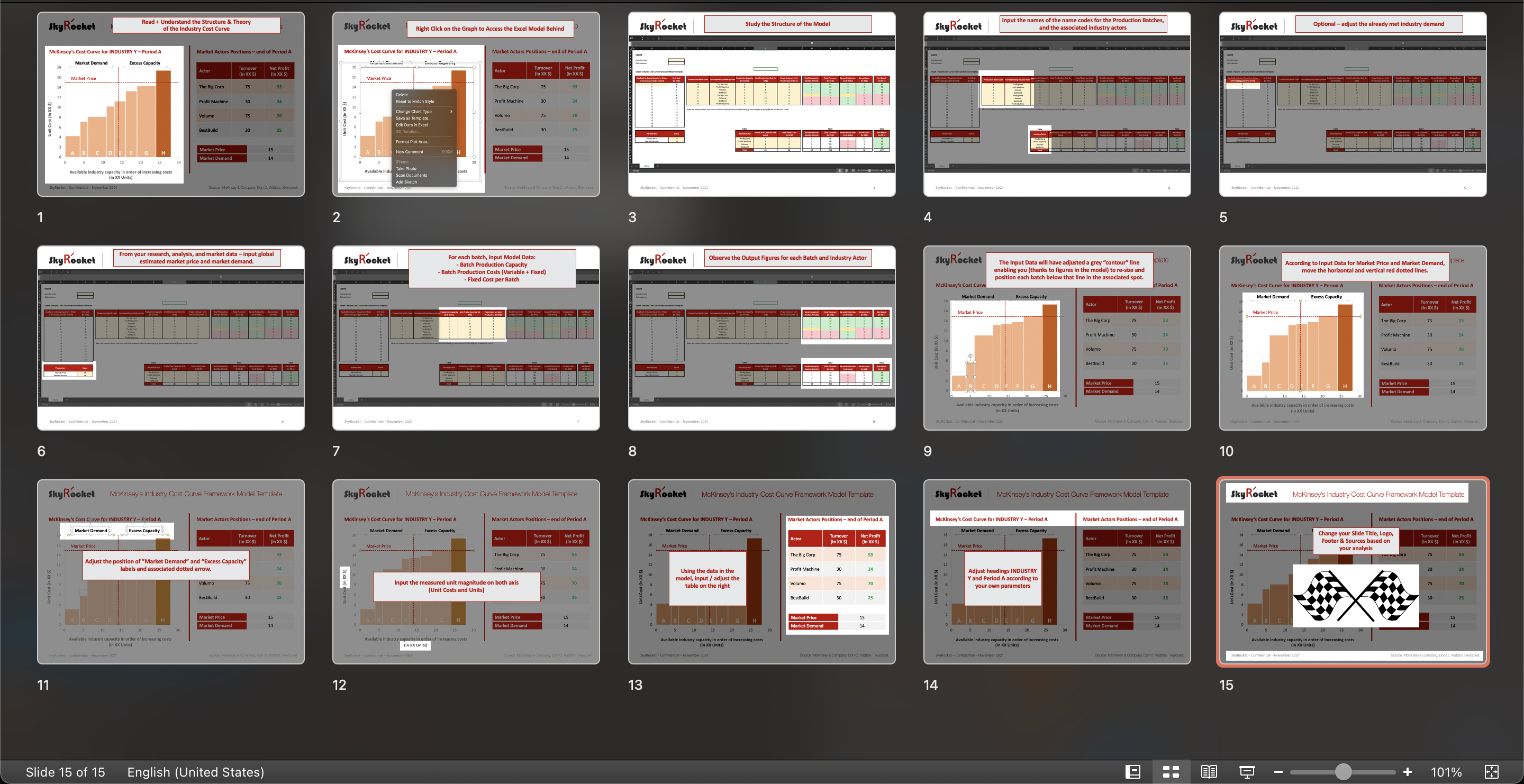
- with an online & offline 17 step-by-step methodology, with pedagogical illustrations for each step.
Should you have any questions on using this top tier cost and pricing analysis Management slide and framework, you're welcome to reach out to me via Private Message.
Good luck!
- Tim
⭐️ Bundle of 15 McKinsey & Company Models & Frameworks(including this one).
⭐️ Bundle of 20+ MBB (McKinsey, BCG, Bain) Strategy Consulting Frameworks (including this one)
Additional sources on Cost Curves by the Financial Times.
FREQUENTLY ASKED QUESTIONS (FAQs)
Q1: What distinguishes the Industry Cost Curve from other pricing and capacity planning models, and why is it considered a "classic" business school model?
The Industry Cost Curve is distinguished by its microeconomic approach, graphically mapping production capacities for a specific product in ascending order of increasing costs. It is considered a "classic" business school model due to its historical significance and the pivotal role it played in revolutionizing decision-making processes in the business world. Unlike earlier practices driven by intuition, the Industry Cost Curve introduced a systematic and analytical framework for strategic decisions, particularly in industries with substantial fixed costs. The model's classic status is attributed to its simplicity and effectiveness in understanding pricing dynamics, especially in competitive markets. Developed by McKinsey consultants in the 1980s, it marked a departure from traditional decision-making approaches and, when combined with linear programming, provided a structured way to analyze options and potential moves by market actors. The Industry Cost Curve is widely taught in business schools as a foundational tool for comprehending pricing strategies, making it a classic reference point in business education.
Q2: How does the Industry Cost Curve template cater to varying business sizes and structures, and can it be adapted for use in both small enterprises and large corporations?
The Industry Cost Curve template exhibits adaptability across a spectrum of business sizes and structures. Its design ensures versatility, accommodating the nuanced requirements of both small enterprises and large corporations. This adaptability is integral to its functionality, providing scalability that caters to the distinct characteristics and operational scales inherent in businesses of different sizes. Whether applied to the intricate dynamics of small enterprises or the multifaceted operations of large corporations, the template remains a robust tool, offering tailored insights and strategic value across the diverse landscape of business contexts.
Q3: How frequently should the Industry Cost Curve be updated using the Excel model to ensure its accuracy and relevance, considering dynamic market conditions?
The frequency of Industry Cost Curve updates using the Excel model depends on the volatility of market conditions. For industries with rapid changes, more frequent updates, possibly quarterly or monthly, may be necessary to maintain accuracy and relevance. In less dynamic sectors, semi-annual or annual updates could suffice. Regular reviews, especially during significant market shifts, ensure the model aligns with current conditions, enhancing its effectiveness in strategic decision-making.
Q4: Does the Industry Cost Curve template include any guidance or best practices for interpreting the graph and deriving actionable insights from the plotted data?
The Industry Cost Curve template incorporates guidance and best practices for interpreting the graph and extracting actionable outputs and conclusions from the plotted data. The associated materials offer users a structured approach, providing clarity on how to analyze the output of the curve effectively. This guidance ensures that users can derive meaningful insights, make informed decisions, and implement strategic actions based on the information presented in the Industry Cost Curve, enhancing the template's practical utility in real-world business scenarios.
🙋♂️ Have other questions ? Please leave your comment here and I'll get back to you as soon as possible. 😀
Originally developed by Ted Hall's San Francisco McKinsey & Company office, the Industry Cost Curve was formalised in a staff paper by director Don C. Watters in 1981. A must have for a performance improvement professional, the framework was built to orient strategic decisions in terms of capacity and production made by actors in substantially high and heavy fixed cost industries. It is a "classic" business school model to understand pricing, easily applicable to competitive markets.
See original 2009 article here.
The Industry cost curve, is a microeconomic graph enabling to map production capacities for a given product in order of increasing costs, thus positioning the market price for the industry. Indeed, to determine the market price, you combine the threshold where the demand for the industry's/market's product is met, and the cost of the next available suppliers capacity .
For example: if capacities that serve the market move, what impact is there going to be on market price? What happens if a given company decreases its fixed costs? Variable costs? Is it worth investing now into new capacity at a cost level just below market price?
Before the framework was launched in the 1980s by McKinsey consultants, businesses tended to make decisions on intuition rather than careful analytics and modeling. The arrival of this framework combined with linear programming, helped to depict options and potential moves by market actors.
The framework is mostly pertinent for:
- commodity products
- near commodity products (customers get roughly the same value from the product, even if the supplier varies)
- markets where quantifiable differences in value are prevalent (e.g. travel times)
- climate change models (carbon emmissions etc.)
Another great illustration of the industry cost curve in use and an extract of Watter's work, can be found here.
Given the historical pertinence of this model in the business world over the last 50 years, I decided to create a simple universal template that any analyst, production planner or forecaster can play with.
By inputing market and company data in the underlying excel model, the cost curve can be drawn and market capacities per "batch" visualised (by moving the PPT square orange boxes).
The Best Practice is:
- an editable Microsoft PowerPoint Template Slide
- 1 associated/attached Excel Model to plot the graph
- 1 EXCEL Only Version
- with an online & offline 17 step-by-step methodology, with pedagogical illustrations for each step.
Should you have any questions on using this top tier cost and pricing analysis Management slide and framework, you're welcome to reach out to me via Private Message.
Good luck!
- Tim
⭐️ Bundle of 15 McKinsey & Company Models & Frameworks(including this one).
⭐️ Bundle of 20+ MBB (McKinsey, BCG, Bain) Strategy Consulting Frameworks (including this one)
Additional sources on Cost Curves by the Financial Times.
FREQUENTLY ASKED QUESTIONS (FAQs)
Q1: What distinguishes the Industry Cost Curve from other pricing and capacity planning models, and why is it considered a "classic" business school model?
The Industry Cost Curve is distinguished by its microeconomic approach, graphically mapping production capacities for a specific product in ascending order of increasing costs. It is considered a "classic" business school model due to its historical significance and the pivotal role it played in revolutionizing decision-making processes in the business world. Unlike earlier practices driven by intuition, the Industry Cost Curve introduced a systematic and analytical framework for strategic decisions, particularly in industries with substantial fixed costs. The model's classic status is attributed to its simplicity and effectiveness in understanding pricing dynamics, especially in competitive markets. Developed by McKinsey consultants in the 1980s, it marked a departure from traditional decision-making approaches and, when combined with linear programming, provided a structured way to analyze options and potential moves by market actors. The Industry Cost Curve is widely taught in business schools as a foundational tool for comprehending pricing strategies, making it a classic reference point in business education.
Q2: How does the Industry Cost Curve template cater to varying business sizes and structures, and can it be adapted for use in both small enterprises and large corporations?
The Industry Cost Curve template exhibits adaptability across a spectrum of business sizes and structures. Its design ensures versatility, accommodating the nuanced requirements of both small enterprises and large corporations. This adaptability is integral to its functionality, providing scalability that caters to the distinct characteristics and operational scales inherent in businesses of different sizes. Whether applied to the intricate dynamics of small enterprises or the multifaceted operations of large corporations, the template remains a robust tool, offering tailored insights and strategic value across the diverse landscape of business contexts.
Q3: How frequently should the Industry Cost Curve be updated using the Excel model to ensure its accuracy and relevance, considering dynamic market conditions?
The frequency of Industry Cost Curve updates using the Excel model depends on the volatility of market conditions. For industries with rapid changes, more frequent updates, possibly quarterly or monthly, may be necessary to maintain accuracy and relevance. In less dynamic sectors, semi-annual or annual updates could suffice. Regular reviews, especially during significant market shifts, ensure the model aligns with current conditions, enhancing its effectiveness in strategic decision-making.
Q4: Does the Industry Cost Curve template include any guidance or best practices for interpreting the graph and deriving actionable insights from the plotted data?
The Industry Cost Curve template incorporates guidance and best practices for interpreting the graph and extracting actionable outputs and conclusions from the plotted data. The associated materials offer users a structured approach, providing clarity on how to analyze the output of the curve effectively. This guidance ensures that users can derive meaningful insights, make informed decisions, and implement strategic actions based on the information presented in the Industry Cost Curve, enhancing the template's practical utility in real-world business scenarios.
🙋♂️ Have other questions ? Please leave your comment here and I'll get back to you as soon as possible. 😀
This Best Practice includes
1 PowerPoint Template Model + 1 Associated Excel Model + 1 EXCEL Only Version + 1 Online 16 Step-by-Step Methodology
