Balance Sheet Structure Chart
Originally published: 10/07/2025 09:32
Publication number: ELQ-42851-1
View all versions & Certificate
certified

Balance Sheet Structure Chart

A smart chart illustrating a company balance sheet structure and changes over ti

Description
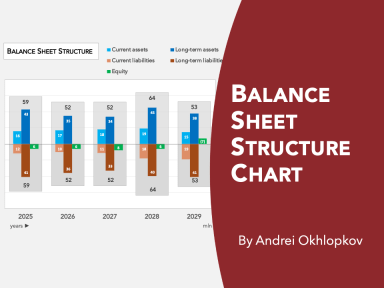
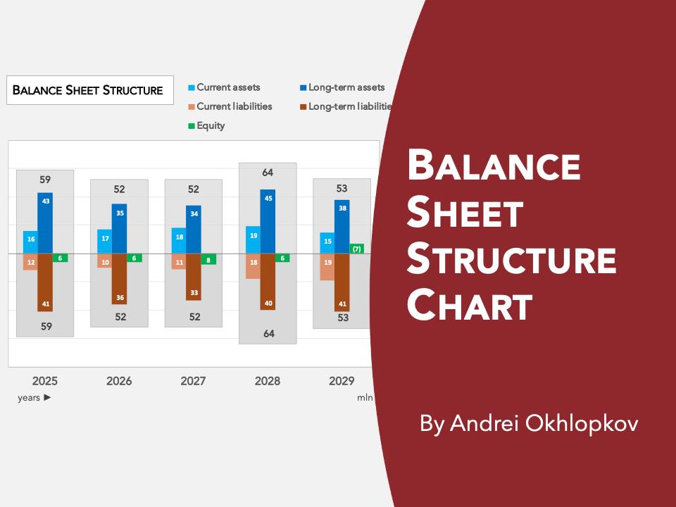
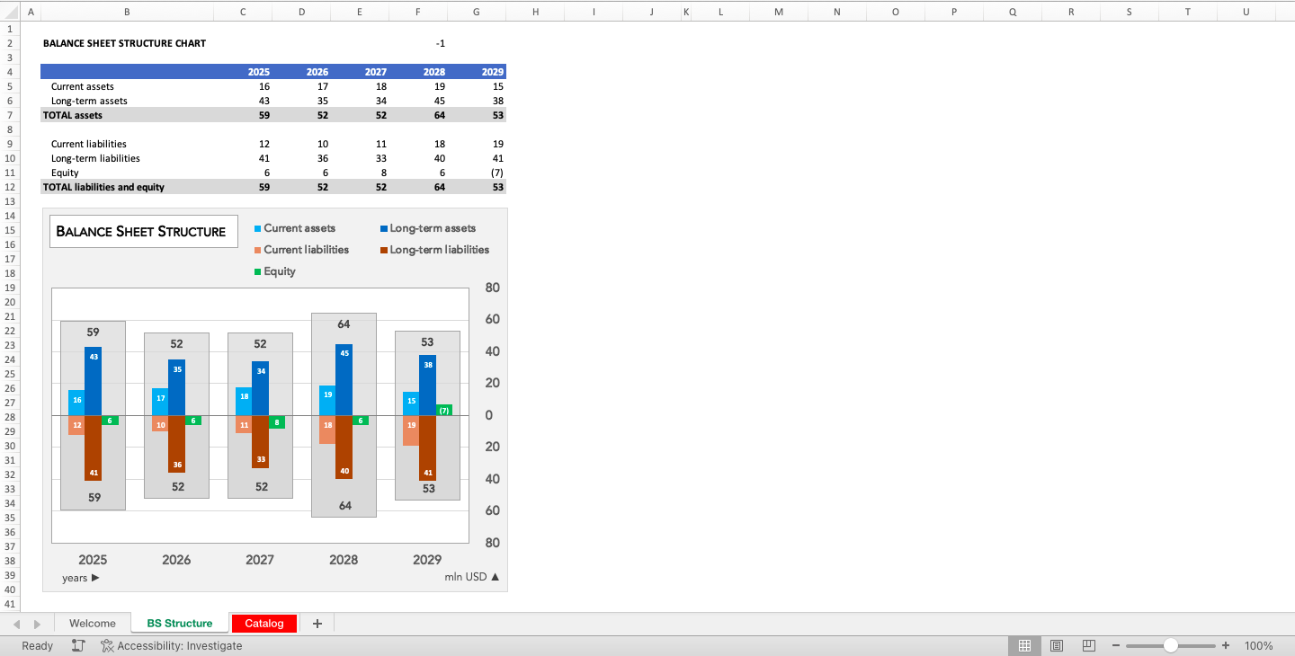
This chart is an excellent visual tool which gives a quick idea of the balance sheet structure across several years.

Unlike stacked column charts typically used for such type of graphs, this chart shows current and long-term assets and liabilities clustered on the horizontal axis. Positioning them on the same line makes them easier to compare between each other within the same year (e.g. current assets against long-term assets) and over time (every category).


To illustrate the share of each section in the total asset and liability plus equity amounts the chart has columns showing those total values.

All components of the chart are native Excel chart elements and are updated automatically as you change the source data, without any manual interventions. It is compatible with all versions of Excel and does not use VBA macros.


The chart delivers the message in an efficient and intuitive way and has a fancy design. It will help you make your presentations and reports look more professional and will impress your managers, clients, colleagues and other important ones.The chart is flexible to change and can be adjusted to your specific requirements if needed. Let me know if you need any help changing the format or content of it.

This Best Practice includes
1 Excel file

Acquire business license for $9.00

Add to cart

Add to bookmarks

Discuss

Further information

To build a charts showing balance structure

Financial statement analysis

n/a


0.0 / 5 (0 votes)

please wait...