Originally published: 01/05/2020 08:30
Last version published: 06/06/2020 07:09
Publication number: ELQ-87019-2
View all versions & Certificate
Last version published: 06/06/2020 07:09
Publication number: ELQ-87019-2
View all versions & Certificate

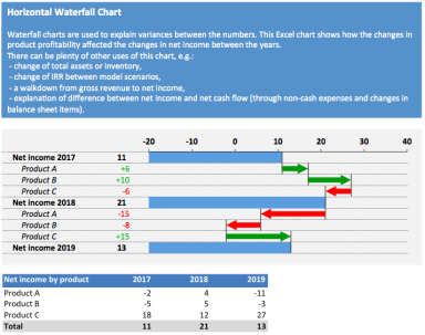
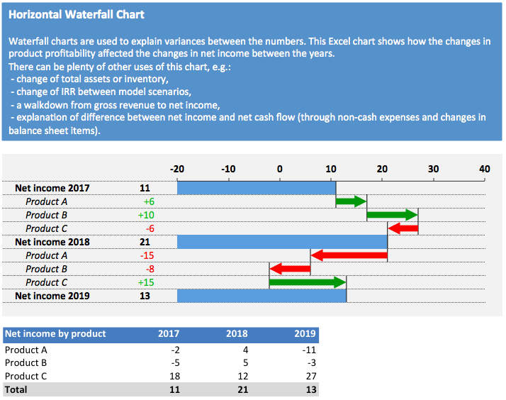
Horizontal Waterfall Chart
A smart and efficient chart with detailed step-by-step instructions
Further information
A chart to visualise variance factors between the numbers
Explaining variances between e.g. model scenarios, change in revenue by years, differences between net income and net cash flow and many others
n/a
