Arrow Chart in Excel
Originally published: 03/05/2021 13:27
Publication number: ELQ-77290-1
View all versions & Certificate
certified

Arrow Chart in Excel

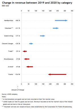
Excel/PowerPoint template to create Arrow Charts (Range bar graph) to show change between two points in time.

Description
Sometimes the primary analytical task at hand is to understand what happened between two points in time. For example, did sales—by product or service—increase, decrease or stay unchanged between this year and last year?

There are different ways to present the change. Slope graphs, Range Bar Graphs and Deviation Graphs are three different approaches that may be used to show change in time. To each its strengths and weaknesses.

The Arrow Chart (Range Bar Graph with arrows) uses the length of the bar to show the magnitude of change. Moreover, the beginning and ending of the bars make it easy to compare the values at the same point in time. However, by using arrows and different colors for bars, Arrow Charts do an excellent job at comparing the direction of change.

Unfortunately, Excel charting library doesn't include native capabilities to produce Arrow Charts. Users are either obliged to resort to VBA or to take the time consuming task of following a long list of steps to create one.

So here I'm offering you an Excel template that takes a data set as an input and creates an Arrow Chart. You will also get a PowerPoint template for the same graph. The Excel model has a summary worksheet (named PowerPoint) that organizes the data in a way compatible with the data input required by the PowerPoint template.

The Excel model has the following capabilities:

- Sort categories by alphabetical order, variable 1 (i.e. sales in 2019), variable 2 (sales in 2020), the change between the two variables (either in absolute or in %) or as per the original data source.
- Sort categories by descending or ascending order.
- Define the number formatting of the labels.
- User-friendly interface to adjust the above settings.
- Data entered into Excel Table—hence the chart and formulas update automatically when the datasource expands or shrinks.
- The size of the data matrix is only limited by Excel's charting and calculating capabilities.
- Fully customizable chart using standard Excel functionality enabling you to design a large variety of charts.
- Unlocked workbook/worksheets with ability to expand template to suit your needs.

What's the refund policy?

If what you see is not what you expected, just reply to the download email within 30 days, and you'll get a full refund. No questions asked.

NOTE: THE TEMPLATE RELIES HEAVILY ON EXCEL'S DYNAMIC ARRAYS CAPABILITIES, ONLY AVAILABLE TO OFFICE 365 SUBSCRIBERS.

This Best Practice includes
1 Excel model and 1 PowerPoint template

Acquire business license for $10.00

Add to cart

Add to bookmarks

Discuss

Further information

To enable business analysts, consultants, scientists, statisticians, data visualizers and journalists to produce Arrow Charts and Range Bar Graphs in Excel and PowerPoint to show change between two points in time.

Exploratory data analysis (EDA), reporting and communication in business, science, statistics, data visualization or data journalism.

Template relies heavily on Excel's Dynamic Arrays capabilities, only available to Office 365 subscribers.


5.0 / 5 (1 votes)

please wait...