Originally published: 06/02/2023 10:52
Last version published: 07/02/2023 10:30
Publication number: ELQ-80452-2
View all versions & Certificate
Last version published: 07/02/2023 10:30
Publication number: ELQ-80452-2
View all versions & Certificate

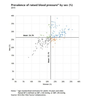
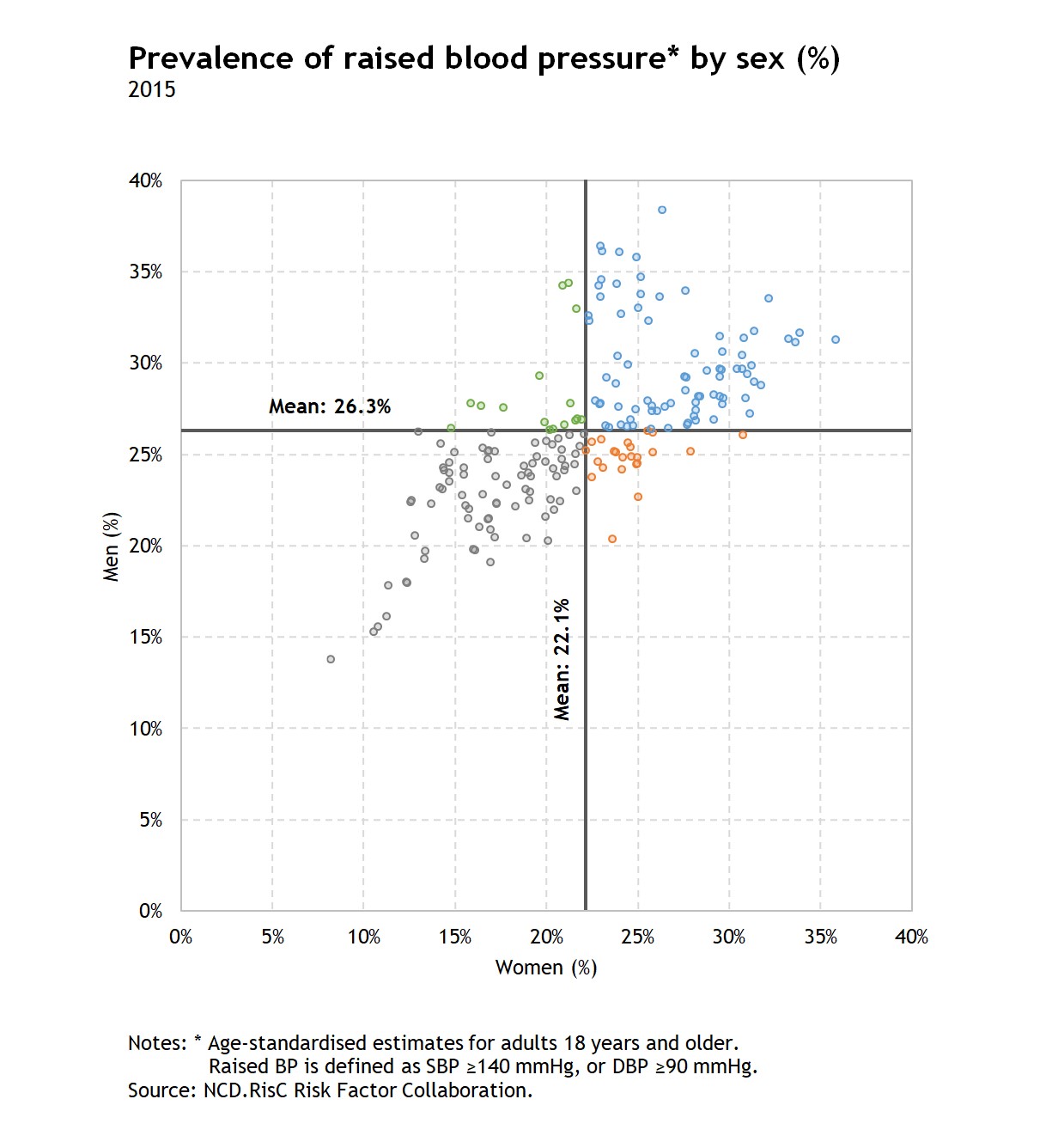
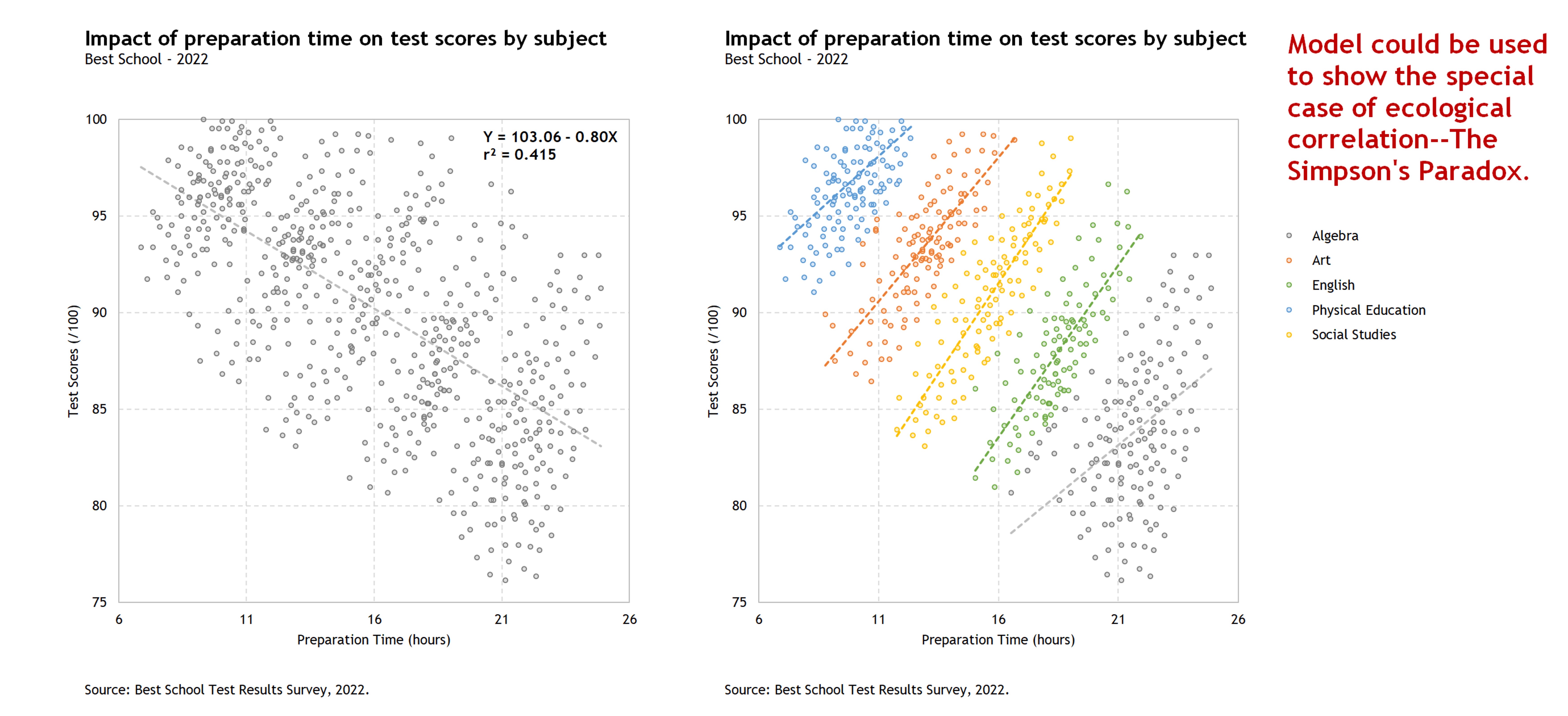
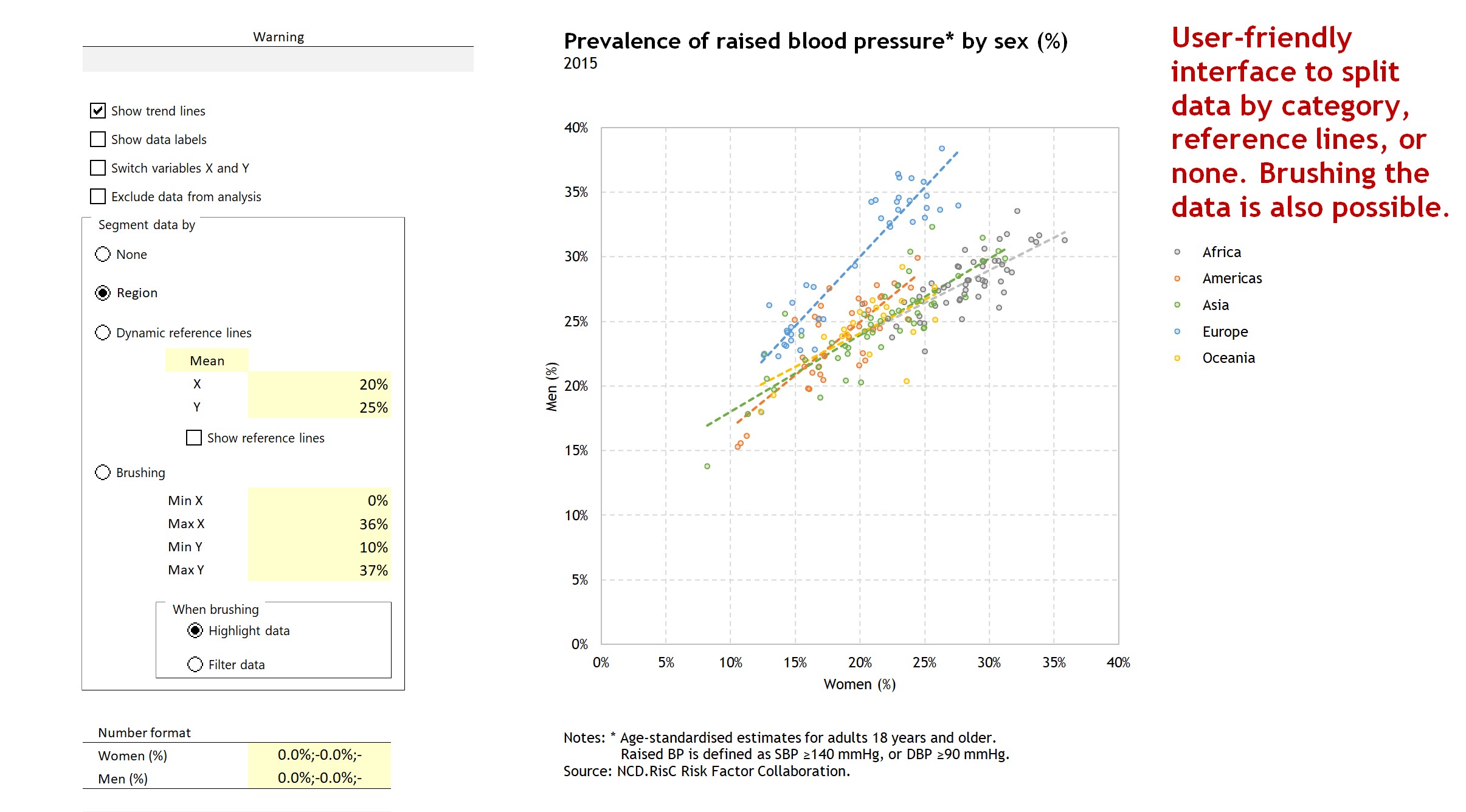
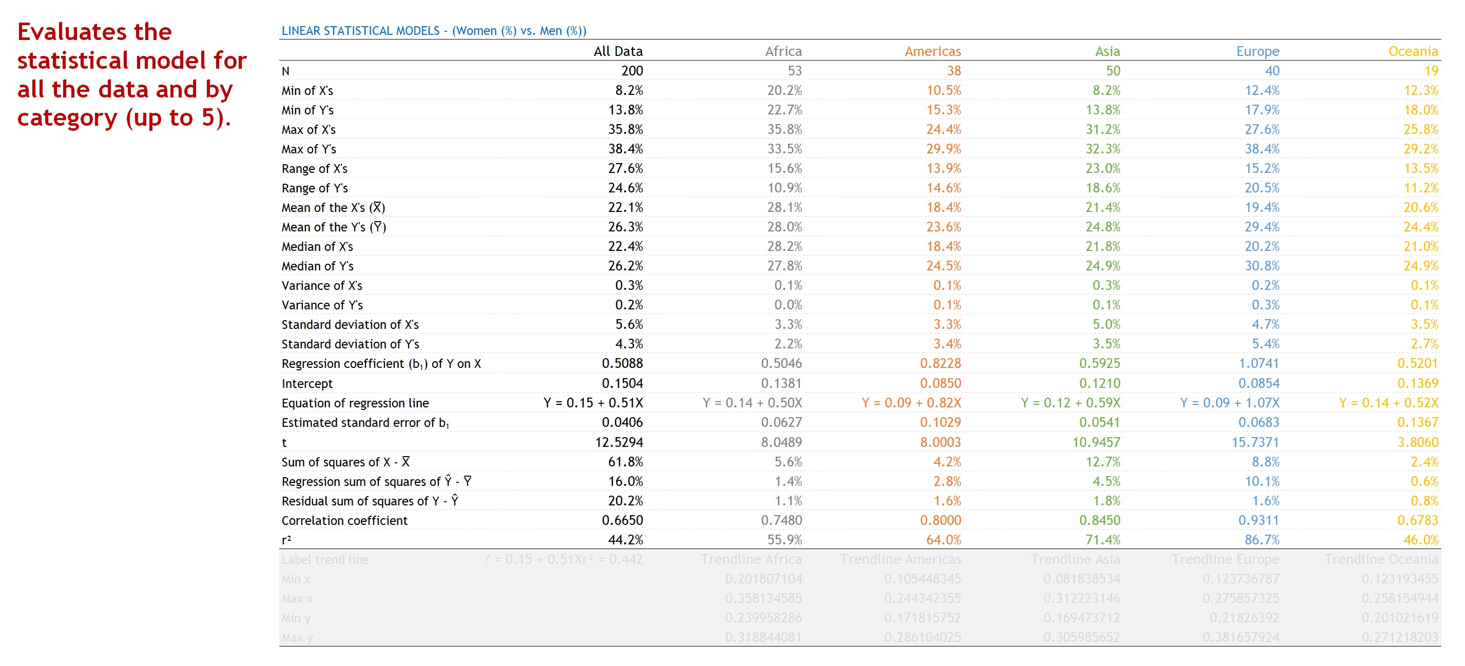
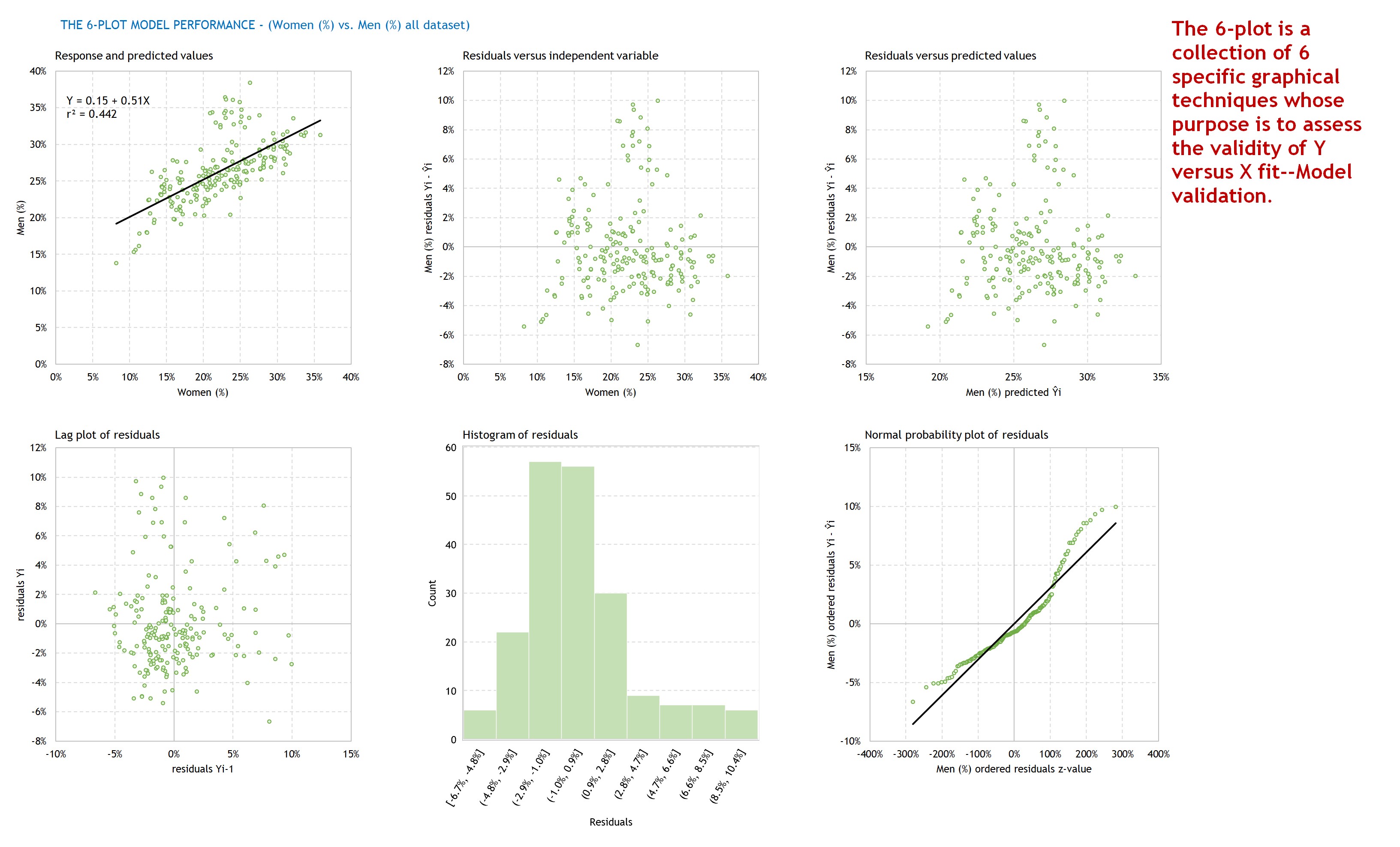
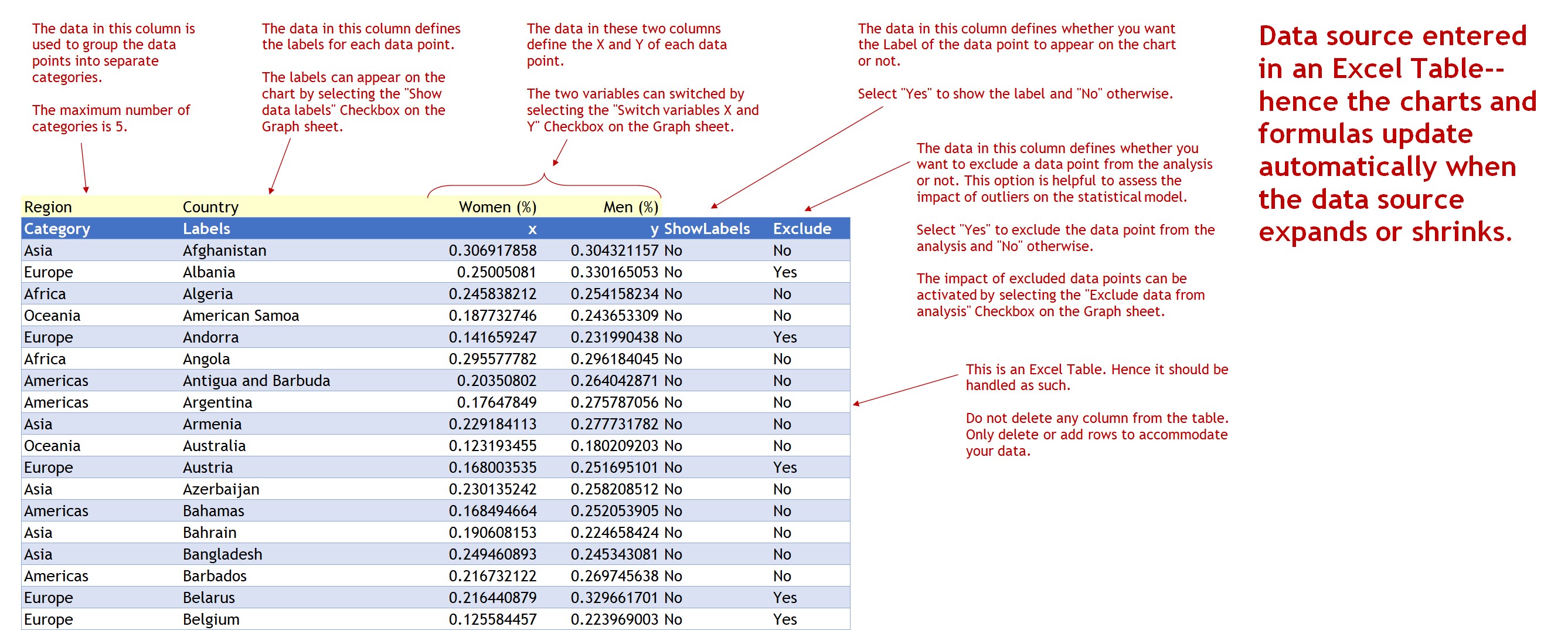
Dynamic Scatterplot in Excel
Excel template to build a dynamic scatterplot along with the statistical model and the 6-Plot charts needed for assessment of the fit of regression analysis.
I build tools that make data analysis, data visualization and real estate investment analysis easier, faster and more fun.Follow
Further information
To enable business analysts, scientists, statisticians, data visualizers and journalists to produce dynamic scatterplots in Excel along with the statistical model and the 6-Plot charts—6 charts needed for assessment of the fit of regression analysis.
Business, science, statistics, data visualization, data journalism.
Template relies heavily on Excel's Dynamic Arrays capabilities, only available to Microsoft 365 subscribers.
