Bar Chart With Color Ranges In Excel
Originally published: 13/04/2021 07:46
Publication number: ELQ-45693-1
View all versions & Certificate
certified

Bar Chart With Color Ranges In Excel

Excel/PowerPoint template to build a bar graph with color ranges of bars representing another dimension in the data.

Description
Bar charts are often used to display categorical data using height or length of the bar to encode numerical values. Horizontal bar graphs are especially useful for ranking purposes—that is, when sorting categories from largest to smallest, or vice versa, is required.

In their standard form, bar charts represent two variables. This low dimensionality can be improved by adding more variables and hence bringing them up on the echelon of graphic excellence using Edward Tufte’s own words, “Graphical excellence is nearly always multivariate.”

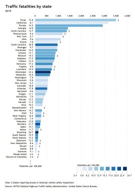
One of the design strategies to enhance the dimensionality of bar charts is to use color to encode another dimension in the data. For example, we can show US traffic fatalities by state in 2015—ranked from highest to lowest—represented by the length of the bars. At the same time, a sequential color scheme encodes traffic fatality rates per 100,000 people.

Another design strategy is to use a symbol to add a fourth dimension to the chart—such as indicating those states with automobile safety inspections.

Unfortunately, Excel charting library doesn't include native capabilities to produce this type of charts. Users are either obliged to resort to VBA or to take the time consuming task of following a long list of steps to create one.

So here I'm offering you an Excel template that takes a data set as an input and creates a ranked bar chart with color ranges. You will also get a PowerPoint template for the same graph. The Excel model has a summary worksheet (named PowerPoint) that organizes the data in a way compatible with the data input required by the PowerPoint template.

The Excel model has the following capabilities:

- Sort categories by alphabetical order, variable 1 (i.e. traffic fatalities), variable 2 (traffic fatalities per 100,000) or as per the original data source.
- Sort categories by descending or ascending order.
- Switch instantly between variable 1 (encoded by the length of the bar) and variable 2 (encoded by the color of the bar).
- Define the number of bands (up to 9) which defines the color coding for the horizontal bars.
- An automatic key (legend) that indicates which colors signified what level of fatalities.
- Produce three more charts useful to assess the distribution of the variables (Histogram, Quantile plot or Q-plot and the scatterplot).
- Change the number of bins in the histogram using a spinner.
- Define the number formatting of the labels for variable 1 and variable 2.
- User-friendly interface to adjust the above settings.
- Data entered into Excel Table—hence the chart and formulas update automatically when the datasource expands or shrinks.
- The size of the data matrix is only limited by Excel's charting and calculating capabilities.
- Fully customizable chart using standard Excel functionality.
- Unlocked workbook/worksheets with ability to expand template to suit your needs.

What's the refund policy?

If what you see is not what you expected, just reply to the download email within 30 days, and you'll get a full refund. No questions asked.

NOTE: THE TEMPLATE RELIES HEAVILY ON EXCEL'S DYNAMIC ARRAYS CAPABILITIES, ONLY AVAILABLE TO OFFICE 365 SUBSCRIBERS.

This Best Practice includes
1 Excel model and 1 PowerPoint template

Acquire business license for $10.00

Add to cart

Add to bookmarks

Discuss

Further information

To enable business analysts, consultants, scientists, statisticians, data visualizers and journalists to produce ranked bar graphs with color ranges in Excel and PowerPoint to show univariate distributions.

Exploratory data analysis (EDA), reporting and communication in business, science, statistics, data visualization or data journalism.

Template relies heavily on Excel's Dynamic Arrays capabilities, only available to Office 365 subscribers.


5.0 / 5 (1 votes)

please wait...