
Originally published: 06/04/2021 12:02
Last version published: 01/07/2024 12:47
Publication number: ELQ-13149-5
View all versions & Certificate
Last version published: 01/07/2024 12:47
Publication number: ELQ-13149-5
View all versions & Certificate

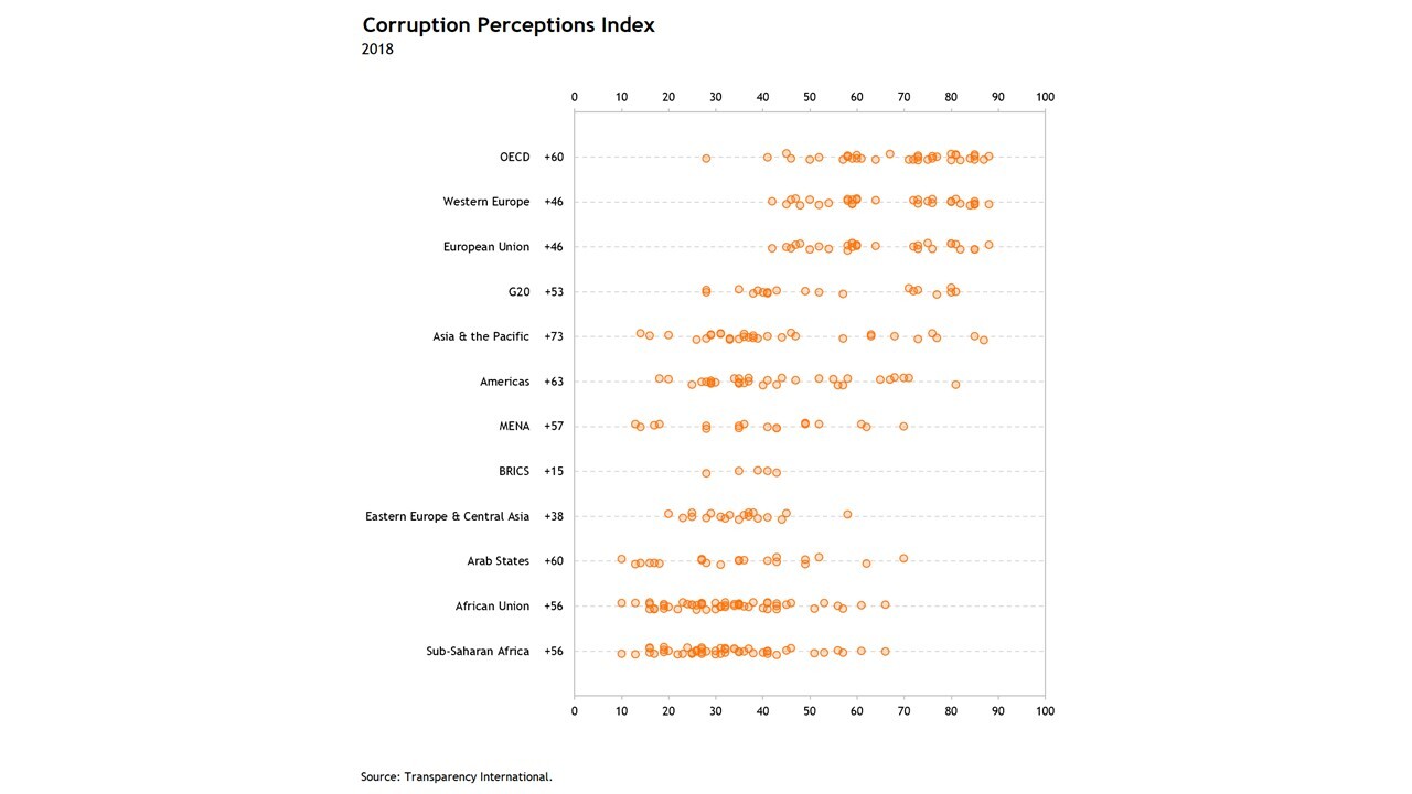
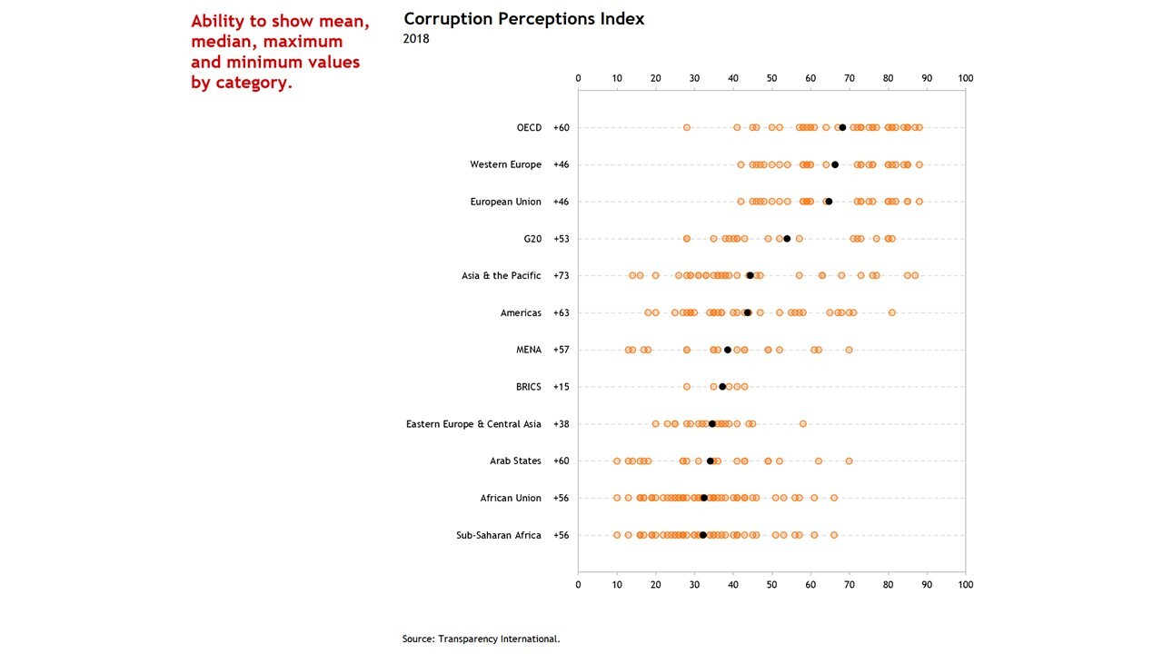
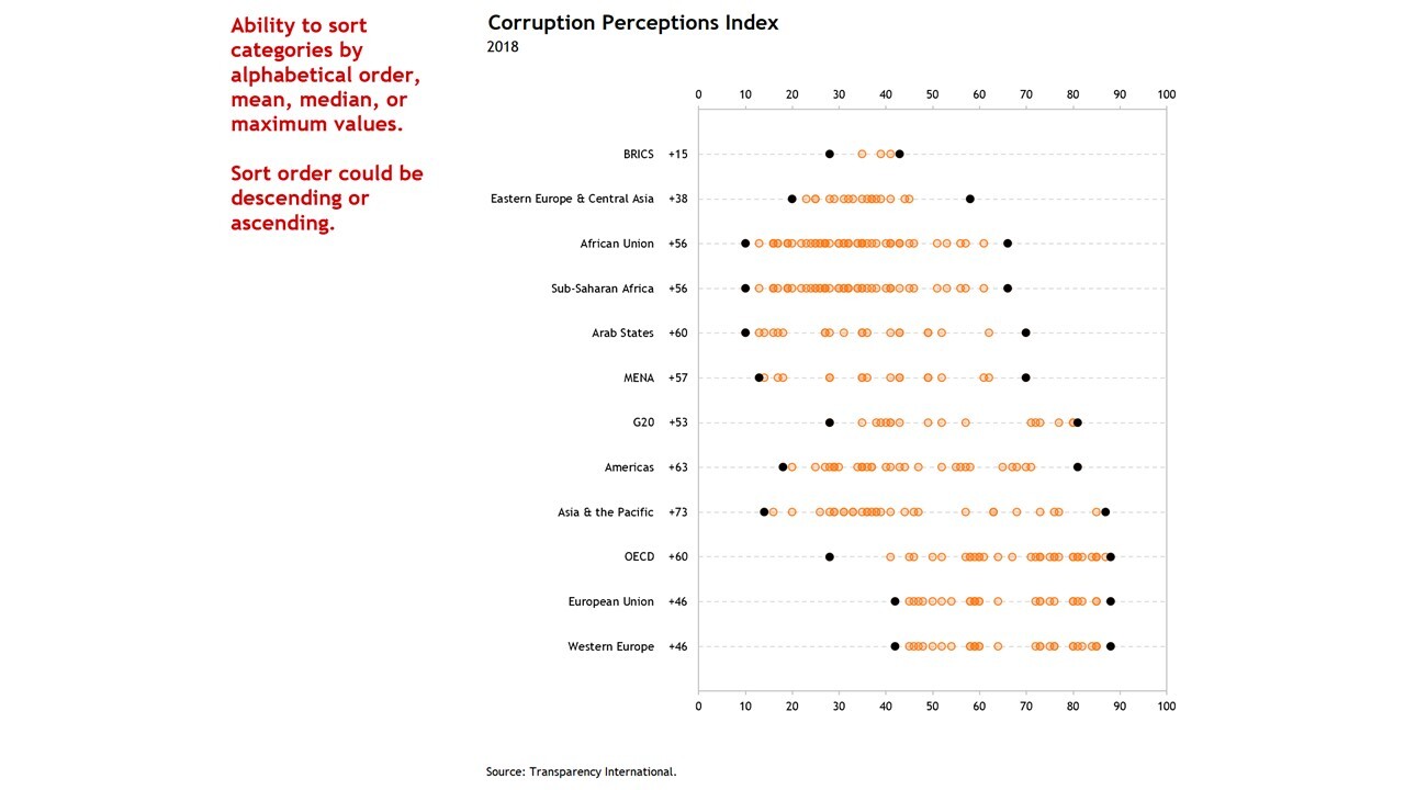
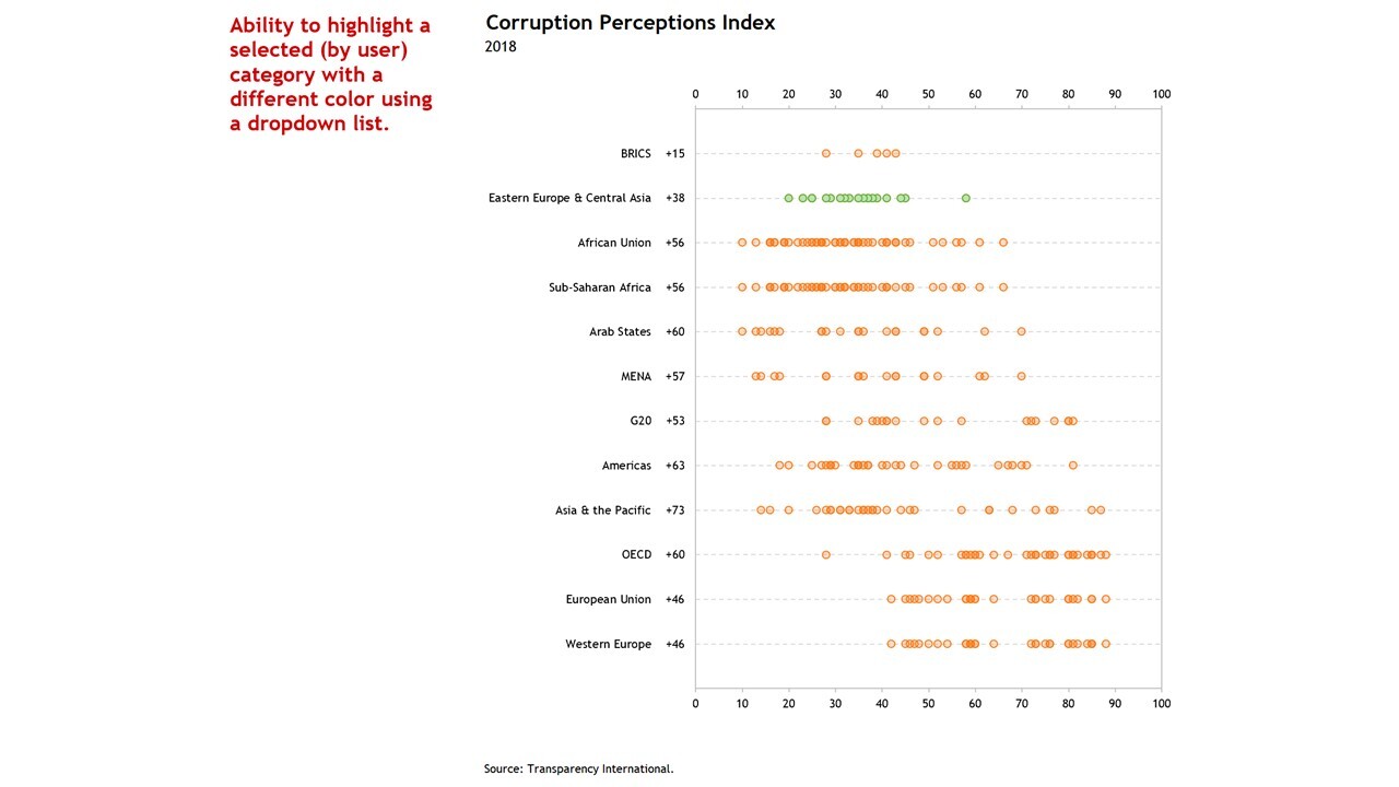
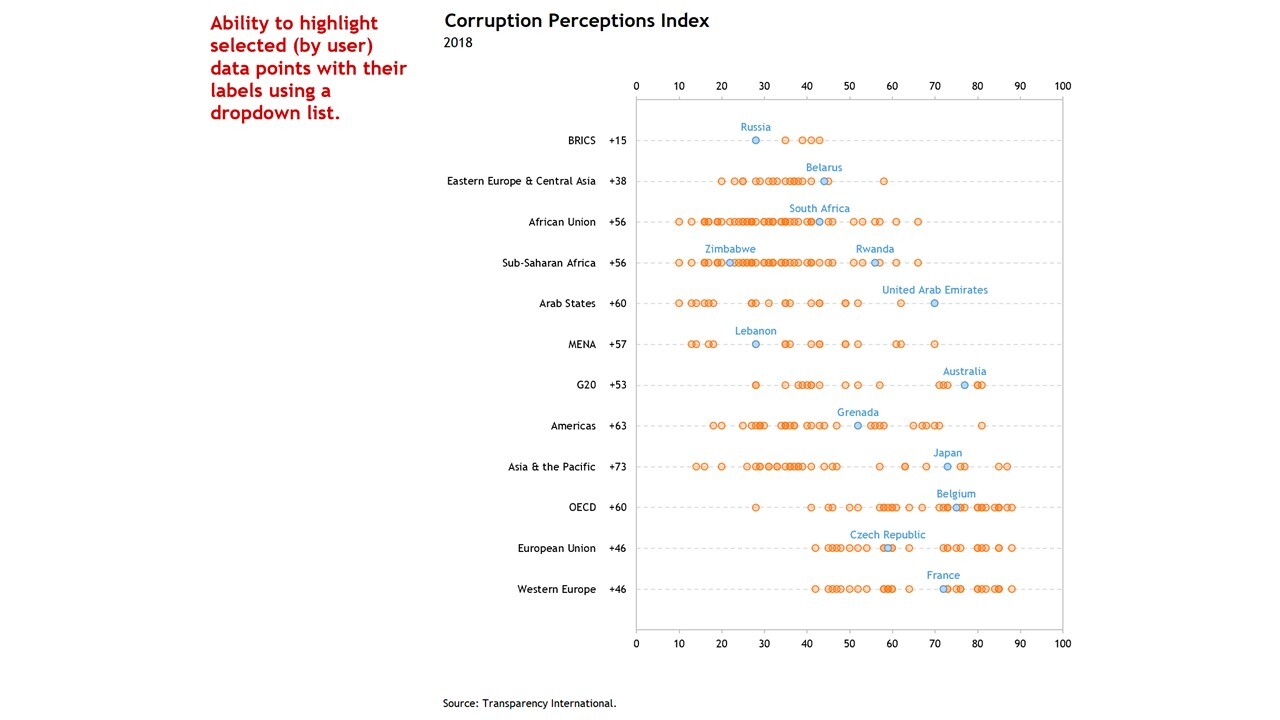
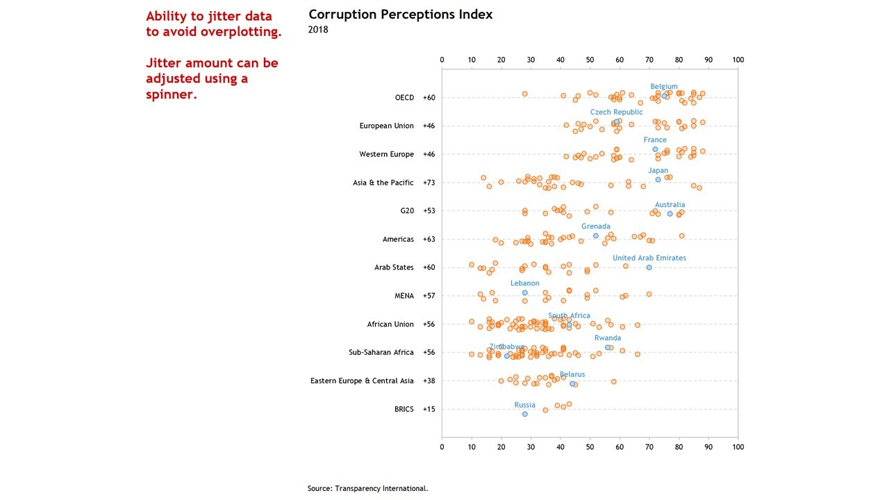
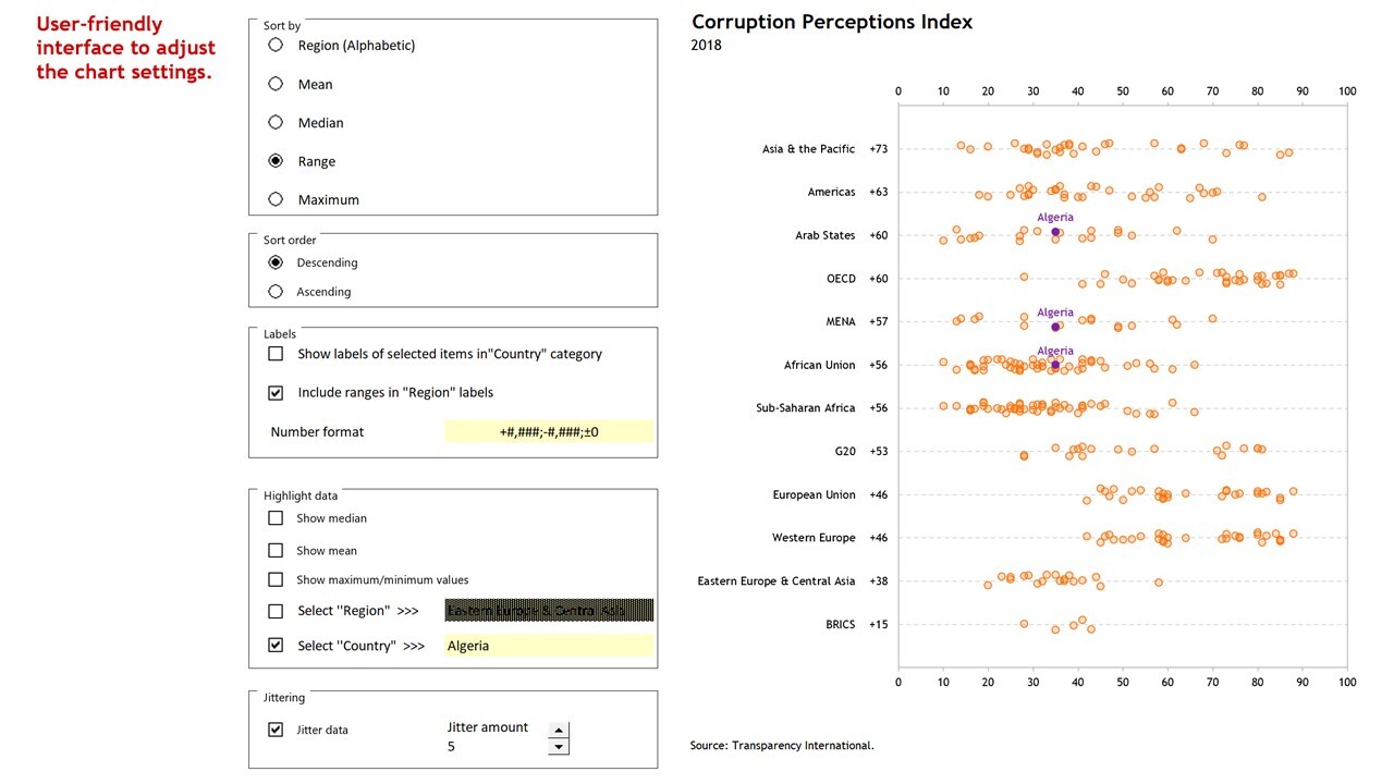
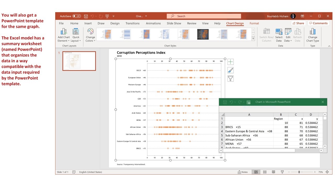
One-dimensional Scatterplot with Jitter in Excel
Excel/PowerPoint template to build 1-dimensional scatterplots—with jitter—to show distributions for several categories.
I build tools that make data analysis, data visualization and real estate investment analysis easier, faster and more fun.Follow
Further information
To enable business analysts, scientists, statisticians, data visualizers and journalists to produce one-dimensional scatterplots in Excel to show and compare distributions.
Exploratory data analysis (EDA), reporting and communication in business, science, statistics, data visualization or data journalism.
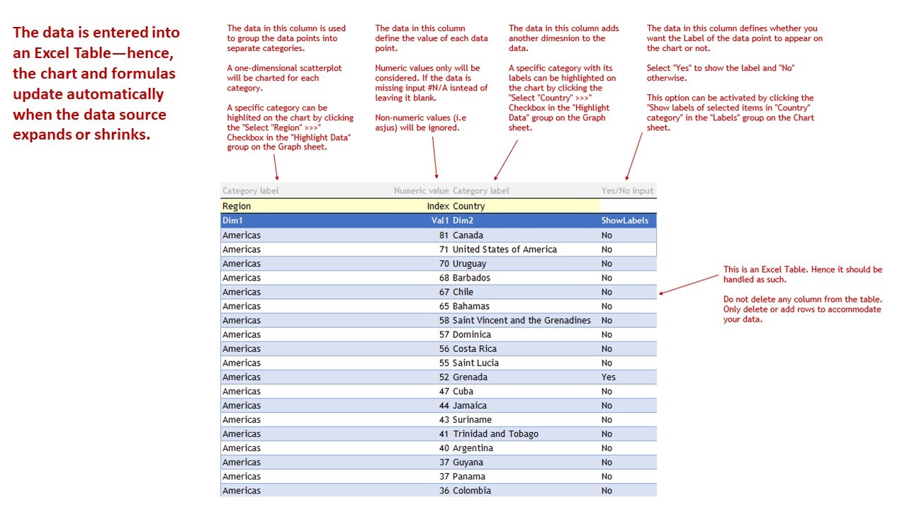
Template relies heavily on Excel's Dynamic Arrays capabilities, only available to Office 365 subscribers.
