
Originally published: 01/01/2023 20:29
Last version published: 08/01/2024 08:51
Publication number: ELQ-81670-2
View all versions & Certificate
Last version published: 08/01/2024 08:51
Publication number: ELQ-81670-2
View all versions & Certificate

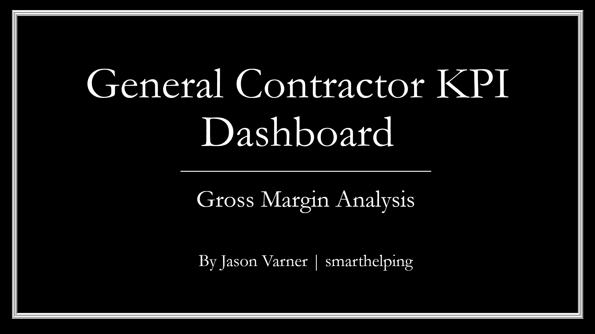
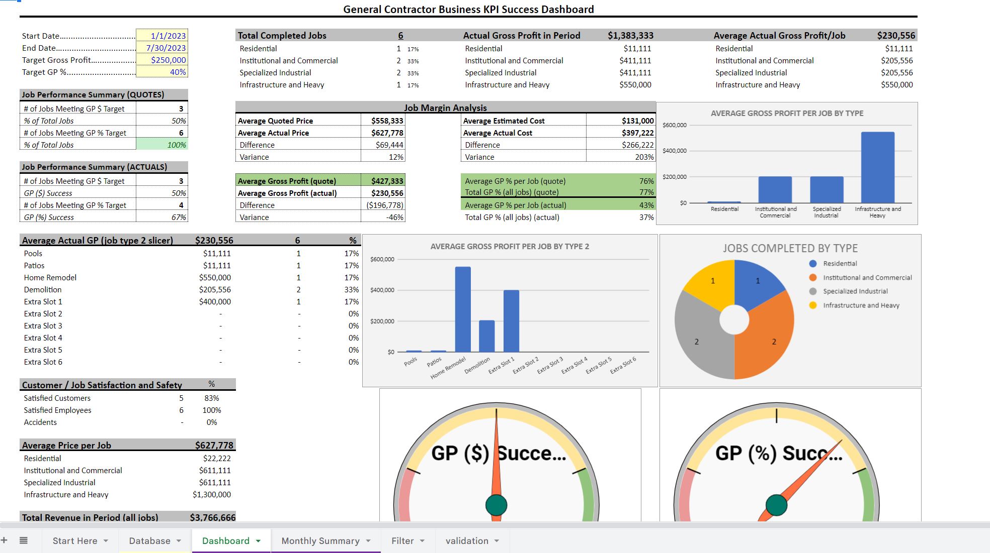
KPI Dashboard: Construction Business
A dashboard that tracks quoted vs actual gross profit of jobs for a defined time frame. Terminology is for construction, but works for a general contractor too.
Further information
Track and analyze gross profit and margins by job.
A construction business or general contractor.
